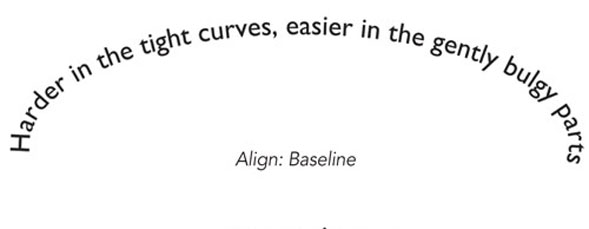
Design The Art of Type: Off the Beaten Path Setting text on curving baselines gets you well beyond how type was designed to be set. james felici September 17, 2009 0
Design The Art of Type: Dot Dot Dot Because with ellipses, language itself intervenes, and you crash up against copyediting style and linguistic logic, as well. james felici July 29, 2009 2
Design Art of Type: Getting Centered If it doesn’t look right, it’s not right—even if your accurate-to-a-micron program says so. james felici June 29, 2009 0
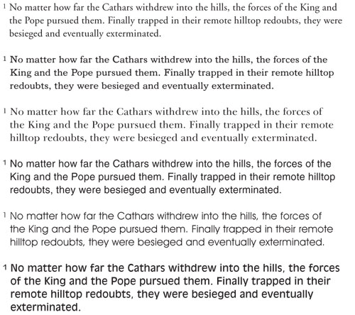
Design The Art of Type: Reading Between the Lines Properly set leading is vital to harmonious page layout and, more importantly, readability. james felici March 9, 2009 3
Design The Art of Type: Ligatures: Fusion Power The tiny detail under the lens this issue is the ligature, a single glyph created from the fusion of two or more letterforms. james felici March 7, 2009 2
Design The Art of Type: A Walk on the Wild Side This column takes a break from the rules and discusses how to try to simulate a hand-lettered look with an off-the-shelf font. james felici March 4, 2009 2
Design Art of Type: Squint-Free Small Type If you don’t want your small type to look like it’s hiding something, if you really want it to be read, it takes some extra ... james felici February 11, 2009 18
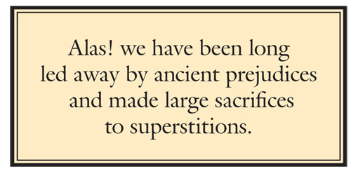
Design Art of Type: Power of the Ballot Box In honor of this election year, I would like to dedicate a column to a humble bit player in the typographic repertoire: the ballot box. james felici August 14, 2008 0