
The Art of Type: Off the Beaten Path
Setting text on curving baselines gets you well beyond how type was designed to be set. You don’t often get to use the word “unnatural” when you’re talking about type, but when it comes to type set on baselines that aren’t straight (so-called type on a path), the word is apt.
From the days of the first incised cuneiform tablets, text has been written—then printed—in straight lines. Our whole system of page layout, of text composition, of the shapes of the alphabet’s characters themselves, assumes a straight, horizontal baseline. Computers may have liberated us from the tyranny of the straight line, but they haven’t freed us from the laws of legibility and readability. Getting loopy type to look good isn’t automatic.
The most obvious problem when type goes nonhorizontal—even on a straight baseline—is that you have to turn your head to read it. This turns out to have cultural dimensions, as European readers—who are accustomed to reading the spine type on books in a library from bottom to top—are more comfortable reading type going “uphill” than Americans, whose habit of reading spine type from top to bottom makes them more comfortable reading type going “downhill.”
The greatest challenge
But that’s really a design issue. From a typographical point of view, curving baselines mount the greatest challenge, because in addition to head-craning readability issues, curving baselines wreak havoc on the spacing between characters. In the InDesign Type>Type on a Path>Options dialog, you can control how a line of type cleaves to a path. Here you can do a lot of clever and mostly useless things—tricks you may use once but that generally don’t bear repeating. These include all of the choices in the Effects pop-up menu, except for Rainbow, which is the one we’ll talk about here. When using Rainbow, the effect is like bowing a normal baseline, with the stems of the characters rising from it at right angles.
Stick to Align: Center for decent character spacing
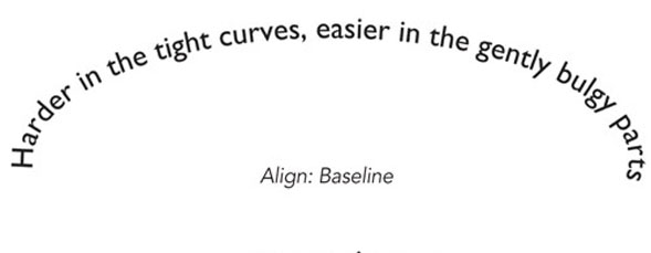
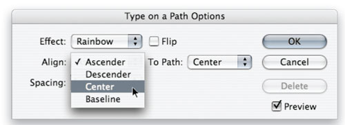
The most important choices in the Type on a Path Options dialog are in the Align and To Path drop-down menus. In Align, you can opt to have your type stand up on the path (the Baseline option), hang down below the path (Ascender) or above the path (Descender), or have the path pass right through the centerlines of the characters (Center). Characters standing on the path have normal spacing where they meet the baseline, but their tops get bunched up on concave baselines and spread too far apart on convex baselines. When you choose to have the ascenders align with the path, spacing at the baseline of the characters closes up on convex baselines and spreads apart on concave baselines. The results in all of these cases are bad. You’ll get the most natural character spacing if you select Center from the Align menu and, if necessary, Center from the To Path menu.
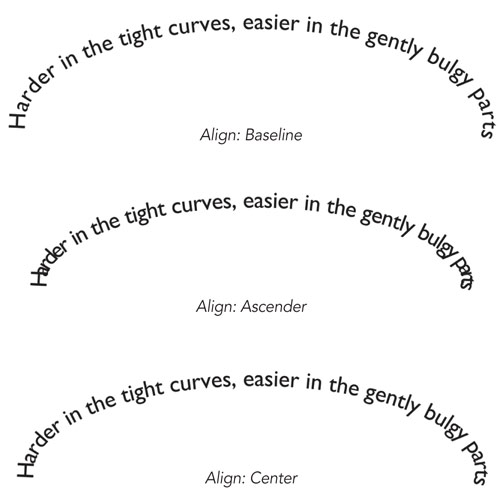
Here, the top sample shows type that’s set base-aligned to an elliptical path. In the sharpest parts of the curve, character spacing is badly distorted. The middle sample is set top-aligned with the curve, which badly pinches the bottoms of the characters in the tight convex curves. At the bottom is the happy medium: vertically centering the type on the curved path. Using baseline shift to raise the text a couple of points relative to the path improves spacing even more.
Note: The To Path menu only comes into play when the path your type is following has been stroked, that is, given width and color; otherwise, it has no top, center, or bottom to align to.
Better overall spacing
Even if you use Align: Center, you’ll still have to do some hand kerning—and possibly some tracking adjustments—where the curves of the path are the sharpest. But there will be far less mopping up to do than with any other alignment option.
Another trick to assure better overall spacing is using the Baseline Shift control in the Control panel to make micro adjustments to the type’s alignment relative to the path. Just make sure you have all of the text selected before adjusting this value. Raising the type a couple of points above where the Center command places it can provide substantially more natural spacing, even in tight corners.
It’s inevitable that in tight bends, your type will get looser or tighter, depending on whether the bend is concave or convex. In these places, use your tracking controls to tighten or loose the overall spacing of words or phrases to establish an even spacing feel throughout the whole text passage. Even after adjusting tracking, some hand kerning will likely be needed.
Choosing the typeface
Lastly, the typeface you choose for arcing type makes a big difference in its final look. In general, sans-serif faces fare better than serif faces; all caps text (because the letters have a consistently blockier profile) fare better than caps and lowercase; and condensed or compressed faces tend to look better than those with a wide set width. Script faces may work on gradual curves, but those with interconnecting letters can either become disconnected or have their connection points overlap—not a pretty thing. Brush faces fare best because their characters are generally not designed to connect, and their calligraphic style gives you more flexibility with their spacing—every little kern isn’t as crucial.
Brush faces and nonconnecting scripts work particularly well on curved baselines, as shown here. Their irregular geometry hides some spacing flaws, and this sample needed only light kerning. Serif faces in particular need more kerning to get character spacing to look something like normal.

