
Before & After: Peekaboo Brochures

 One sheet of paper folded like an accordion makes a great brochure easily. Narrow front panels give a peek at the inside, which opens into a beautiful presentation. No one will really notice that it’s just one sheet of paper—it looks and acts like much more.

One Peekaboo
Layout
 Once open, your design can ignore the folds. Note how the brochure has been designed in halves–the dark half is a narrative and the light half is a listing.
Type
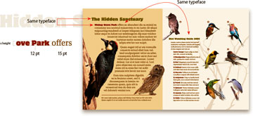 The halves of the page use the same two typefaces but in different sizes and line lengths: On the left half, oversize, 15-pt type creates a richly textured introduction.
The narrative begins beautifully with both headline and subhead in the same typeface (ITC Motter Corpus). Note the subhead runs with the text (Utopia). This attractive detail requires adjustment–san-serif type usually has a greater x-height than serif type, so its point size must be reduced until it lines up (see left).
The panel-width column (see left side of figure) yields a narrative-style look, awhile on the right, the narrow listing looks like a directory.
Template: One peekaboo
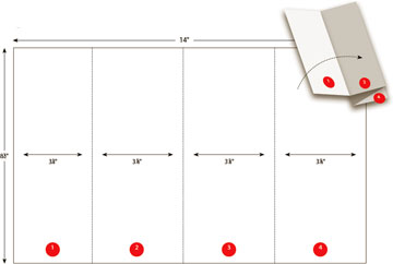 Legal-size page (14×8½”)
Eight panels (four per side)
Accordion fold with one, half-inch reveal (panel 1)
Two Peekaboos
Three panel widths yield two peekaboos, which serve as a tiny table of contents. Inside can be similar products (as shown) or different products.
Layout
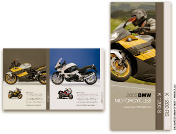 Repetition and scale are key to this handsome design—two motorcycles, two views each, two paragraphs of text, all the same size in the same place on both pages.
Giving this brochure its unusually clean appearance are its high contrasts of scale– one motorcycle is much larger than the other. Such a large difference has two benefits: It establishes a clear hierarchy and keeps the images visually apart—images of too-similar size tend to fight for the reader’s eye. Note that the large side views are straight-on, detailed, and meant to be examined, while the small views are angled, casual, and meant to be felt. This is a storytelling contrast.
The repetitive format–one page exactly like the other–allows the eye to fall into an easy, page-by-page rhythm. This is an excellent way to present small quantities of similar products.
Template: Two peekaboos
 Legal-size page (14×8½”)
Eight panels (four per side)
Accordion fold with two, half-inch reveals (panels 1 and 4)
![]() John McWade is a designer, teacher, and author who has been at the forefront of the graphic design and desktop publishing worlds for two decades.
John McWade is a designer, teacher, and author who has been at the forefront of the graphic design and desktop publishing worlds for two decades.
He is founder, publisher, and primary voice of Before & After magazine (www.bamagazine.com; email: layers@bamagazine.com).
