Get Skin Tones Right Using Photographic Styles on iPhone with Aundre Larrow
This excerpt comes from Aundre Larrow’s “Get Skin Tones Right With Photographic Styles” session from last year’s iPhone Photography Conference. In this clip, Aundre shows how Apple’s Photographic Styles can help you dial in accurate skin tones and communicate better with your subjects—even right in camera and during editing.
iPhones Are Editing Tools, Too
Our phones are great tools, not only to capture, but also to edit. And I think styles is a great opportunity to showcase that.
Getting skin tones right is this really interesting dance between art, science, and preference. Sometimes it’s hard for us to trust our own eyes. So working with our subjects, using something like Photographic Styles, is easier than doing three or four rounds of edits where they’re saying, “It’s not warm enough” or “It’s not bright enough,” when what they very well could mean is, “My hair looks too dark,” or “My shirt looks too blue,” or just something feels off.
This gives us the opportunity to share something that’s easier for them to understand, less daunting, and lets us communicate quickly and work with them well.
What Photographic Styles Actually Are
So this is where Photographic Styles comes in. It’s a really interesting change Apple made that allows you not just to filter, but to actually edit how undertones are rendered per subject on an easy-to-understand scale.
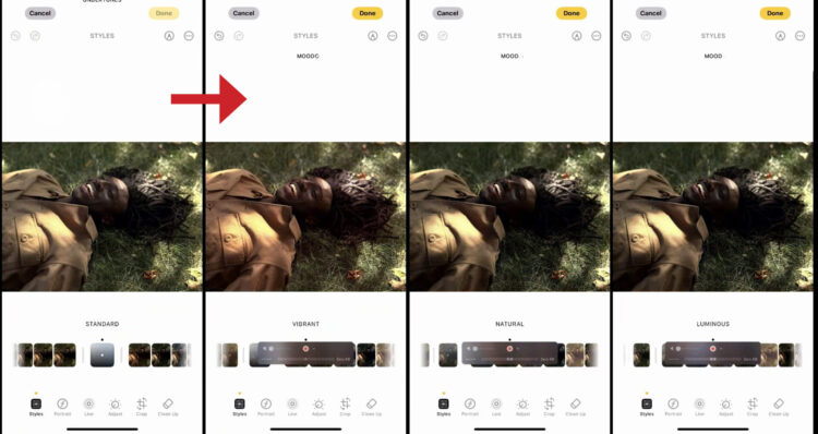
If we go to Edit, you’ll see the Style option come up. One thing to point out: if you move to the left, you get undertones—you’ll see that denoted right here underneath Styles. But if you go to the right, you’re getting your normal Moods, which are kind of like your filters. As we move across, you’ll see each one changing our base colors, but unlike the moods we’ve seen before, this person’s skin tone isn’t changing drastically. It’s getting slight and specific changes to the color highlights in the image.
Now let’s go over to Moods real quick so you can see what I mean. As you scroll across, you’ll see dramatic changes in skin tone. They’re not as bad as some of the filters we used in the past, but they’re still more intense. I wouldn’t call them destructive, but they’re stronger. And that’s not always helpful if A) you’re not used to editing the skin tone you’re working with, and B) you’re not sure what your client actually wants.
Photographic Styles lets you zoom out, tap, move around, and make changes in a much more controlled way. You can dial in skin tone more easily and show it to them early. You can even set a style ahead of time. So if you’re working with a subject who’s less photo-literate, or you just want to make things easier, you can have them use this as an example of how they think their skin tone looks best in this kind of lighting.
This is a tool for everyone, but it really helps make your job as a photographer easier.
Editing With Tone and Color
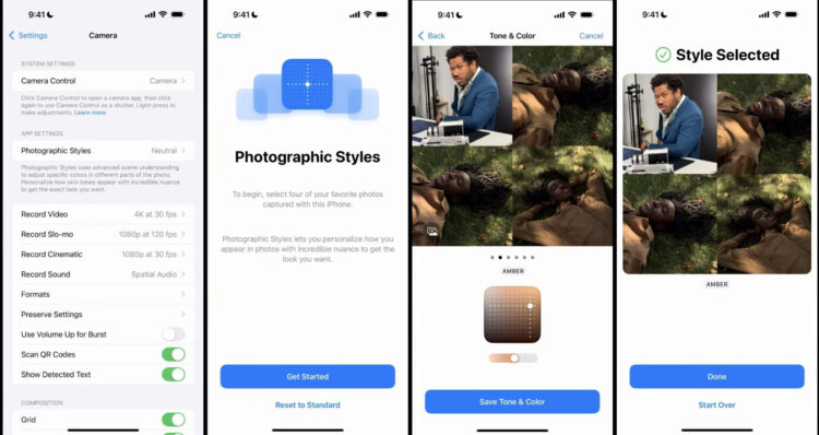
Here’s a simple photo of my friend, Boo. We’ll start with Standard. If you’re wondering how I got here, just hit Edit again. On the bottom you’ll see (right to left) Cleanup, Crop, Adjust, Live, and Styles.
Note: If you don’t see the Styles option, your photo format for Camera Capture needs to be changed to High Efficiency (under Settings > Camera > Formats).
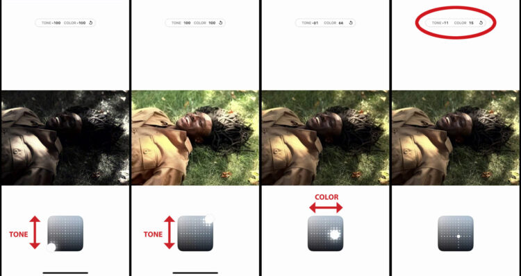
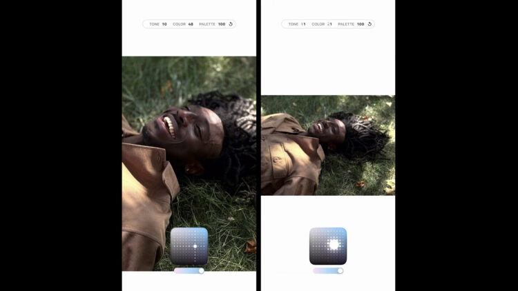
We start with Standard, and our axes are Tone and Color. We can adjust the tone of the shadows. You see our blacks down on the bottom of the grid, our lights up top. It’s kind of an X and Y axis. I know many of us aren’t big calculus people, but if you think about it, as we increase color left to right or alter tone north to south, it gives us the ability to move around more naturally.
I actually really like this edit system Apple created because it’s intuitive. As we move around, you’ll see numbers changing at the top. That means after you’ve made edits—or if your subject asks, “What photographic style do you like on yourself?”—they can literally tell you, “Hey, I like Standard, minus 11 tone, plus 15 color.”
That’s huge.
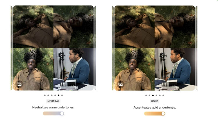
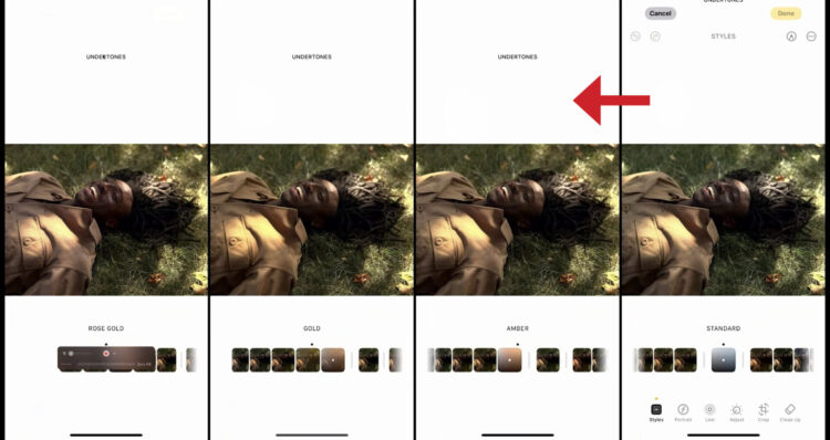
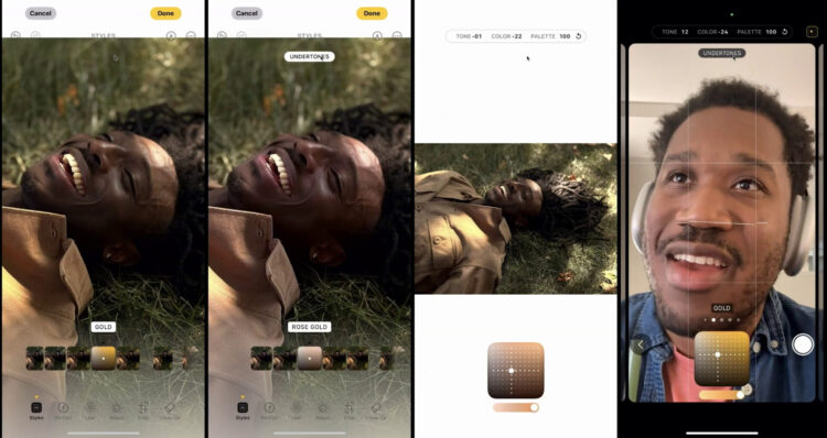
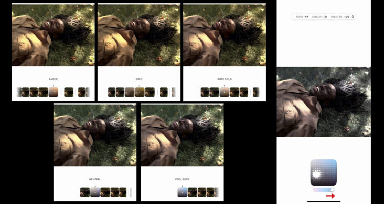
Your undertone options are Amber, Gold, Rose Gold, Neutral, and Cool Rose. Obviously you can alter tone and color for each. You can also use the slider under the grid to change the intensity of your palette. Slide it all the way down and you’re back to the original image. Slide it up and you get a full undertone look.
As we move across, we’re removing color and adding it back. Even while we do that, his skin tone is still warm like when we started, but the feeling of the image is different. That’s the really interesting part. It’s like some Apple Neural Engine magic, mixing localized edits on skin with global edits. The entire image changes, but locally, the skin tone still looks right.
Setting a Base Style for In-Camera
Open Settings, go to Camera, and then Photographic Styles. That gives you a chance to learn about it for the first time if you haven’t explored it yet. Here we’ll choose some images as reference to set a base style we can use in-camera.
We’re going to use a selfie from me and three pictures of Boo, because I like the mixed light on his face. This gives us an interesting opportunity. Something I really like about this is you can take four photos—yourself, family members, whoever—and pull them across to see how they look in Photographic Styles.
The reason I like doing that is it gives us a chance to pick a base style. That way, when you open your camera, you don’t have to change anything. That’s just what it renders at.
For me and Booba, we find a warmth we like. Maybe it’s a little too dark, so we move it over. Cool. I like how my skin looks. I save tone and color. Now when I go back to my camera, that’s what it’s set to. And you’ll notice the same Amber setting is ready for everyone. That’s really cool.
Using Styles as an editing tool is amazing, but it can also be an excellent reference—like a living, breathing white card. You and your subject can talk through edits live instead of going back and forth later. You can say, “Hey, how do you feel about this skin tone?” As they move around, you’ll see all the numbers changing at the top. The only one that doesn’t move is palette, because you change that separately. If you find something you like, screenshot it, save it, and use it later.
Using Styles With Clients
Coming in with this helps a lot. Let’s say you’re a street photographer. Or you shoot influencers. Or just beautiful people who say, “I want to hire you. Photograph me.” Now you already know: they like Cool Rose, they like Gold. So you make sure you photograph them in environments where that warmth works well with their skin.
You use this as a reference point to create better environments and better light to get skin tones right. Your subject has confidence in the edit you’re making because they understand it and helped choose it.
Giving people the opportunity to learn is really powerful. And the thing I love about Photographic Styles is that it’s a departure from the tech debt (legacy Western-centric calibration standards) we’ve seen in photography for years.
Final Thoughts
This gives us the opportunity to make edits at the source of the imaging pipeline. It helps us understand how we want our skin tones rendered—both as a matter of preference and as a matter of truth. I think that’s just awesome.
I hope you use Photographic Styles in a way that empowers your subjects and makes your life easier. Because honestly, you need things to be a little easier sometimes, too.
Thanks so much. See ya.
Make Every Shot Count
The iPhone Photography Conference is back March 9–11, 2026, featuring three days of hands-on tips, creative approaches, and editing techniques from top industry pros. You’ll walk away ready to capture images you’re truly proud of—anytime, anywhere.