Design Makeover: Designers Revamp a Jewelry Artist's Line Sheet
Before
CLIENT: Shahasp Valentine – www.precieux.com
 Shahasp Valentine is a San Francisco Bay Area jewelry designer whose main jewelry line, Precieux The Modern Artifacts Collection, is a series of handmade necklaces, earrings, and rings of precious metal clay, a material that contains micro-particles of pure silver or pure gold mixed with a clay binder. When fired at ultra-high temperatures, the clay burns away, leaving pure precious metal. Valentine also incorporates precious stones, such as rubies and sapphires, into her jewelry, which she sells wholesale to gift stores, jewelry stores, galleries, and other retail outlets, and to individuals over the Internet.
“The Modern Artifacts Collection is historically inspired and draws from all periods,” says Shahasp, whose pieces range from Renaissance and Victorian designs to styles derived from various religious symbols throughout history. Even though her handcrafted jewelry is new, it looks antique, like an heirloom handed down through generations.
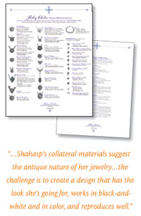
Shahasp says it’s important that her line sheet reflect the antique quality of her jewelry. At the same time, it needs to be extremely legible and straightforward, so that storeowners can easily select the styles they want, figure out the wholesale prices, and place an order.
There are additional design challenges: Shahasp would like to be able to photocopy the line sheet. When she has only one or two information requests, she prints them out on her printer in color but when she attends a trade show, she sometimes makes up to 50 blackand- white photocopies to hand out to prospective buyers. Some of Shahasp’s collateral materials suggest the antique nature of her jewelry by using images of aged, cracked marble or faded logos and screens; however, she’s discovered that those things don’t photocopy well. So the challenge is to create a design that has the look she’s going for, works in black-and-white and in color, and reproduces well.
Another consideration is that she needs to be able to update the line sheet. Prices change, pieces get added to the collection, and other pieces get dropped. She wants to make text changes whenever needed.
We found three designers to give a new look to this jewelry designer’s line sheet.
After
DESIGNER: Calixto Flores – www.maxpictures.com
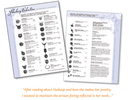
After reading about Shahasp and how she makes her jewelry, I wanted to maintain the artisan feeling reflected in her work and her original line sheet. I thought the line sheet could use a cleanup, so I focused on simplifying the fonts, organizing the information more clearly, and placing more emphasis on the jewelry.
The original line sheet used several fonts to show different types of information, but the result was more distracting than differentiating. I spent time trying to fi nd a font family that would have the right look and enough variety for the various kinds of information on the line sheet. Monotype Centaur seemed to fit the bill. Aligning the prices for the jewelry pieces and moving the stone type to the top of the listings also helped organize them.
To bring the jewelry to the forefront, I increased the size of the images and also cleaned up the images in Photoshop, erasing necklace links and increasing contrast for black-andwhite. To accommodate the larger jewelry images, I moved the earrings section to the back of the sheet, and to further emphasize the jewelry information, I placed the identity and contact elements in a frame along each side of the sheet.
Finally, the new layout is full-bleed, but functions well enough when printed on 8.5×11″ paper with margins. Time permitting, the line sheet could be output on 11×17″ and trimmed down.
ABOUT THE DESIGNER
Calixto Flores originally went to college to study computer science and engineering but became interested in graphic design when he saw someone creating a party flyer with MacDraw on an Apple Mac Plus.
Twenty years of in-house creative services and freelance production experience later, Calixto now designs full-time for the University of California, Berkeley. In his spare time, he works on independent documentary films at Max Pictures. See the results of his labors at www.maxpictures.com.
APPLICATIONS USED: InDesign 2 and Photoshop 7
After
DESIGNER: Joe Nicklo – www.nicklomedia.com
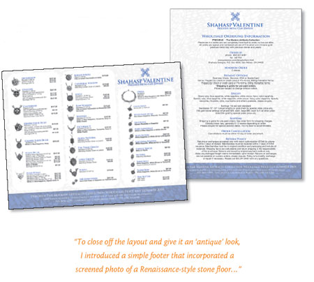
After viewing the original line sheet, I experimented with several different layouts until I decided that the best format to keep the layout uncluttered was landscape. I adopted a layout similar to that of the “before” line sheet and focused on the type. I chose Trajan Pro as the font for the product names and Helvetica Neue to ensure the legibility of the prices and descriptions.
I also decided to clean up Shahasp’s logo a bit and incorporate new typography. I knocked the logo down to two colors to give myself a color palette to work with for the rest of the line sheet.
To close off the layout and convey an “antique” look, I introduced a simple background image and footer that incorporated a screened photo of a Renaissance-style stone floor and then set the foreground to the color I used in the logo and product titles, to tie it all together.
ABOUT THE DESIGNER
The lead designer at an automotive performance parts manufacturer in Boca Raton, Florida, Joe Nicklo has been designing professionally for six years and he’s also a freelance logo designer. Joe attends the Art Institute of Fort Lauderdale, working toward his Bachelor’s degree in Graphic Design. In his spare time, he runs an online community for graphic designers at www.anticubicle.com. Joe enjoys all aspects of design but considers corporate identity to be his strong point. He’s grateful to many people for nurturing his talents but above all says “thanks to my father for fi rst putting Photoshop in my hands.”
APPLICATIONS USED: Adobe Creative Suite
After
| DESIGNER: Donovan Sears – www.transfixdesign.com |
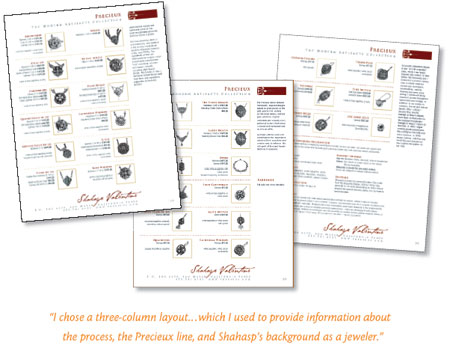
When I fi rst saw the line sheet, I noticed that the fi rst page— which squeezed in the whole jewelry line—was cluttered, and that the contact and payment info was spaced out over the second sheet. To simplify the layout and make better use of the space, I decided that instead of squeezing all 30 pieces onto one page, I’d showcase 12 items per page, which pushed the overall project to three pages. This also allowed me to present larger images of the jewelry to emphasize the intricate beauty of the Precieux collection. I chose a three-column layout: two columns to the left of the page and a narrower column to the right, which I used to provide information about the process, the Precieux line, and Shahasp’s background as a jeweler. I selected Trajan Pro for the headlines and jewelry names, and ITC Kabel for the jewelry pricing and info. To tie in with the idea that the jewelry is handmade, I decided that a font that looked more like handwriting would better represent Shahasp’s logo. Cezanne seemed like a good choice. When it came to color, I decided to use earth tones, but I had to stay toward the darker end of the spectrum to allow for copier duplication.
ABOUT THE DESIGNER APPLICATIONS USED: Adobe Illustrator CS, Adobe Photoshop CS, and Adobe InDesign CS |