Art of Type: Getting Centered

It’s a truism of typography: If it doesn’t look right, it’s not right…
There are many reasons why centered type often doesn’t look that way, and the fix is usually visual rather than mechanical. It’s a truism of typography: If it doesn’t look right, it’s not right—even if your accurate-to-a-micron program says so. This conflict between what your eyes see and what your software says is probably most obvious in the case of centered type.
Before we launch into corrective measures for program-generated off centering, let’s look at the principal cause of operator-induced imbalances.
Misplaced word spaces
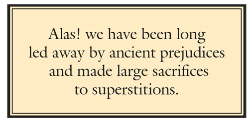
When you create a centered block of type, you want it to have a nice shape, an aesthetically pleasing variation in the lengths of the lines. This usually doesn’t happen by itself, and the fix is to hard-end the lines manually using Shift-Return (PC: Shift-Enter). This forces a line break without starting a new paragraph. But when you do this, the word space at the end of the line can easily get pushed to the next line, where it will create a one-word-space indent, pushing the line off-center to the right. This is alarmingly easy to do without noticing, and it’s amazing how often you’ll see this in print once you start looking. It may take a second glance to notice that the third line of this Thomas Paine quote is off-center to the right.

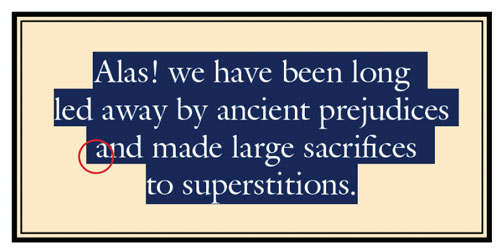
An important thing to note is that, although you may leave a word space at the end of a line when hard-ending lines like this, InDesign will not take that space into account when centering the line. Even though your cursor shows that the space is there—and you can even select it—it doesn’t affect the centering of the visible type. The same cannot be said, however, for a word space that starts a line. To quickly check for those misplaced spaces, quadruple-click with the text cursor in the centered paragraph (to select the entire paragraph) and look for highlighted spaces in untoward places. As shown here, a misplaced word space at the beginning of the third line is the culprit.

Measures right, looks wrong
Most likely, though, apparent bad centering results from design choices or simple optical illusions.
In the design category, a leading culprit is putting a centered heading over flush-left text. Because the ragged right-hand margin of flush-left text holds a lot of white space (particularly if hyphenation is limited or disallowed), a centered heading will always look off-center to the right.
So instead of centering your heading across the entire measure of the column, you want to center it over the “apparent measure.” To find this, align a vertical ruler guide with the end of the shortest line in the flush-left text. The apparent right-hand margin of the text will be about halfway between this ruler guide and the true right-hand margin. The distance between this halfway point and the ruler guide is about the amount that you have to indent your heading from the right to get it to appear centered.
This recipe, of course, works best for the numerically oriented. For the visually confident, just nudge the heading to the left using the Paragraph/Right Indent field in the Control panel until it looks centered. It’s best to do this with guides and frame edges hidden, so all your eye has to work with is the text. Other visual points of reference don’t appear on the printed (or online) page to mislead your eyes.
Where this effect creates the thorniest problems is in tables. Centered headings in text tables rarely look centered unless the tab entries below them are also centered. Flush-left, justified, or decimal-aligned entries will all tend to make centered column headings look off-center. In this “before” table the column margins have been highlighted to show that the column headings are mechanically centered, even though they look wrong above flush-left columns.
In these situations, the best solution is to complete the table and leave the heading cells blank (use an em space as a place-holder, if you like). Then, only after you have all of your gutters balanced and the table entries look properly positioned, you can go back and add your headings. They’ll look bad, but using right indents (for justified or flush-left columns) or left indents (for decimal-aligned columns), you can nudge them into better positions. Some of them will never look perfect—this is a game of visual compromise. Here, we’ve applied right-hand indents to push those heads into visually centered positions.

An italic title over roman text (even if it’s justified) can also look off-center, simply because the characters are all leaning to the right. The larger the type, the more dramatic this effect can be. Again, the solution is to apply an indent to push the centered text to the left.
Character issues
When your program is centering type, it’s making its calculations based on the widths of the characters in each line. But there’s no way it can appreciate that some characters have very little mass on the page, and these visually carry little more impact than an empty space. When such a graphically weak character appears at the end of a line, it seems to push the line slightly in the opposite direction. (Imagine what the line would look like if the character were the same color as the background.)
Although many of these visually weak characters are punctuation marks, such as commas and periods, they take up a surprising amount of space. A period and its side bearings, for example, account for about a quarter of an em in a typeset line. Double-quotation marks take up about half an em. And an em dash, of course, occupies a full em of space, as do points of ellipsis (…). When characters such as these appear at the end of a line, those lines will likely look off-center, because such a line’s center of gravity—so to speak—is shifted away from the weak character.
Quotation marks are the most common culprits. In this pull quote, the graphic weakness of the quotation marks makes the first line look off-center to the right and the third line look off-center to the left. [Insert pull quote.pdf]—crop, if needed
In these cases, indents—which are Paragraph attributes in Adobe programs—are of no help, unless you end each line with a return, making a separate paragraph of each line. The alternative is to use Shift-Return (PC: Shift-Enter) to hard-end the lines and use fixed spaces (thin spaces, at one-eighth of an em, should suffice) to pack the other end of the afflicted lines to make them look centered.
Just say “no” to hyphens
One last bit of advice is to avoid hyphenation in centered type. First of all, hyphens don’t look very good in such settings, although the occasional hard hyphen (as found in a compound modifier, such as English-speaking) at the end of a line won’t kill you. Still, it would be better to hand-rag the lines to avoid such an occurrence. In addition, hyphenation has the effect of making the length of the lines more uniform in a block of text and in centered passages, and this is probably the opposite of what you want. It’s the shape of a block of centered text that makes it interesting and provides the contrast between it and its surroundings.


