The Art of Type: Dot Dot Dot
“Maddening . . . awkward . . . indispensable . . . .” Welcome to the world of the ellipsis, more accurately known as points of ellipsis or points of omission. They don’t seem complicated, but in the pages you see every day, points of ellipsis are almost always done wrong, and for a variety of reasons. Because with ellipses, language itself intervenes, and you crash up against copyediting style and linguistic logic, as well. There’s no such thing as a simple dot-dot-dot.
Filling gaps with spaces
Grammatically speaking, any break in the sense of a sentence is an ellipsis—this em dash, for example. In days of yore, as well as in parts of Europe today, points of ellipsis were used in the same way as an em dash, except to indicate an even more exaggerated break, as in the dramatic pause of an orator. In American English, though, points of ellipsis are used almost exclusively to indicate an omission amid a direct quote: a stand-in for text that’s been eliminated for the sake of brevity or clarity. By convention, they’re used in mid-quotation, or at the end, but rarely at the beginning. Occasionally, they’re used outside quotations, at the end of a sentence, for example, to indicate a thought trailing off . . . .
Points of ellipsis are comprised of periods, and their spacing is important both typographically and grammatically. Spaces are always added between the periods of an ellipsis, but how much space depends on what authority you consult. The most popular spacing options are ens (Words Into Type), one-third ems (Chicago Manual of Style), and one-quarter ems (Hart’s Rules for Compositors and Readers), the last of which are essentially the width of a regulation word space. As we’ll see a little later, quarter ems are the most practical choice.
The evil ellipsis character
Now, every font has a points-of-ellipsis character built in (Mac: Option-: [PC: Alt-0133]), but it’s close to worthless. First, it’s too narrow to excel at its job, which is to alert you to missing text. If something’s missing, there should be an obvious gap, right? Secondly, when points of ellipsis come at the end of a sentence, the rules of grammar say you have to add a sentence-ending fourth period. But there’s no way you can add a fourth period to an ellipsis character and have its spacing match that of the other three dots. If you set it closed-up (that is, with no space), its spacing is too narrow. In InDesign, if you use the narrowest fixed space—a Hair Space—between ellipsis and period, it’s better, but still too close. And if you use the next-largest space—a Thin—it’s too wide. This bad spacing can be particularly apparent in webpages, where the low resolution of the screen display exaggerates bad character spacing to begin with. (Note: To find the fixed spaces in InDesign, go to Type>Insert White Space.)
Worse yet, in some typefaces, the dots of the ellipsis character are not the same size as the periods. So not only will the spacing of a four-dot ellipsis be bad, but the dots won’t even match.
The only possible role for this ellipsis character is in display type, where tight spacing is the norm. Set it closed-up, with no space between it and the text that precedes it. If you must use a four-dot ellipsis in a display setting, you can hand-kern that fourth period to get the spacing you want. But note that in very large point sizes, even the tight spacing of the ellipsis character may seem too slack.
On this book cover example, the ellipsis character can be used to good effect, because the large type complements its tight spacing.

The do-it-yourself ellipsis
As a rule, you should build your own ellipses. For the dots, just use everyday periods. For the spaces between periods, use nonbreaking spaces. To create a nonbreaking space in Microsoft Word, use Option-Spacebar (PC: Ctrl-Shift-Spacebar). In Adobe applications, use Command-Option-X (PC: Ctrl-Alt-X).
Nonbreaking spaces are included in every font and have the same width as normal word spaces in whatever typeface you’ve chosen. (As mentioned above, this is just about one-quarter em for text-width faces.) The distinctive feature of a nonbreaking space is that it’s not a legal place to divide a line, so using nonbreaking spaces assures that the points of ellipsis will remain as a group and not be broken up at the end of a line.
Now, by copyediting norms, points of ellipsis can appear anywhere on a typeset line, including the beginning. This means that it’s logical to separate the last word of text from the first dot of your ellipsis with a normal word space—this provides a legal place for your program to break the line. To keep the dots together and make sure they travel as a unit, separate them only with nonbreaking spaces.
If you’re using three-dot ellipses, as in the movie-review phrase “heart-warming . . . enchanting,” you’ll want the space after the third dot to be a normal word space too, again for linebreaking purposes. It’s when you start using four-dot ellipses that things get more complicated.
The spacing of a four-dot ellipsis depends on the sense of the text. A space before the first dot indicates that the preceding word is not the last word of its sentence. Rather, the missing text represented by the ellipsis is part of that sentence, and the fourth dot of that ellipse is the sentence ender. If the first dot of the ellipse is set closed up against the text, it’s a sentence-ending period itself, and the following three dots represent missing matter that followed that sentence. This is a copyediting distinction, but often, as the typesetter, it’s your job to assure this spacing is correct.
This brings up yet one more reason not to use the ellipsis character. InDesign, like most other text-processing programs, will break a line after an ellipsis character, just as it would after an em dash. But Web browsers will also break a line before an ellipsis character, even though it’s not preceded by a space. This means that if you create a four-dot ellipsis that starts with a period, in a browser display you could end up with a broken ellipsis, with the period at the end of one line, and the ellipsis character at the start of the next line. Bad.
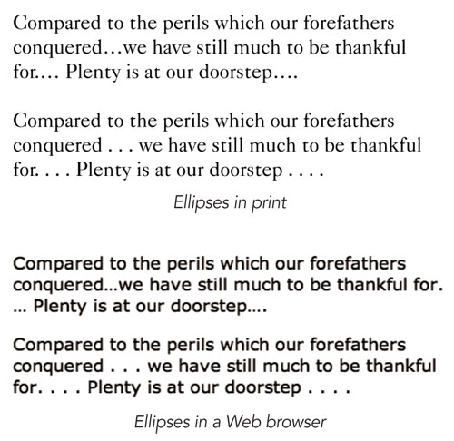
In the print sample here, the spacing problems created by the ellipsis character in the upper example are apparent: in its three-dot form it’s too wimpy, and when a period is added, it isn’t spaced properly. The lower sample shows well-formed, hand-built ellipses.
When the same text is viewed in HTML format in a browser, more problems arise: one four-dot ellipsis comes apart at a line ending, and in the second, the period used to create it is obviously a different size.

Automated help
Making your own points of ellipses isn’t that much work, but it would be nice if Adobe programs offered some easy way to save such complex text composites for future use. Libraries don’t work for text morsels like this. A good solution is a utility program I’ll call a “Clipboard enhancer,” which can hold all kinds of bits for later use, saving them to disk or holding them in memory simultaneously. (Normally, when you Copy something to the Clipboard, it overwrites whatever was there before.) Among the many such programs available, Mac users can take a peek at CopyPaste Pro (www.scriptsoftware.com), while PC users have a freeware option in AccelClip (www.flexigensoft.com).


