Art of Type: Squint-Free Small Type

The disclosure forms for prescription drugs are typically printed using eye-aching 6-point Helvetica Light Condensed. It would doubtless be smaller if this minimum weren’t mandated by law. As a designer or typesetter, your job is to make sure the type you create isn’t just legible, but readable, and usually there’s no FDA around to make sure you do the right thing.
If you don’t want your small type to look like it’s hiding something, if you really want it to be read, it takes some extra effort, because all type programs default to settings for creating full-sized text. When you start setting smaller type than this, whether it’s for footnotes, contracts, legal notices, or the front and back matter of books, you have to make adjustments.
Typeface choice
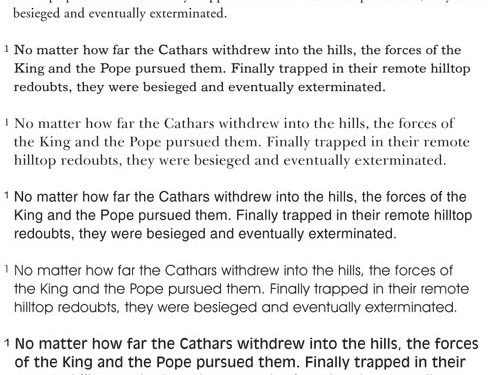
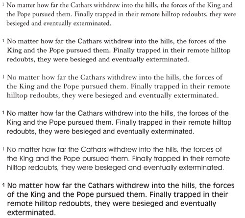
If you’ve struggled to read a drug disclosure, you know that a light, condensed face for small type is bad news. What you really want is a face with a wide set width, that is, one whose characters are relatively wide. In addition, you’ll want a face with a generous x-height: one whose lowercase letters are rather tall. Below is a selection of faces illustrating this. All of these footnotes are set in 7-point with 9 points of leading. The apparent size of the various faces varies widely, as does their relative readability. The faces, from top to bottom, are Adobe Garamond, Bookman, Baskerville, Helvetica, ITC Avant Garde Book, and Antique Olive.

Likewise, faces with a heavier stroke weight and less contrast between the thick and thin parts of their characters are more legible in small sizes. Palatino, for example, holds up better in petite formats than Garamond, and both fare better than Bodoni.
Although Helvetica Light Condensed may be a poor choice for setting small type, Helvetica itself is not, because it scores high on all the previous criteria: big x-height, good color, and a wide stance. In fact, many sans serifs fare well in small sizes for the same reasons. In general, humanist sans serifs such as Gill Sans work better than a geometric sans, such as Futura or Avant Garde, because the shapes and proportions of their letters share more of a seriffed face’s visual cues to easy character recognition. Antique Olive is a face that was specifically designed for legibility (by Roger Excoffon, in the 1960s), but it’s sadly neglected today. With its lowercase letters that are almost as big as its caps, it stands up very well in small sizes.
Italics suffer particularly badly when set small. Ironically, they were first developed 500 years ago by Aldus Manutius as a way to cram more type onto a page, because their narrower characters saved space and paper for his popular cheapo editions. They looked crowded then too, and when you reduce the size of italic type, it can quickly start to look like alphabet soup.
Word and letter spacing
No matter which face you use, when setting small type you should loosen the tracking. Spaces between characters always appear to change size faster than the type they’re with: Just as type appears too loosely spaced when its size grows, it appears pinched as its size is reduced.
Depending on the setting, you may have to alter your type’s hyphenation and justification (h&j) settings as well. Often, loosening tracking to open word spaces enough will cause overall slack character spacing. In such cases, consider making the h&j Optimal value for word spaces more than 100% of normal. (“Normal” being the value established in the font itself.)
Leading and line length
You can’t reduce point size much without also narrowing its measure (that is, shortening its line length). For two or three lines, you can suffer a reader to endure small type over a long measure, but in longer paragraphs, it becomes too easy to lose track of the correct baseline as the eye moves from right margin to left. Generous leading helps. In magazines with image captions set at reduced point sizes, designers often leave the leading the same as the surrounding text type. This not only makes for easier reading, but it also makes it easier to align the captions to the page’s baseline grid.
Footnotes—especially lengthy academic ones—present a particular challenge because they’re normally set to the full width of the page, matching the measure of the text type. In these cases, generous leading is a must. Often, using italics for footnotes will allow for an effective contrast with the text type while allowing you to use a slightly larger point size than you’d be obliged to use for footnotes set in a roman type.
Background checks
The visual fragility of small type makes it extra vulnerable to other forms of graphic static, such as high color contrast. In addition, when small type is printed in a blended color (that is, not pure cyan, magenta, or yellow), the screening used to create that blend is going to cause a loss of sharpness more exaggerated than that seen in larger type. Any slight misregistration multiplies the problem. The result is fuzzy text that’s hard to decipher.
Avoid reverses—white type on black—when using small type, especially small italic type or typefaces with high contrast, such as Bodoni. Inevitably, the ink that forms the black background will spread slightly into the white type areas, thinning them and possibly breaking up thin strokes and hairlines. Proofing on a desktop printer may not reveal these problems, as these printers are less prone to ink spread than a printing press, especially on absorbent, uncoated paper.
Small can be beautiful
All type is meant to be read, even the fine print—although you have to wonder if the people who write the text necessarily agree. As always in typography, it’s the little things that count, and this is nowhere more true than in little type.
OpenType Pro fonts to the rescue (again)
For the 500 years that commercial type was set using hot or cold metal, it was normal for different sizes of a typeface to have different designs. Small types were wider, slightly bolder, with taller lowercase characters. In the 1960s, phototype introduced the possibility of using a single master character design to generate type in a range of sizes. Fonts with different master sizes (8-point for classified ads, 12-point for text, 18-point and up for display) were still made, but not universally used.
Desktop digital type made the problem worse, forcing everyone to use a single-size type master—usually 12-point—for type of all sizes.
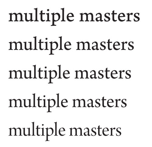
The OpenType format has broken this limitation by allowing several fonts representing the same typeface to be bundled together transparently in the same package. Adobe calls these size-specific variants “opticals.” They’re found in a handful of Adobe’s OpenType pro fonts. A good example is Adobe’s Arno Pro (shown here), which offers five size-dependent variants: caption (6–8.4 point), small text (8.5–10.9 point), regular (11–13.9 point), subhead (14–21.4 point), and display (21.5+ point). The design of each is matched to the demands of readability in various size ranges. Designs for smaller sizes feature wider, taller, bolder characters, features that become less so as point size increases.

The only one of Adobe’s recommended optical ranges that Arno lacks is poster, which would normally kick in above 72-point.
These point-size ranges aren’t normative, though, and font developers are free to use whatever ranges they choose. A font could just as easily have three ranges, for example, covering small, medium, and large sizes, applied to point-size ranges of the maker’s choosing.
As of today, the complete list of Adobe Pro fonts including opticals is Arno, Brioso, Cronos, Chaparral, Garamond Premier, Jenson, Kepler, Minion, Sanvito, Utopia, and Warnock.


