
The Art of Type: Reading Between the Lines
Properly set leading is vital to harmonious page layouts and, more importantly, readability.
Leading is an aspect of white-space management that gets far too little attention. Properly set leading is vital to harmonious page layouts and, more importantly, readability. It’s a key element in the even texture we call “good type color.”
Now, when I use the term, “leading,” I’m using the mainstream definition: the distance, in points, from the baseline of one character to the baseline of the line of text above it. The word comes from the lead alloy used to create the metal stamping blocks in handset type. The vertical dimension of the face of these blocks equals the point size of the type. The computer-type equivalent is the height of the bounding box that surrounds each character you set.
In computer type as in metal type, when you set lines of these character blocks one on top of another with no added intervening space, you’re setting your type solid. When you add space between lines, you’re adding lead. In a solid set, the type’s point size and leading are equal, for example, when 12-point type is set on 12 points of lead. This is typically written 12/12, pronounced “12 on 12.” Adding 1 point of lead gives you 12/13, or “12 on 13.”
Just say “no” to automatic leading
The first step to asserting control over your leading is changing the “automatic leading” value in all your programs. In the absence of a decision by you, this value determines what your leading will be, based on the size of your type. Never surrender this decision to a computer program! But since the “automatic” option exists, you may as well set it to a useful value.
 Extreme leading is often used for artistic effect, as in this coffee-table book, but it’s not very useful for normal text. Here, 12-point Fry’s Baskerville is set on 24-points of lead.
In all Adobe programs, the default value for automatic leading is 120% of your type size. Sometimes this may be appropriate, but it’s like having a broken watch: It’s accurate twice a day, but useless the rest of the time. It’s far better to have “automatic” leading default to a logical integer value that’s the same as your type size.
With no documents open, open your program’s Paragraph panel, click on its menu (top right of the panel), and choose Justification. In the Justification dialog, change the Auto Leading value to 100% and click OK. Thenceforth, your automatic leading will produce a solid set. If you forget to specify a leading value, this has the merit of usually being more noticeably wrong than a 120% setting, which may be just close enough to being correct as to go unnoticed.
Getting the lead in
So what leading value should you select? Since there should be harmony among the proportions of all the white space systems on your page—tracking, gutter width, measure (and by inference, margin width)—the answer is, “It depends.” One thing to know is that in most cases, leading measured in whole- or half-point increments serves perfectly well. Using fractions finer than a half-point is really a case of splitting hairs, and is unlikely to accomplish anything.
The most important factor in determining a proper leading value is your type’s measure, or line length. Here’s a handy rule of thumb: When your type size (in points) equals your measure (in picas), a solid set usually works fine; for example, 12-point type over a 12-pica measure. When your measure (in picas) is twice your point size (in points), add 1 point of lead. When this ratio goes to 3:1, add two points of lead. This doesn’t always work, but it will get you close.
There are two reasons to increase leading as you increase your measure. First, the space between lines serves as a path to steer your readers’ eyes from the right margin back to the left so they can start reading the next line. Narrow leading makes this transit more difficult. Second, tight leading in a wide column simply makes the text block look gray and uninviting—suffocating.
The point size you choose makes a lesser difference. As point size increases, so does the amount of negative space in and around the characters. Both character and word spacing appear somewhat looser. The type appears to have more breathing room. This can allow you to use slightly tighter leading in large type. But generally, your choice of point size is related to the measure you use, which brings us back to the previous point.
A more important consideration is the choice of typeface itself. Most seriffed typefaces for text are so-called “old-style,” which have a moderate amount of contrast between their thick and thin strokes and work with the rule-of-thumb for leading outlined above. But so-called “modern” faces, such as Bodoni and Didot, have much greater contrast, with exaggerated thin strokes, giving them a brightness on the page that somewhat diminishes their readability. They also have large counters, the open spaces in characters such as o and a, which give them an airy appearance on the page. Just as these faces suffer from tight tracking, they suffer from tight leading, because this fights against the openness of the letterforms themselves. Adding lead helps.
Likewise, sans-serif faces used in text settings, as on this page, also suffer when set with tight tracking and leading. In this case, it’s because sans-serif faces are inherently somewhat less legible than seriffed faces (serifs provide visual clues for quick character recognition), so tight tracking slows reading. Along with the looser character fitting that typifies sans-serif faces must come looser leading as well.
A character attribute?
In Adobe programs, leading is nominally a character attribute set in the Character panel. But this is badly implemented. To see how badly, select a single character in the middle of a paragraph and double its leading value and you’ll see that the whole line takes on the leading of that single character. Bad! Your supposed character attribute is in fact a line attribute. If leading were properly implemented as a character attribute, doubling that character’s leading would simply push that one character down until its baseline was the specified distance below that of the previous line.
To move single characters up and down like this in Adobe programs, you have to use the Baseline Shift command, which is a half-baked implementation of true character-based leading.
Negative leading
Computerized typesetting introduced negative leading, where your leading value is less than your type’s point size. It’s rarely useful in body text, but it’s often handy in display settings. That’s because as point size increases, white space appears to grow faster than the characters themselves. As “normal” tracking looks too loose in large sizes, so does “normal” leading. As long as ascending and descending characters don’t collide, you can use negative leading to good effect in headlines and titles, especially in all-caps or caps-and-small-caps matter.
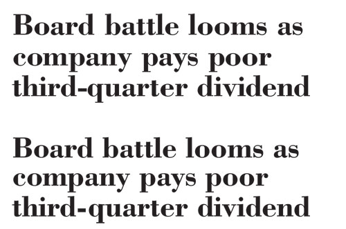
One last point: Nobody said leading has to be consistent within a single passage of display type, either. When one line of type lacks ascenders, for example, its leading will appear to be greater than other lines in the text block (as shown here). The absence of ascenders and descenders between the first two lines of the upper sample (set in 24/24 Bodoni Bold) make the leading seem wider than that between the last two lines. In the lower sample, the leading of the second line has been reduced to 22 points, creating the effect of more balanced spacing.
 Negative leading in action
Likewise, a line with few or no descenders can make the leading of the following line look too slack. Don’t be afraid to select these lines and (using the so-called character attribute as a line attribute) tweak the leading until the spacing between all the lines looks even. Because in type, what looks right is right.
Key Concepts
To learn more about the following InDesign tools and commands used in this tutorial, visit www.layersmagazine.com/keyconcepts:
- Using the Character Panel: Font Size, Leading, Kerning, Tracking, Vertical Scale, Horizontal Scale, Baseline Shift, and Skew

