
Photoshop Finishing Touches
Imagine—your Photoshop masterpiece is almost complete, but you need a last, little something for that finishing touch. A border effect perhaps, or maybe a color treatment to add some “pop.” The following techniques are from my Photoshop Finishing Touches book. The book is all about adding a finishing touch to your images, including frames, artistic effects, dramatic lighting effects, combining color with black and white, and much more. The techniques that I share with you here are a two-photo effect, a gradient map effect, and a gallery print effect.
The beauty (and irony) of these techniques is that you’re never really finished, since you can always come back and try a different setting, tweak an adjustment layer, or apply a different color. It can border on addictive when you start digging into the unlimited options. Just keep in mind that the main goal is to achieve maximum impact for your images. But if you start to lose sleep because you just can’t stop tweaking the filters and colors, then it’s time to quit out of Photoshop and just walk away.
TWO-PHOTO EFFECT
This technique offers a wide range of possibilities, but starts with a very simple premise: Use the same photo twice.
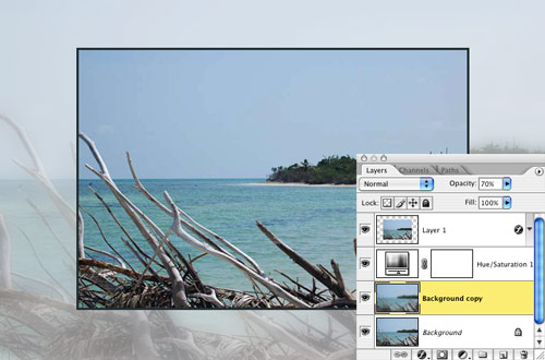
STEP ONE:
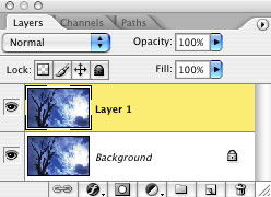
Press Command-J (PC: Control-J) to duplicate the Background layer.
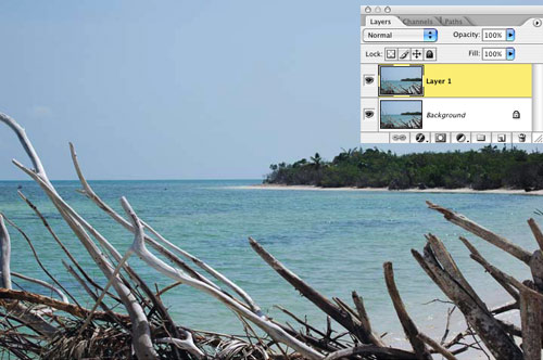
PHOTO CREDIT—DAVE CROSS
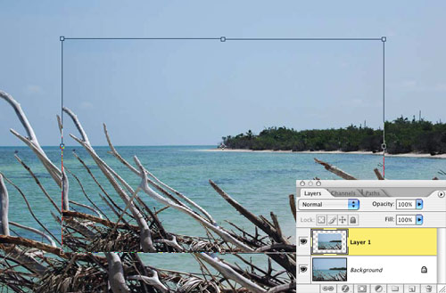
STEP TWO:
Press Command-T (PC: Control-T) to enter Free Transform mode. Then, Option-Shift-click (PC: Alt-Shift-click) on a corner handle and drag toward the center. This will scale down the photo and keep it centered. Press Return (PC: Enter) to commit the transformation.
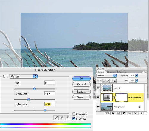
STEP THREE:
Click on the Background layer to make it active, and then click on the Create New Adjustment Layer icon at the bottom of the Layers palette and choose Hue/Saturation from the pop-up menu. Lower the Saturation slightly and increase the Lightness (I used –29 for Saturation and +52 for Lightness). Click OK.
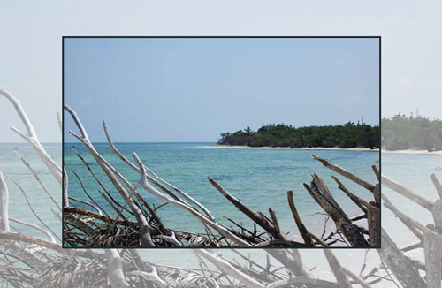
STEP FOUR:
Click on the scaled photo layer (Layer 1) to activate it, then click on the Add a Layer Style icon at the bottom of the Layers palette and choose Stroke from the pop-up menu. In the Layer Style dialog, click on the color swatch, then move your cursor onto the photo and use the eyedropper to choose a color from the image. (Make sure the Position is set to Inside.)
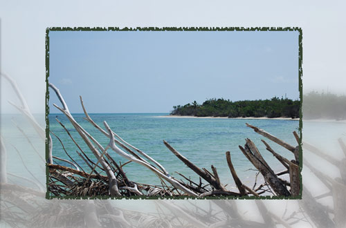
Variations
To create a soft focus effect on the larger background image, I duplicated the Background layer, and using the Filter menu, applied a Gaussian Blur of 10, and then lowered the Opacity of the blurry layer to 70%.
Variation 1: Gaussian Blur applied to background
Here I made a selection based on the smaller photo by Command-clicking (PC: Control-clicking) on its thumbnail in the Layers palette, then added a layer on which I created a stroke (using Edit>Stroke). Then, I applied the Sprayed Strokes filter (Filter>Brush Strokes>Sprayed Strokes) to the stroke layer.
 Variation 2: Sprayed Strokes filter applied to stroke
In this example, after scaling the photo smaller and adding a Hue/Saturation adjustment layer, I then added a Drop Shadow layer style that I positioned as more of a slight outer glow.
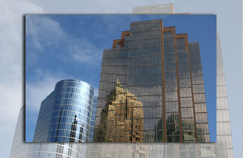
PHOTO CREDIT—DAVE CROSS
Variation 3: Stroke replaced with drop shadow
GRADIENT MAP
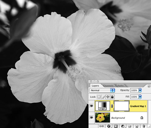
With just the addition of a Gradient Map adjustment layer, you can add all kinds of color effects to your image, as I’ll show you here. Here’s the original image. I chose a close-up shot of a yellow hibiscus.
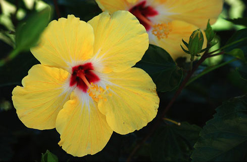
CREDIT: DAVE CROSS
STEP ONE:
Click on the Create New Adjustment Layer icon at the bottom of the Layers palette and choose Gradient Map from the pop-up menu. In the Gradient Map dialog, click on the down-facing triangle next to the gradient thumbnail to get the Gradient Picker. If black and white are not your current Foreground and Background colors, choose the third gradient (Black, White) from the left in the top row; otherwise, you can use the Foreground to Background gradient in the top left.
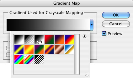
This will add a black-and-white effect to your color photo, as you can see here.
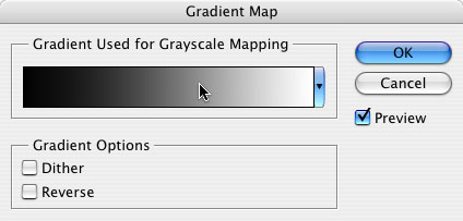
STEP TWO:
If you clicked OK, double-click on the adjustment layer’s thumbnail to reopen the Gradient Map dialog, then click once on the gradient thumbnail itself (not the triangle) to open the Gradient Editor.
STEP THREE:
In the bottom half of the Gradient Editor, double-click on the first (far left) black color stop to choose the main color you want to use in your gradient. In the resulting Color Picker, after choosing your color, highlight the hexadecimal color number (underneath the Blue value) and press Command-C (PC: Control-C) to copy it.
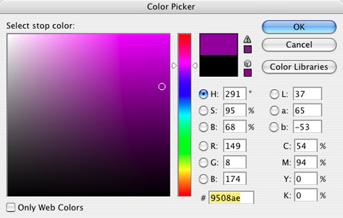
Next, double-click on the last (far right) white color stop and in the Color Picker, press Command-V (PC: Control-V) to paste the hexadecimal color number in its field (this is a simple way to ensure both color stops are the same color). Then click below the color bar, roughly in the middle, to add another color stop. Double-click on the new color stop and change the color to white in the Color Picker. As you do these operations, you’ll see the effects you’re having on the image.

STEP FOUR:
Continue to experiment with different colors for the color stops, and click-and-drag the color midpoints (the small diamond shapes between the color stops) to vary the distance of the blend between colors.

Variations
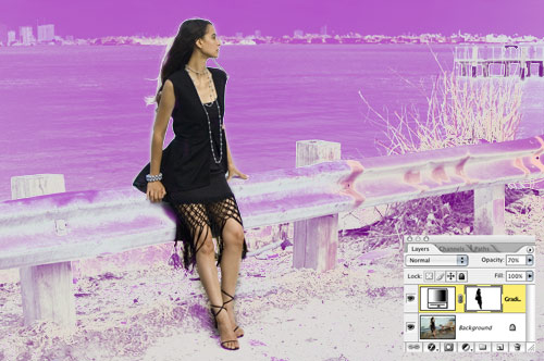
In this variation, I’m drawing attention to the main subject of the image. Set your Foreground color to black and use the Brush tool (B) to paint over the subject on the layer mask so the original subject shows through. Then lower the Opacity of the Gradient Map adjustment layer to 70% in the Layers palette to bring back a little of the original detail in the background.
GALLERY PRINT
Scott Kelby coined the name “gallery print” for this effect, since it adds a we-bought-this-from-a-high-end-gallery look. It’s easy to do, and you could even record an action with these steps to automate the whole thing. (If you wanted to make this into an action, you would simply start recording before you did these steps.)
STEP ONE:
Press Command-J (PC: Control-J) to duplicate the Background layer.
STEP TWO:
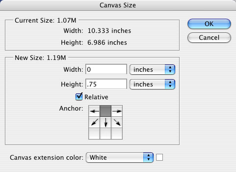
From the Image menu, choose Canvas Size (or press Command-Option-C [PC: Control-Alt-C]). Make sure the Relative checkbox is turned on and add 1″ to both the width and height (or more if you prefer).

STEP THREE:
Then, choose Image>Canvas Size again, and this time click in the top-center square of the Anchor grid to add canvas only to the bottom. We’ll add .75″ to just the height (this is assuming that you want to add some text as we will in Step Seven—if you don’t want any text, skip this step and Step Seven).
STEP FOUR:
Command-click (PC: Control-click) on the thumbnail of the top layer to load the image as a selection. Then from the Select menu, choose Transform Selection. Press-and-hold the Option key (PC: Alt key) and click-and-drag one of the corner handles slightly outward to make the selection slightly larger than the image. (Holding down the Option key resizes the selection from the center.) Press Return (PC: Enter) when you’re done.
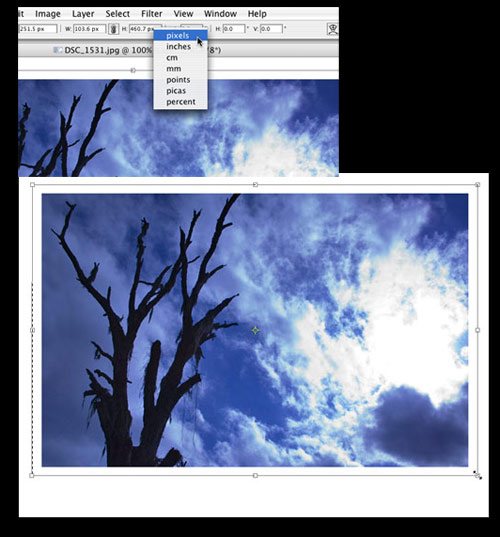
PHOTO CREDIT—DAVE CROSS
Although you could use Select>Modify>Expand to make the selection larger, I don’t recommend it, as the corners of the selection will become slightly rounded. You could also try making the selection larger by using Transform Selection and entering slightly larger values in the fields in the Options Bar. Control-click (PC: Right-click) on the Width field and choose pixels from the contextual menu. Repeat for the Height field and then enter values in each of these fields, adding whatever amount you want (e.g., add 10 pixels to each value).
STEP FIVE:
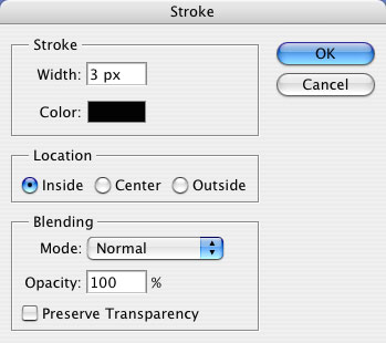
Click on the Create a New Layer icon at the bottom of the Layers palette to add a new layer. From the Edit menu, choose Stroke, and use a width of 1–3 pixels with Inside as the Location. I used black for the Color here but you could use a dark gray, too. Click OK, and then press Command-D (PC: Control-D) to Deselect.
STEP SIX:
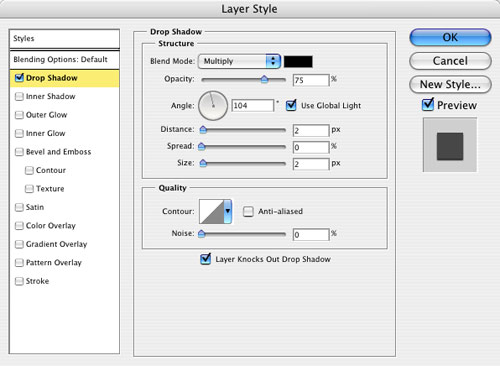
As an optional step, I’ll add a slight drop shadow to the stroke layer. With the stroke layer (Layer 2) active, click on the Add a Layer Style icon at the bottom of the Layers palette and choose Drop Shadow from the pop-up menu. Enter a small value for the Distance and Size.
STEP SEVEN:
Finally, use the Type tool (T) to add center-aligned text under the image (click the Center Text icon in the Options Bar to align it). After entering the text, I increased the tracking dramatically (by pressing Option-Right Arrow [PC: Alt-Right Arrow]) to loosen the spacing between the letters.
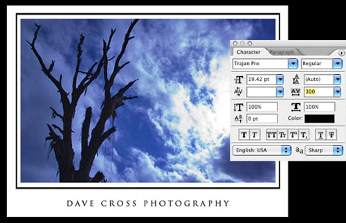
Hint: To align the Type layer with the photo, Command-click (PC: Control-click) on both layers to select them, choose the Move tool (V), and click on the Align Horizontal Centers icon in the Options Bar.


Use the gallery print effect to show off your other finishing touches.
So there you have it—three ideas for adding finishing touches to change the overall impact of your photographs. Experiment with these techniques on you own photographs, but just remember to get some sleep.
