Photo Recipes: Three-Light Shoot with Five Lights for Edgy Portrait Lighting
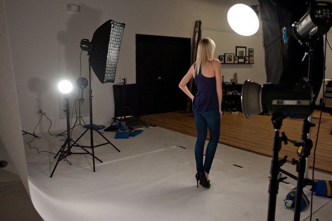
When it comes to lighting, I’m one of those less is more guys, and my lighting setups tend to be mostly one or two lights, and occasionally three. For this shoot, we’re going to use five lights but don’t freak out; it’s really a three-light shoot because the other two lights are just dumb lights aiming at the background of white seamless paper to make it really white, so you can’t count those, right? So think of it as a three-light shoot, using five lights.
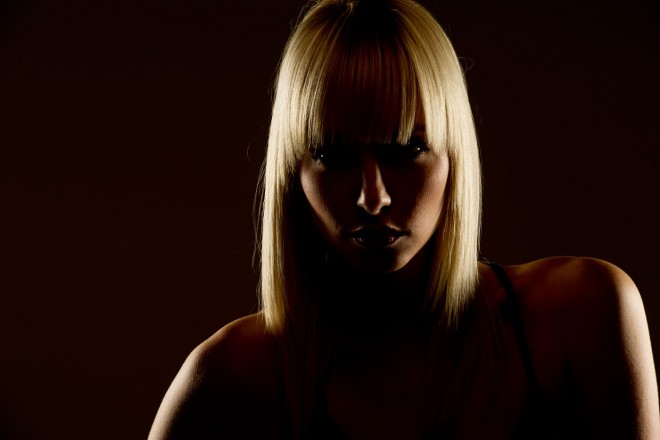
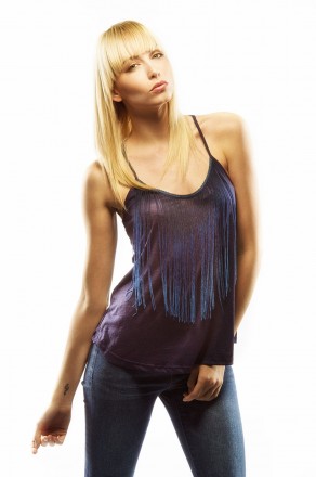
This edgy lighting look is usually used on portraits of men, and often on a dark background, but I’ve been seeing it used more and more with shots of women, and most often on white seamless, so that’s what we’re setting up here. The key to this look is the strong highlights along both sides of our subject.
The Front Light
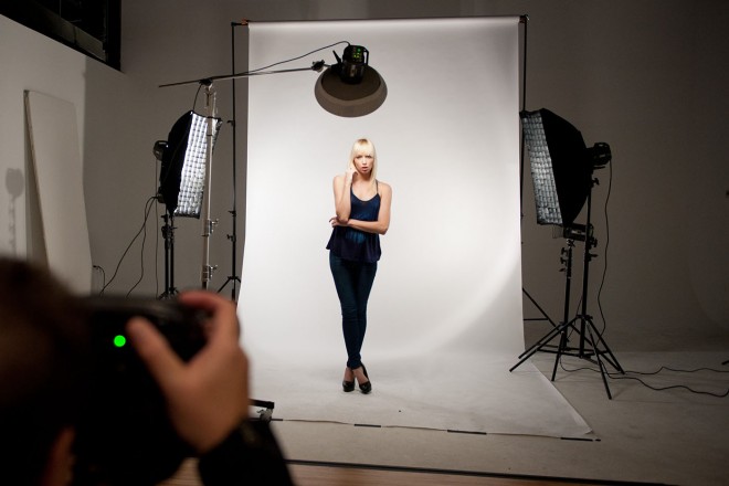
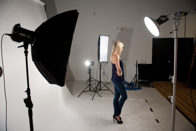
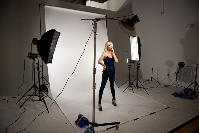
The front light isn’t the main light because in this instance, the two back lights are the main lights. The front light is a 17″ beauty dish and is providing fill in the front, so we keep the power for this front strobe down as low as it will go. It’s positioned directly in front of our subject, aimed at a 45° angle, and it’s very close to her as well, so you definitely don’t need a lot of power coming out of that strobe.
The Main Lights
The two main lights at the back are doing most of the work for this look. The softboxes are two of my workhorse softboxes—Westcott 1×3′ Strip Banks. I use an adapter made by Westcott that allows me to use Westcott softboxes on Elinchrom strobes (I’m using inexpensive Elinchrom BXRi 500 strobes with the built-in Skyport wireless receivers). The reason I like the Westcott strip banks is that they have Velcro around the inside-front edge, which makes using an egg crate grid easy—you just Velcro them into place in 30 seconds (more on these grids in a moment). Position these two strip banks behind your subject, on either side, aiming at your subject at around a 45° angle.
The Key to Making This Work
The secret to nailing this look is to build this setup one light at a time, starting with the strip banks, and turn off every other light. Just turn on one (either the left or the right—it doesn’t matter) and do a test shot so you can see the aiming of the light. You want it to light the sides of your subject without really spilling onto her face. It should be a rim light, like the sun would backlight your subject. You’ll need to crank up the power on these because they’re your main lights. I have them at three times the power of the front beauty dish (it’s a 3:1 power ratio), so the back lights are essentially two stops brighter than the front light. Once you get one side in place, turn on the other side. Use the same power settings and align the height, then aim so both sides look pretty much the same (as shown here). Once you get that all set, you can turn on the front beauty dish (remember to keep its power all the way down).
The Egg Crate Grids
The beam of light that comes out of a tall, thin strip bank is already more narrow than what you’d get out of a large square softbox. To make that beam even more focused and tighter, I use two egg crate grids. Westcott’s Egg Crate Grids run about $150 (which sadly cost about the same as the strip bank itself), but a cheaper alternative is Denny Manufacturing’s 1×3′ Egg Crate Grids (with Velcro) for around $40 each. They’re not as rugged or well made, but hey, they’re $40.
Camera Setting
These photos were taken with a Nikon D3s and a 70–200mm f/2.8 lens, at a focal length of 135mm, and ISO 200. Generally, I shoot at the lowest ISO I can in the studio, and ISO 200 is native for most Nikons. At ISO 200, I get the cleanest, noise-free files. On a Canon, I’d shoot at ISO 100 for the best quality files. In the studio, I shoot in Manual mode so I can set the shutter speed and forget it (the shutter speed was 1/125). The f-stop was f/11, which is an ideal f-stop for situations where you want absolutely everything in focus in a portrait. I focused on the eye closest to me, held the shutter button down half way to lock focus, and then I recomposed the image (with it still held half-way down) and took the shot.
Background Elements
The background is an inexpensive roll of white seamless paper that’s 9′ wide. It only costs around $50. The background lights are just two more of the same strobes, but with no softbox attached—just the metal reflectors. They’re on either side of the paper, positioned down low and aiming up at the background.
Positioning the Subject
I generally position my subject 8–10′ from the background so the front lights don’t affect the background. In this case, since the background is going to be bright white anyway, it won’t matter if the light spills over. With the way the lights are positioned,there won’t be much spillover anyway—two of the lights are aiming back toward the camera, and one is aiming down at the floor—but as a rule I keep the subject 10′ from the background for spillover concerns.
Final Image
To get the final look of this image, I used the Photoshop plug-in Nik Color Efex Pro 4, and selected the Sunlight effect at its defaultpreset. When that effect appeared on its own layer in Photoshop, I lowered the Opacity to 70% so the effect wasn’t so strong.
Editor’s Note: If you want to check out Scott’s books on Amazon, here is a link to the latest Digital Photography book. You can find Scott on tour right now teaching his latest seminar on “Shoot Like a Pro” traveling around the world right now. For more on Scott, go ahead and follow his blog.

