Processing Trends in Photoshop
In the 2014 November issue of Photoshop User magazine, Brian Matiash and Nicole S. Young show some quick-and-easy ways to stylize your photographs in Photoshop based on current popular processing trends. This is a bonus tutorial from Nicole to give you an idea of the excellent techniques that you’ll find in the magazine. Enjoy!
The Matte Look
One of the more popular looks is the faded, matte look. This processing style is created by softening the dark areas of the overall photo, particularly in the deep blacks and shadows, and can be achieved in a few simple steps in of Photoshop.
Step One:
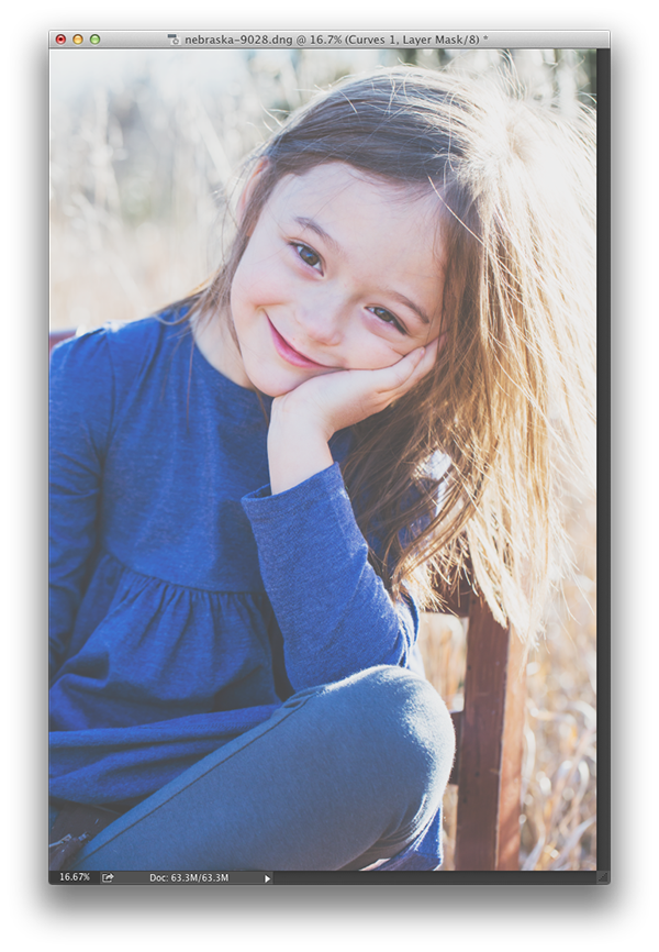
Start by opening a photo in Photoshop. I’m using a photo of my niece, Lily. Click on the Curves icon (third icon in the top row) in the Adjustments panel (Window>Adjustments) to bring up Curves in the Properties panel.
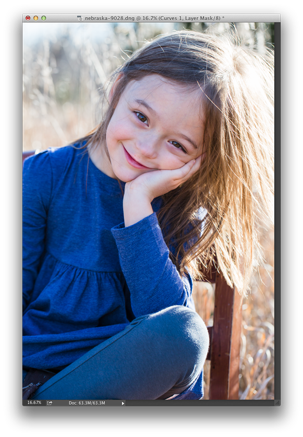
CREDIT: Nicole S. Young
Step Two:
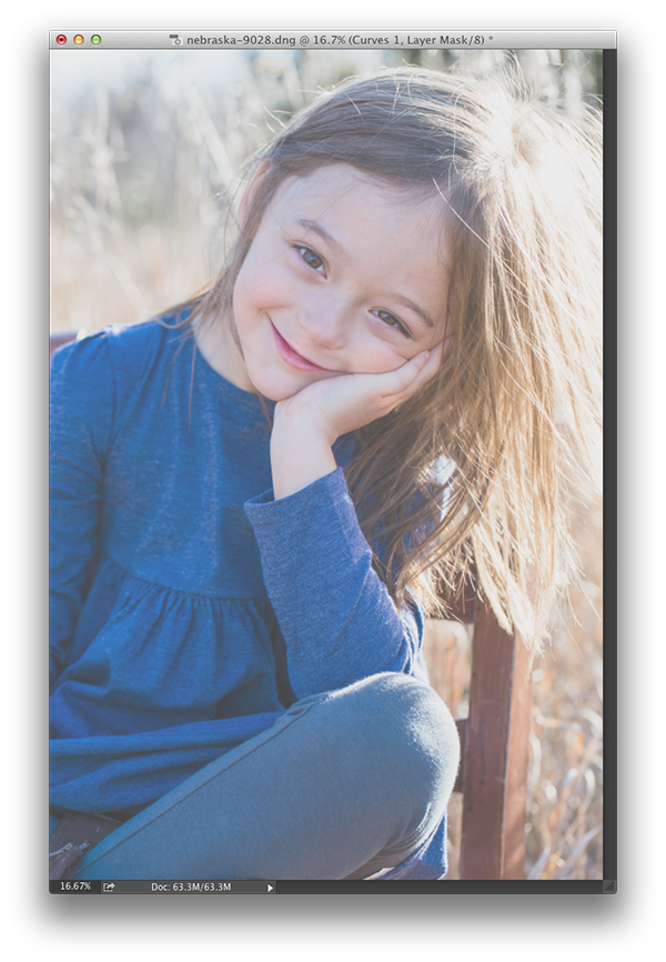
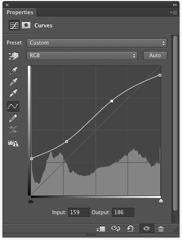
Click on the point at the bottom left of the curve and bring it directly upward. You’ll immediately see your image get brighter and lose much of its contrast, and the blacks will start to fade away. Now, click on the point on the opposite side of the curve in the upper right and move it downward, but not too much. The whites in the image will start to get slightly darker, adding to the low-contrast look of the photo.

Step Three:
Next, change the curve so that it has more of an “S” shape to it. First, add a point toward the left-third of the curve graph and pull it downward so that it’s still above the far-left point. Then, add another point to the right of this point near the right-third of the curve graph and move it upward to crate a slanted “S” curve in the graph area. The matte look has now been achieved!
Step Four:
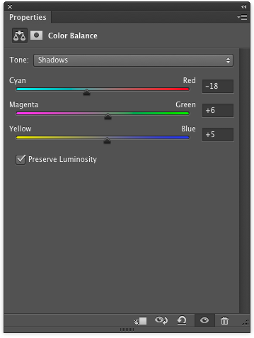
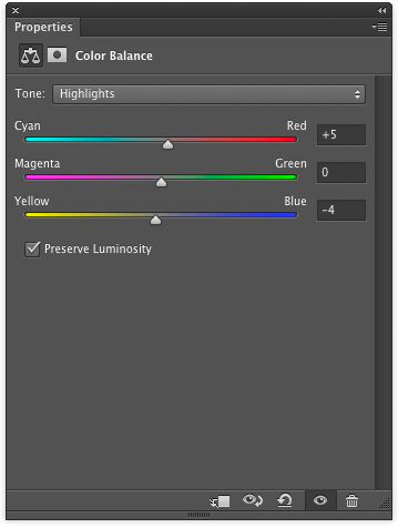
If you like, continue to edit your photo to your liking. For this example, I added a Color Balance adjustment layer (second icon in the second row in the Adjustments panel) with the following settings to warm up the photo: For the Shadows (in the Tone drop-down menu), I set Cyan to –18, Green to +6, and Blue to +5; for the Highlights, I set Red to +5 and Yellow to –4.