Beginners’ Column: Flash to Subject Distance
As you’re learning to use a flash on your subject, you’ll invariably start the endless fiddle with the power settings—more power; less power; more power; less…. While going up and down on the power scale can alleviate any lighting situations, you may be overlooking something extremely important: Power is great, but your flash-to-subject distance can help your lighting. By moving your subject or light source, you can turn white backgrounds to black, as well as help your lighting with everything in-between.
Distance and the Inverse-SquareLaw
When you’re lighting a subject with a flash, the further you place the flash from your subject, the less light she will receive. But, by how much? One of the basic principles in flash photography is something called the “inverse-square law.” Simply put, the strength of the light is inversely proportional to how far the subject is moved away from the light source.
For example: Let’s say that you have a light on your subject at a specific distance, then you move the subject twice that distance from the light source, the power (or strength) of the light will be one-fourth of what it was. If you move the model three times farther from the light source, the power will be one-ninth as powerful as it was. So, something as simple as moving your subject back a little can be just as effective as changing the power settings on your lights. Sometimes it’s best to leave the light right where it is and not risk moving it away from its sweet spot.
Light-To-Subject Ratio
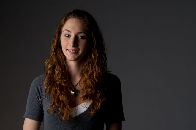
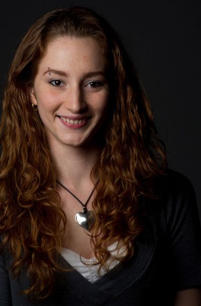
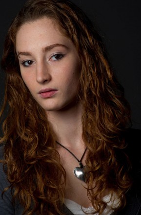
Another component to keep in mind is how light falls on your subjects and the elements around them. For example, if you place an individual (in this case, my friend Justine) against a white wall, and light both the subject and the wall, you’ll get one result. Here, the light is hitting both Justine and the wall, and you can see that the white wall is a shade of gray. The light source is pretty equidistant to both the subject and the wall, so the light is even on both of them.
Now, let’s change this up by bringing Justine relatively close to the light and the white background a lot farther from the light. That means a big difference in the distance between the light and the background, and the light and Justine. This is known as the relative distance. Because Justine is relatively close to the light, we’re able to finesse it to get a nice look. And because the background is so far behind her, light falloff occurs, and we can take that white background and make it much darker.
As we pull both Justine and the light farther from the background, you’ll notice we can get the background to black. The problem that we’re running into here is that we start losing a lot of the separation between Justine and the background. In this instance, I like to add a second light to the right of the image (camera right) and slightly behind the subject. This allows me to get some nice light around Justine’s hair and “kick” her off the background (that’s why they’re called “kicker” lights). Now, add a little postproduction, and we’re off to the races.
RC Concepcion loves to have his images tell a story. If your photographs tell a story – maybe you need to see this (free!) tutorial over on Layers by Scott Kelby. It uses Lightroom to “Create a Photographic Story“. Highly recommended! For more lessons in lighting, try this course titled: Simple Lighting Techniques by Tony Corbell.


