
Designing Ultra SceneXCore Apparel in Photoshop and Illustrator

Grunge effects are very popular with today’s apparel designers. This tutorial takes you through creating a t-shirt design using vector graphics.

Everything you see in Hot Topic or Pac Sun these days features some combination of skulls, flourishes, splatters, and miscellaneous grunge effects. Why? Don’t ask me, but I’m sure it’s got something to do with the recent rise of popular screamo, metalcore, and hardcore bands into the mainstream. This aesthetic can look ultra lame if done badly, but hella cool if done right. I’ll show you how it’s done right.
Before You Begin
How do you make all those flourishes, splatters, and other design elements? Some do it by hand and draw their own flourishes, wings, skulls, etc. But what most t-shirt designers are doing these days is using stock design elements and clip art. It’s a quick and easy way to get that cool look without actually doing a lot of custom work.
You can do a Google search for “vector packs” or “stock vector art” and you’ll find some resources that will give you just the effects you are looking for. You’ll be amazed and what’s out there. This tutorial was made using a vector pack available at Go Media. (www.gomedia.us)
Advertisement
On With the Tutorial!
You’ll need these programs:
Photoshop
Illustrator CS2
Let’s get on with the tutorial! First, open up Photoshop and Illustrator, as you’ll be using both. Mostly Illustrator. So get that Pen Tool ready!
Step 1. Decide what your client wants.
Or if this is a personal project, what YOU want. Your client should give you some ideas. But I find that quite a few just want something “dark” and “scary.” So that’s what we’ll give them.
Step 2. Come up with an original idea!
You might be tempted to use skulls or other typical dark imagery, but you really should try to come up with something new. If you want to sell shirts however, skulls are so trendy right now it might make you some cash. Think of an original concept and go with it. That’s the best way.
Step 3. Get out your sketchbook or open up Firefox.
Once you have an idea, start sketching around. For those who can’t draw, search the Internet for a stock photo. For the sake of this tutorial let’s stick to photos. We can make that work!
Step 4. Find a photo.
It helps a lot if you find an image that’s fairly large – preferably over 1500 pixels. I just searched Google Images for this one. Now some may ask about copyright laws and whatnot. For the sake of this tutorial, it’s just learning. If you want to use these images in your client projects, then it’s good to ask the owner of the photo, but most times you can get away with it if you are manipulating it beyond comparison, which is what we are planning to do. If you are worried about it, then purchase a stock photo or take your own photos.
Here’s the one I found:

Step 5. Cut out the image you want to use.
Copy the image and paste it into a new Photoshop document of the same size. Use the Pen Tool and create a selection around the image. Select the Inverse and press Delete.

Step 6. Convert it to 3 colors.
I’ve actually created an action to do this, because I do this quite often. Here are the steps.
Make a new layer. Go to Select > Color Range > Highlights and Fill with White. Next, make another new layer. Go Select > Color Range > Shadows and Fill with Black. Make another new layer underneath those two and Fill with Grey.
Ctrl+Click on the original photo you cut out to make a selection around it. Then go to Select > Inverse. Select each layer and press Delete. You are now removing any unnecessary background color to your object.
You should end up with something like this:

Step 7. Live Trace (Vectorize) each of those layers.
This is the point where we take this project into Illustrator. The newest version CS2 has a handy tool called Live Trace. This will save you lots of time! Here are the steps:
In Photoshop, select the white layer and press Ctrl+I (Command+I on Mac) to invert the color. You just made it black. Now, with that layer selected, physically drag your art (not the layer) to your Illustrator button on the task bar and Illustrator should pop up. Let go of the mouse and your layer should drop right into your empty Illustrator document.
(Tip: If you are having a hard time doing this, you can press Ctrl+A (Command+A on Mac) to Select All and then copy and paste the layer into Illustrator. Another option is to actually save the image as a JPG and then place your art into Illustrator. Basically, you have to get your art into Illustrator so you can Live Trace it.)
In Illustrator, select the newly placed image and click Object > Live Trace > Make and Expand. You will get something like this:

Ungroup it. Now deselect everything and then select a white shape. Live trace makes both black and white shapes, so click on an area where there may be white shapes and you will see it become selected.
Select > Same > Fill Color.
Delete all the white shapes and leave just the black shapes.
Select the black shape and change its fill color to white.
Draw a big black square around your shape and send it to the back. This will be your background.
Go back into Photoshop and drag the “black” layer over to Illustrator and do the same thing you did for the white layer.
Go back into Photoshop and select your grey layer. Use brightness and contrast to get your layer to look black. Then drag it into Illustrator and Live Trace this layer. Ungroup it and delete any white shapes. Then change its color to grey.
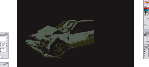
Now put the grey shape in behind the white and black layer. You should end up with this in Illustrator:

Step 8. Add more stuff.
Now that you have your primary image Live Traced and converted to three colors, you can start adding more design elements. For this tutorial, I’ll use some of the design elements in my own library of stock vector art. Again, you can search the web for stock vector elements and see what you can find. Alternatively, you can create you own and start to build your own custom library.
Now this is the point where I begin to experiment with different shapes, different arrangements, etc. Just use your imagination.
For this example:
I just flipped around the design and started choosing colors.
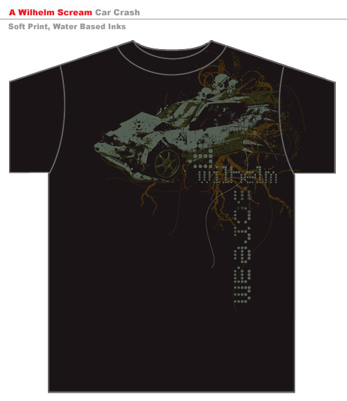
Here I added some miscellaneous shapes to give the design some direction and motion. I put them behind the car.

I opened up the Splatter Set from my library of stock vector art

Here I added a few splatters in the background.

Then used the “Destroy Set” to blend things in and add some dirt to my design.

Then I used a skull from the Skull Vector Set and duplicated it a few times.

Next, I added some flourishes!


Then I drew some random curvy lines with the Pen Tool.

Next I used another vector piece from the Tree Set.

Finally, I added the text

So to get to this point, you need to just play around with your design elements and arrange them in a way that satisfies you. This particular example was a concept I did for a band called A Wilhelm Scream.
Once your design is done, it’s best to mock it up on a shirt for your client so they can get a good idea of how it will look when printed. I have a variety of templates to do this. I like this one that a client provided us because it’s pretty versatile:
Creating the Template
Some may ask how we get a template like this. Well, it’s actually very basic. We just created the shirt outline in Illustrator and slapped the design on it. In this case, we actually have one of our clients supplying us with their standard template. The client has multiple design firms they work with, so they want all their artwork on the same template. I like to use it for myself from time to time because it is basic and effective.
Another way to mock up your design is to actually get a photograph of a person with the shirt on and then use Photoshop to make it look like the design is printed on the shirt.
Setting up the Design for Print
Now that the design is created, what do you do with it? In most cases as a designer, you will be sending the proper files to a screenprinter. All screenprinters are different and may require different file formats. Some have prepress people that do all the color separations and can work with almost anything you send them, as long as it’s high enough resolution to keep the detail on the shirt once it’s printed.
So here are some tips for preparing your file for your screenprinter:
1.) Choose Pantone Colors – Some printers can match colors, but if color accuracy is important to you, you should choose the exact pantone colors that you want your design printed with.
2.) Prepare your design at the exact size it will be on the shirt. If your design is going to be a full chest print, then it should be around 11 inches wide. Set up Illustrator to the correct dimensions and make sure your design is that big.
3.) Export your design as a flattened JPG or TIFF at 300 DPI and in RGB color mode with the background color intact. This will work for most screenprinters. I know our printer takes JPG files and their prepress guy separates the colors on his end. We design the art, and it’s their job to prepare it for print. RGB color mode is OK because you have pantone colors selected already. You will then tell your printer to use those inks.
4.) Soft prints. Some printers like to really layer the ink on, resulting in a thick, heavy, and plastic-ky print. Not so comfortable. Ask your printer to make sure the final print has a “soft hand” or a “soft print” and they should know what you are talking about. If not, ask them to use “water-based inks” as opposed to “Plastisol.” This is a more expensive process, but it’s better quality and better for the environment. It blends well with cotton and results in a softer print.
Conclusion:
Part of being a graphic designer today is finding resources and using them to your advantage. Look around your favorite t-shirt shops and be aware of the trends. You’ll notice that most of the trendy shirts these days are recycling old graphics and clip art. There are plenty of stock vector packs and other elements out there for those of you who have trouble or simply don’t want to create them yourself. I admit that it takes time to create your own flourishes and whatnot. Sometimes your clients want things quickly and don’t want to pay for you to create these kinds of things yourself. And that’s why stock photos and vector art have become such a hot commodity these days.
There are also times when clients will prefer you to create completely original artwork. I love those jobs. I wish we could get more of those!
Thanks for reading the tutorial and I hope you learned some new things. If you have any questions, feel free to ask. I am sure I may have skipped a few things here and there that I take for granted. Thanks!
Jeff Finley of Go Media Inc. www.gomedia.us
