
The Art of Type: Finding the Characters You Need
This inaugural column about type addresses a basic subject: how to find the characters you want in the fonts you have. But I’m off on the wrong foot already. Because today we no longer talk about characters, we talk about glyphs.
Glyph notes
The distinction between the terms “character” and “glyph” became important when Unicode was adopted by Apple, Microsoft, and the world’s font vendors to identify all the characters in a font. Before Unicode, Mac OS used one numbering scheme and Windows used another. Fonts for non-Western languages used the same numbers for other characters. Cross-platform, cross-border communications were nightmarish.
Unicode assigns unique numbers to more than 100,000 characters used for typesetting the world’s languages. Unicode distinguishes between characters (a capital E, for example) and the symbols, or glyphs, that represent them. So Unicode’s number for an E (0045) is the same for an italic E, a swash E, or an engraved E. No matter what computer system character 0045 appears on, it’s always a recognizable E.
So now when we talk about what’s inside a font, we talk glyph sets, not character sets. This also explains Adobe InDesign’s and Adobe Illustrator’s Glyphs palette’s curious name.
Font exploration
Finding the glyphs you want is a headache because today’s fonts have no standard glyph set. PostScript Type 1 fonts contained only 228 printable glyphs, but almost all text faces conveniently contained the same glyphs. TrueType and OpenType fonts can contain over 65,000 glyphs, but there are no standards for what a font might contain. Even Adobe’s “Standard” OpenType fonts don’t all have the same glyph set (although most do): Poplar Standard contains about 250 glyphs; Minion Standard, more than 350. The same goes for Adobe Pro fonts.
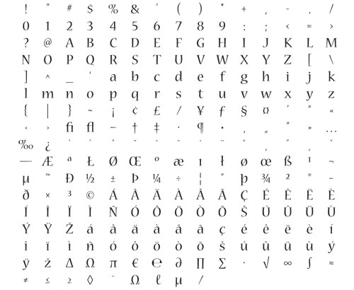
This is a typical glyph set for an Adobe “Standard” OpenType font, although some fonts with the “Standard” moniker don’t follow suit. It only has as handful of characters more than a PostScript Type 1 font.
The Mac’s Character Palette (found in Font Book under Edit>Special Characters) and the Character Map in Windows (Start>All Programs>Accessories>System Tools) are handy tools for exploring fonts and copying glyphs into your documents, but Adobe’s Glyphs palette (found in the Type menu) is better. The default view, set in the Show pop-up menu, is Entire Font, but if you click on this menu you see which subcategories of glyphs lurk within your chosen font. Note that what are often called “standard” ligatures may be anything but.
If a square for one of the characters in the Glyphs palette grid has an arrowhead in the lower right, that character has alternate forms. Click-and-hold the mouse button over the arrowhead and these forms appear.

The Glyphs palette shows that the Adobe Garamond Pro 4 has nine possible forms, most of which share the same Unicode number, or code point. Only three have unique Unicode IDs: small caps (upper right), superior (center), and inferior (center right).
To get a glyph into your text from this palette, double-click on the glyph. To insert an alternate form of a glyph from its pop-up submenu, hold down the mouse button, drag the cursor until the character’s frame is highlighted, then release. In both cases, the glyph will appear at the active cursor position in your text.
Getting organized
If you have a font management program, use it to round up fonts with similar glyph sets. A font management program can include a single font in multiple font sets, so the same font could be filed under “old style numerals,” “fractions,” and “small caps.” The time you spend classifying your fonts will be repaid many times over.
A powerful tool in InDesign (but not Illustrator) is the ability to create custom glyph sets: a sort of glyph bulletin board so you never have to search for the same obscure glyph twice. To create a new set, Control-click (PC: Right-click) on any glyph in the palette and choose New Glyph Set from the pop-up menu. Name it when prompted and click OK. Now select a glyph in the grid by clicking on it once. Control-click (PC: Right-click) again and drag the cursor over Add to Glyph Set. A list with all existing glyph sets appears. Click on the one you want to add the glyph to, and you’re done.
You can create sets combining glyphs from any number of fonts: font-specific sets, job-specific sets, whatever. (Mac users note: Popular keyboard symbols such as the Command, Shift, and Return are found in the Chicago font.)
To get a glyph out of a set and into your text, select the set from the Show pop-up menu. A double-click on the glyph of your choice copies it into the text at the active cursor position.
If you use both InDesign and Illustrator, glyph sets are a good reason to set complex type in InDesign and then export it to Illustrator. You can move your text using copy-and-paste or drag-and-drop.
Automatic glyph substitution
Sometimes you’ll want to make wholesale insertions of unusual characters. Fortunately, OpenType fonts allow for the automatic substitution of one glyph for another. For example, if your chosen font supports it, the keystrokes 1/8 can be turned automatically into a true fraction.
To find out which of these automatic substitutions are supported by a font, select the font in the Character palette, click the palette’s flyout menu, and drag the cursor to OpenType. All automatic glyph-substitution options are listed, whether or not the font offers them. Those not supported appear in brackets (e.g., [Swash], as shown). Clicking on one activates it.

An OpenType font’s automatic glyph-substitution options are revealed in the Character palette menu. For Adobe Garamond Pro, shown here, all options except Swashes are available.
Warning: Virtually all fonts include the fractions 1/4, 1/2, and 3/4, and when most OpenType fonts claim to be able to create fractions automatically, they are only referring to these three. To create other fractions, a font must contain a full set of numerator and denominator glyphs, and most OpenType fonts don’t. So while 1/4 may be converted, 5/8 will stay 5/8. To check for fraction-building characters, use the Glyphs palette.
Because OpenType glyph substitutions are activated through the Character palette, it’s easy to build them into character styles, which is, in fact, the best way to use them.
PostScript Type 1 & the Glyphs palette
One last thing: Don’t let old habits handcuff you. Adobe’s Glyphs palettes let you access characters that used to be off-limits in PostScript Type 1 fonts. Mac users can now get at those 1/4, 1/2, and 3/4 fractions, not to mention real multiplication and minus signs, and Windows users can finally get their mitts on fl and fi ligatures.

