
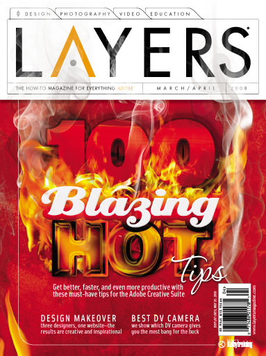
In the March/April 2009 issue of Layers magazine, you’ll find our “Fourth Annual Layers 100 Wicked Tips.” It’s one of our favorite features and we have a lot of fun putting it together every year. But let’s rewind the clock one year to our “Third Annual Layers 100 Blazing Hot Tips” issue. (We base the name of the tips feature on what phrase we hear uttered the most from our editors as they read each tip.) The cover for that issue was one of our most popular covers ever, and we had a lot of requests from readers for us to show them how it was created. So we went to the cover designer—Associate Designer, Christy Winter—and asked her to write a tutorial on how she did it. She was more than happy to oblige. (Note: And if you like this year’s cover, let us know. Taffy Orlowski, another one of our very talented Associate Designers, designed that cover. I’m sure that with a little bribery, we could get Taffy to reveal her secrets, as well.)
How to Create the Layers Magazine 100 Blazing Hot Tips Cover: Part 1—The Text
By Christy Winter
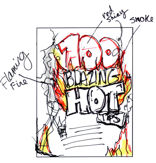
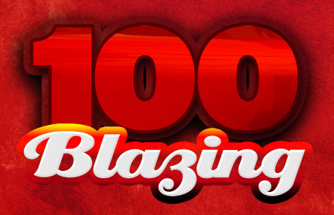
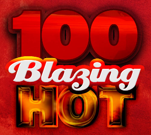
When I first started to concept ideas for a theme, I decided to go with a “Hot Tips” theme. But not just hot, “Blazing” hot. Whenever I’m creating a concept for a cover, I first write down any ideas I might have and then I sketch out thumbnails. Here’s a scan of the thumbnail I used for my final design along with the final cover. Below I’ll show you how I created the text effects. (Check out “How to Create the Layers Magazine 100 Blazing Hot Tips Cover: Part 2—Smoke & Fire” for directions on how to make the smoke and fire.)
The background behind the text
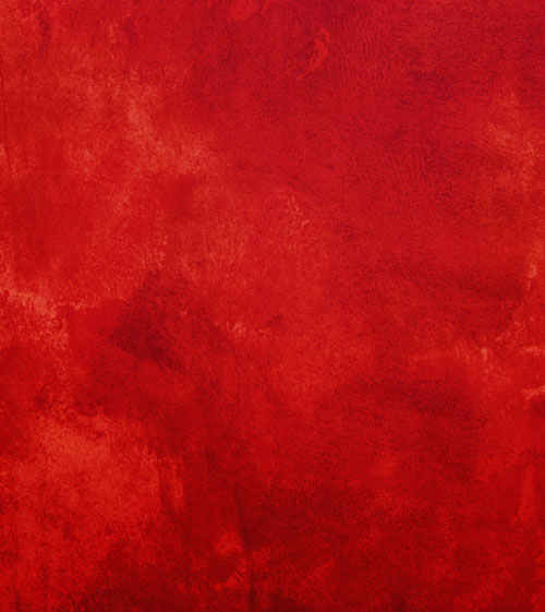
The red background is a photo of a painted wall from istockphoto.com. The colors were adjusted using Levels (Command-L [PC: Ctrl-L]) to get the shade of red that we wanted. You can also go with a solid red background for this tutorial. Save and name this file; we’ll build on this file using layers from here.
For each word, we’ll create different effects using multiple layers and various layer styles. Pay close attention to the dialogs below for specific settings on each layer style.
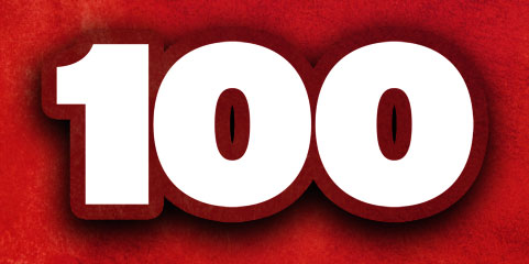
Create the number “100”
Step 1
The font used for “100” is Interstate Ultra Black. To make the “100” appear more realistic, we need to mask (also known as clip or group) a shiny object into the text, so locate an image that has a large shiny surface (we used a photo of a side of a truck). Drag-and-drop the shiny image into your cover image (it should appear above your text layer). To clip an image into a layer below it, press Option-Command-G (PC: Alt-Ctrl-G). Double-click to the right of the layer’s name in the Layers panel that contains your shiny object to open the Layers Style dialog. Click on the words “Color Overlay” in the list of Styles on the left, choose a red color, and change the Blend Mode to Multiply. Click OK.
Step 2
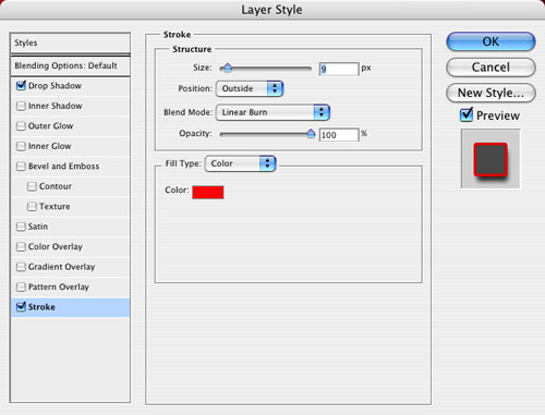
Next, double-click on the 100 text layer to bring up the Layer Style dialog. Click on the word “Stroke” in the list of Styles on the left, and give the text layer a dark red, 9-pixel stroke (click on the Color swatch to change the color of the stroke). Set the Position to Outside with a Blend Mode of Linear Burn.
Step 3
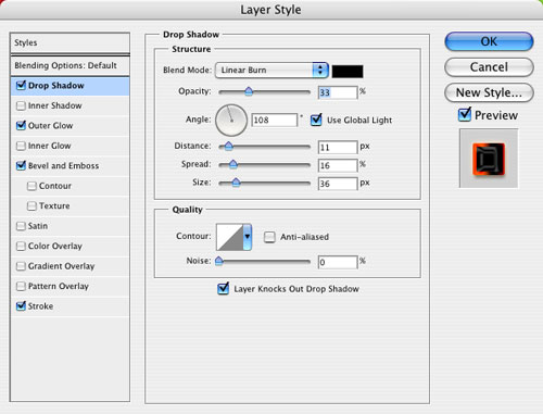
Click on the word “Drop Shadow” in the list of Styles to add a drop shadow using the settings shown here.

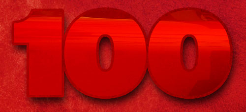
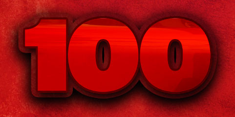
Step 4
Duplicate the 100 text layer by dragging it to the Create a New Layer icon at the bottom of the Layers panel. Drag the copied text layer behind the shiny 100 as shown here in the Layers panel. (Note: You may need to reclip the shiny object layer to the original text layer.)
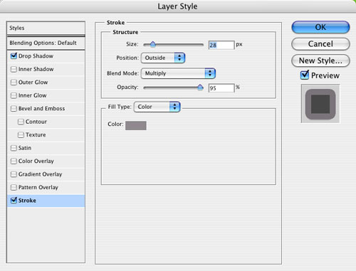
Step 5
Double-click the duplicate layer to open the Layer Style dialog again. In the dialog give this text layer a larger Stroke of 28 px, change the color to gray, and set the Blend Mode to Multiply.
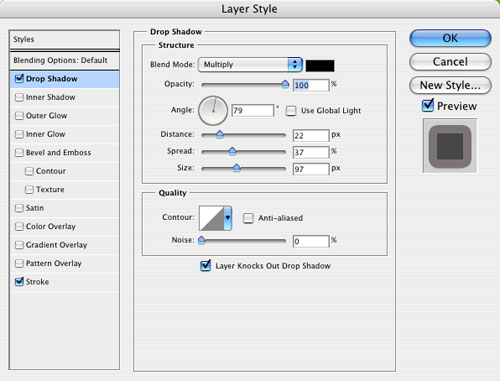
Step 6
We also need to give the duplicated “100” a larger, darker drop shadow to help it pop off the page. Use the settings shown here.
Step 7
Here’s what the duplicated layer looks like by itself (the fill color isn’t really important since the shiny 100 layer above covers it). And here’s what it looks like with the original 100 text layer turned on.
Create the word “Blazing”
Step 1
The word “Blazing” is a cool font called Creampuff set in white. After setting the type, double-click the layer to open the Layer Style dialog. Click the words “Bevel and Emboss” and add a very soft bevel using the settings shown here. Make sure you change the Gloss Contour in the Shading area by clicking on the thumbnail and selecting Cove-Deep in the Preset drop-down menu of the Contour Editor dialog.
Step 2
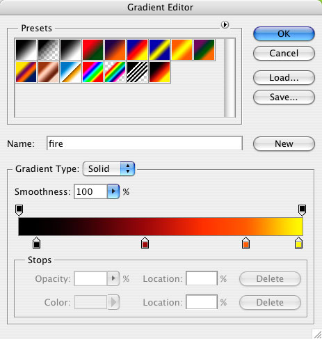
While you’re still in the Layer Style dialog, add a 22-pixel Stroke with a Blend Mode of Pin Light. Change the Fill Type to Gradient, and then click on the Gradient thumbnail to open the Gradient Editor. Create a gradient similar to the one shown here. To change the color of a gradient color stop, just double-click it and choose a new color in the Color Picker. To add color stops to your gradient, simply click below the gradient bar. Here’s what the final word will look like slightly overlapping the “100.”
How to make “Hot” look hot
This is probably the most complicated part of the tutorial. The word “Hot” is also set in Interstate Ultra Black, using gold as the base color of the font. On the main text layer there are many different layer styles applied with specific settings. Be sure and pay close attention to all the settings to get the exact look.
Step 1
Double-click the layer in the Layers panel to open the Layer Style dialog. Add a drop shadow with the following settings. Make sure to change the Blend Mode to Linear Burn.
Step 2
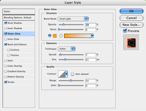
Click the word “Outer Glow” in the Styles list and use these settings. Notice that we changed the Blend Mode to Vivid Light and changed the default yellow color of the Outer Glow. Just click on the color swatch to change the color.
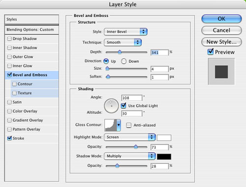
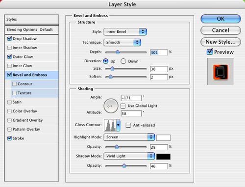
Step 3
Now add a Bevel and Emboss layer style. Use the settings shown here. Be sure to turn off the Use Global Light checkbox. For the Gloss Contour in the Shading section, click the thumbnail and choose Ring-Double in the Preset drop-down menu of the Contour Editor.
Step 4
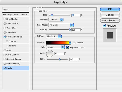
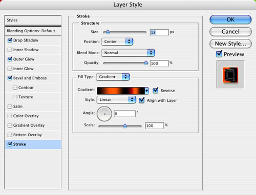
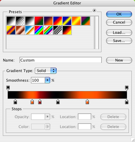
Add a Stroke layer style with a custom gradient as shown here. Make sure to change the Position to Center and the Angle of the gradient to 0˚.

Step 5
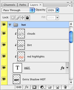
This is where things start to get a little more complicated. As you can see here in the Layers panel, we’re going to add three different layers and then clip them into the “Hot” text layer. We also need to create an extra drop shadow below the “Hot” text layer.
Step 6
Let’s start with the dirt layer. Click on the Hot text layer in the Layers panel to make it active, and then click the Create a New Layer icon to add a new layer. This layer should only be visible on the Hot text layer, so clip the layer into the layer below it by pressing Option-Command-G (PC: Alt-Ctrl-G). Add grunge and texture to this layer by using the Brush tool (B). Click on the brushes thumbnail in the Options Bar and experiment with some of the various artistic brushes such as the Spatter and Dry brushes. Use these brushes to paint in dark areas by hand. When you’re done, lower the Opacity of this layer to 80%.
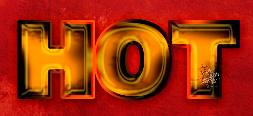
Step 7
Click on the Hot text layer in the Layers panel to make it active, and then click the Create a New Layer icon to add another new layer. The new layer should automatically be clipped to the text layer. On this layer we want to create a bright hot look, so brush in red and orange highlights using soft-edged round brushes along the edges of the text.
Step 8
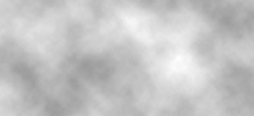
We’ll use the final clipped layer to create a more realistic, uneven, and dingy look. We can do this using the Clouds filter. Press the letter D to set your Foreground and Background colors to their default black and white colors, respectively. Create another new layer above your text (again, this layer should be clipped) then go to Filter>Render>Clouds. Drop the Opacity to 31% for this layer, and set the blend mode to Multiply. Drag this layer above the dirt and red highlight layers.
Step 9
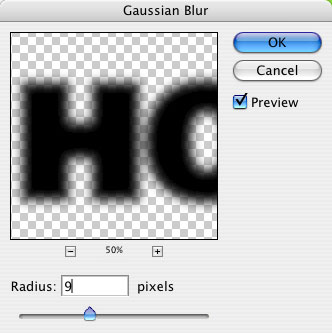
Now let’s add some extra depth by creating a drop shadow the old-fashioned way. Duplicate the Hot text layer by dragging it to the Create a New Layer icon at the bottom of the Layers panel. Drag the duplicated layer below the original Hot text layer. (Note: You may need to reclip the dirt, red highlights, and clouds layer with the original Hot text layer.) Drag the letters “fx” to the right of the duplicated layer to the Trash icon at the bottom of the Layers panel to delete all the layer styles. Double-click the layer thumbnail to highlight your text in the document, click the color swatch in the Options Bar, and select black in the Color Picker. Control-click (PC: Right-click) the layer in the Layers panel and select Rasterize Type. Next, go under the Filter menu to Blur>Gaussian Blur. Set the blur Radius to around 9 pixels. Lower the Opacity of the shadow layer to 37%. With the Move tool (V) active, use the Arrow keys to nudge the shadow down and to the right slightly.
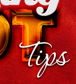
Create the word “Tips”
And finally, the easiest part of all: I found a cool script font, P22 Corinthia, for the word “Tips” and placed it where it looks as though it was wrapping around the T in “HOT,” and then added a slight drop shadow.
Well that’s it for the text portion of this tutorial. If you want to learn how the smoke and fire effects were created, see “How to Create the Layers Magazine 100 Blazing Hot Tips Cover: Part 2—Smoke & Fire.”
