Go Nuts in Illustrator, Render in Photoshop
Illustrator allows you to assign varying levels of transparency to vector-based objects. That’s great because, as we’ll see, it makes for a remarkably versatile drawing environment. The problem is, PostScript doesn’t accommodate transparency. And given that PostScript has long been and continues to be the professional-level commercial reproduction standard, this conflict seems to raise a red flag.
But in truth, you never need worry about whether a translucency-imbued illustration will print. Illustrator has been known to throw some tricky output instructions, and a dozen different PostScript RIPs might very well screw up those instructions in a dozen different ways. But there is always an arbitrator (not to mention, enabler) of an illustration’s printability, and that’s Photoshop.
In this article, we’ll take a crude digital photo of my youngest son, Sammy, banging on a hopelessly busted piano (below top) and transform it into a work of otherworldly, vector-based weirdness (below bottom). The primary instrument of this transformation will be the Transparency panel in Illustrator. But while Illustrator can belt out a medley, can it carry a tune? The answer is, yes, so long as Photoshop produces.


[If you’d like to download the Illustrator file used in this tutorial to practice these techniques, click here]
STEP 1: Changing the Opacity of an Attribute
Our job is to dress the photograph of Sammy in vectors so he looks like a Liberace-/Elton John-/Phantom of the Opera-type character. Having already imported the photo of Sammy into Illustrator and establishing a few base objects, we’ll start things off by styling Sammy’s vector-based jacket. Let’s say we want the orange fill of the jacket to be translucent, so we can see through it to the stage elements behind young Sam. But if we reduce the Opacity value of the path to, say, 50%, we change Fill and Stroke alike, making the stroke look weak and just plain bad. The trick is to select the Fill attribute independently in the Appearance panel (Window>Appearance). Twirl open the For You! layer, then the jacket layer, then the suit layer. Target the path sublayer containing the portion of the jacket on the left by clicking the circular “meatball” to the right of the layer in the Layers panel. Select the orange Fill item in the Appearance panel, and change the Opacity value in the Control panel to 50%.

STEP 2: Creating a Knockout Group
Problem is, we can see through to the other objects in the Suit group, which gives away the fact that the paths overlap each other. The conventional solution is to apply the Opacity value to the group as a whole instead of the individual paths, but if we did that, we couldn’t affect Fill and Stroke independently. So instead, we need to convert the group to a knockout group. Target the suit group in the Layers panel. Then turn on the Knockout Group checkbox in the Transparency panel. If the checkbox fills with a minus sign instead of a checkmark, click it again to select it for real.

STEP 3: Applying an Opacity Mask
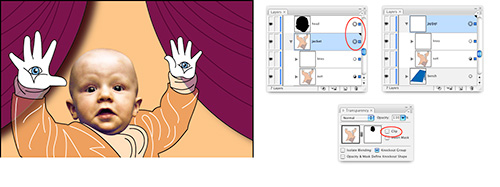
The tops of the jacket paths overlap Sammy’s face, currently represented by a black silhouette. We could use the silhouette path to clip holes in each and every overlapping jacket path, but that would take more effort than it’s worth and potentially leave behind extra stroked edges. Better to cut one large hole in the jacket sublayer using an opacity mask.
When making an opacity mask, white reveals and black conceals. If you wanted to make a white opacity mask, you would select a white path, place it in front of the sublayer you want to clip, Shift-target the sublayer (by Shift-clicking the target icon to the right of jacket in the Layers panel), and choose Make Opacity Mask from the Transparency panel’s flyout menu. Instead, we want to make a black mask, one that conceals the overlapping edges of the jacket, so do this:
• Select the silhouette head outline (head sublayer) and move it above the jacket sublayer in the Layers panel.
• Shift-target the jacket sublayer.
• Choose Make Opacity Mask from the Transparency panel’s flyout menu.
• Turn off the Clip checkbox (also in the Transparency panel).
The silhouette disappears, clipping a hole in the jacket and revealing Sammy’s head in the background.

STEP 4: Opacity Mask Tips and Tricks
Now that you’ve made an opacity mask, here are a few ways to manipulate it. Click on the opacity mask thumbnail in the Transparency panel to make the mask active. Shift-click the mask thumbnail to deactivate or active it. Option-click (PC: Alt-click) the mask thumbnail to view the thumbnail independently of the illustration (below). And finally, click the drawing thumbnail (in our case, the jacket) to return to the illustration.

STEP 5: Blending between Groups
Now for a little meta-tip that has nothing to do with transparency and everything to do with creative expression, flexibility, and all-around coolness. The keys on the piano sublayer are actually a blend. But instead of blending between two paths—to create a custom gradient, for example—I made the keys by blending between two groups of paths. That’s right, Illustrator lets you blend between groups.
Let’s re-create things by turning on the piano layer visibility and releasing the blend object (target the blend sublayer and go to Object>Blend>Release). Notice that each key group comprises three paths: a black key, a white highlight line, and a black line that represents the border between white keys. Select both groups and choose Object>Blend>Make to blend them together. Edit the blend and specify 21 steps (Object>Blend>Blend Options). Twirl down the Blend group and target the path sublayer. Choose the Convert Anchor Point tool (Shift-C) and click-and-drag on the endpoints of the path to create control handles. Then use the Direct Selection tool (A) to drag the control handles to change the speed of the blend and add some perspective.

STEP 6: Editing an Existing Opacity Mask
The bottom edges of Sammy’s jacket and pants are visible through the blue part of the keyboard because its blend mode has been set to Multiply, thus advertising to the world that I haven’t drawn everything. We need to use the keyboard to clip the leg stump away. Select the bottom blue path in the piano sublayer and choose Edit>Copy. Then target the jacket sublayer, click on its opacity mask thumbnail in the Transparency panel, and choose Edit>Paste in Front to paste the blue shape in place in the opacity mask. To make it a proper concealer, fill the shape with black and set its Stroke to None.

STEP 7: Creating a Gradient Opacity Mask
You can combine a gradient with an opacity mask to make a continuous fade. Click the Create New Layer icon in the Layers panel, draw a rectangle that encompasses the entire piano, and fill it with a black-to-white gradient with an Angle of –90°, straight up. While you’re at it, click the gradient slider on top of the gradient bar and enter a Location of around 75%. (Make sure the Stroke is set to None.) Move this new path down the Layers panel so it sits directly in front of the piano sublayer. Target the piano layer, choose the Selection tool (V), and Shift-click the gradient in the document. Then choose Make Opacity Mask from the Transparency panel’s flyout menu, which converts the gradient to a new opacity mask. The keyboard fades from opaque at the top (where the mask is white) to transparent at the bottom (where the mask is black).

STEP 8: The Multiply Blend Mode
Let’s now move from translucency effects to blend modes, which allow you to apply more complex mathematical interactions. Target the bench sublayer (which contains the blue bench), choose the Multiply blend mode from the Transparency panel, and set the Opacity to 50%. Multiply burns the bench into its background, as if the bench and background were printed on separate transparencies and stacked one in front of the other on a light table. In other words, everything gets darker. For another example, turn on the eyes sublayer. Target the makeup paths, apply the Multiply blend mode, and again reduce the Opacity value to 50%.

STEP 9: The Screen Blend Mode
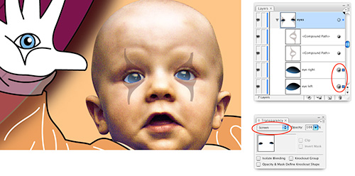
Throughout the Adobe print applications, the opposite of Multiply is Screen. Target the blue eye paths in the eyes sublayer and choose the Screen blend mode from the Transparency panel. Screen treats eyes and background as if they were output to separate slides, placed in two different projectors and shown on the same screen. In other words, it’s great for creating highlights like those in the eyes.

STEP 10: The Color and Luminosity Modes
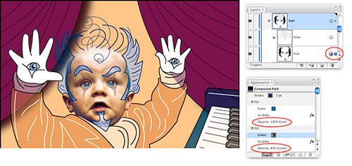
At this stage in his life, Sammy had no hair. (He has a full head of hair now, you’ll be relieved to know.) So I felt obliged to give him some in Illustrator. Twirl open the hair sublayer and target the hair shapes (which have been combined into a single compound path). Try out a couple of other useful blend modes in the Transparency panel. The Color mode mixes the blues of the hair with the underlying background details. The Luminosity mode mixes the texture of the hair into the flesh colors below.
Both effects are interesting, but we want to blend individual Fill attributes. So undo any playing around and switch to the Appearance panel. Select the blue Fill attribute and change the blend mode to Color. Then select the gradient Fill attribute, set its blend mode to Screen, and reduce the Opacity value to 80% to create the effect pictured here.

STEP 11: Screen and Super-Rich Black
Toward the top of the Layers panel is an object called Gradient. The gradient goes from black at the top to blue way at the bottom. Turn on the big Gradient path and change the blend mode in the Transparency panel to Screen. If you have any familiarity with Screen (from your work in Photoshop, for example), you know that it lightens all colors except black, which drops out. And yet in our case, black results in a significant brightening effect. What gives?
The problem is that we have a plain black, made of 100% K only. Because C, M, and Y are 0%, or white, these inks lighten. To make the black invisible, change the final color in the gradient to a super-rich black, in which all inks (CMYK) are set to 100%. (To do this, click on the black gradient slider in the Gradient panel, choose CMYK from the Color panel’s flyout menu, then drag the CMY sliders to 100%.) Now black is completely neutral, resulting in a blue-to-transparent gradient, as indicated by the highlight in the bottom-left corner of the image below.

STEP 12: Masking an Entire Layer
Now let’s mask away the excess vector garbage that’s hanging outside the artboard. I’ve already drawn a couple of rectangles (without Fill or Stroke) around the boundaries of the artboard and placed it as the first sublayer in the For You! layer. Deselect everything in the illustration (Select>Deselect). Click on the layer name For You! (don’t target the layer) and click the Make/Release Clipping Mask icon at the bottom of the Layers panel. The result appears below.

STEP 13: Becoming a Transparency Detective
The transparency functions in Illustrator are exciting, powerful, even inspirational. But they can be confusing as well, especially if you’re wandering through a piece of artwork created by someone else (or by you a long time ago). For example, consider the contents of the Text Items layer. If you turn on that layer’s visibility and target the Knockout group, you’ll notice that the Appearance panel lists Other Transparency Options. What in the heck is that? To find out, check out the bottom section of the Transparency panel. In this case, the Knockout Group checkbox is turned on.
Twirl open the Knockout sublayer in the Layers panel and you’ll see a black path at the bottom. This is the talk balloon. Given that nothing in the talk balloon looks black, how does the path work? It’s another weak black set to Screen. Set the K value to 50% to lighten the balloon even more.

STEP 14: Flattener Preview, Rasterize in Photoshop
Okay, so it’s fun, beautiful, and weird, but will it print? Given that PostScript doesn’t support transparency, aren’t we flirting with disaster? Not necessarily. First, bear in mind lots of things aren’t supported by PostScript, including gradients, and Illustrator manages to communicate them anyway. Second, you can check out areas of concern using the Flattener Preview panel (Window>Flattener Preview). Click the Refresh button and select All Affected Objects from the Highlight pop-up menu. Everything that’s red needs some kind of special attention (below). Third, if you’re at all concerned that something is going to go wrong, open the AI file in Photoshop (or save it as a TIFF image from Illustrator using File>Export). Set the Resolution value to 1200 ppi if you want super-sharp results that are guaranteed to print.

If there’s a moral to this story, it’s this: Transparency functions in Illustrator are as complex as they are amazing. They’re likewise safe. So long as you’re prepared to export your vector art as a high-resolution image file, you can do anything you want without any worries of PostScript incompatibilities. So play your heart out. Unlike that piano, your illustration is indestructible.

