
High-Speed Color Correction in Photoshop
Color correcting images can be a very time-consuming activity. You can streamline your color-correction workflow by standardizing your image evaluation and correction processes. There are two main keys to fast and effective color correction: The first is to quickly determine what needs to be corrected or adjusted in an image. The second is to standardize the order and the tools that you use for accomplishing your color correction. A few minutes spent evaluating your image, and then planning your color correction strategy, can save you much time by avoiding unnecessary corrections or redoing corrections. And if you perform your corrections in the same order every time, your efficiency improves and mistakes are reduced.
Here’s a color-correction workflow you can use and adapt to your own specific image correction needs:
STEP ONE:
Open the image you want to correct,and make a duplicate copy (Image>Duplicate). Title this duplicate image “Name_Working” (for instance, “Beach with Kids_Working.psd”). This working version should be saved as a native Photoshop file (.psd) to provide maximum flexibility.
STEP TWO: Conduct a visual evaluation of your image.
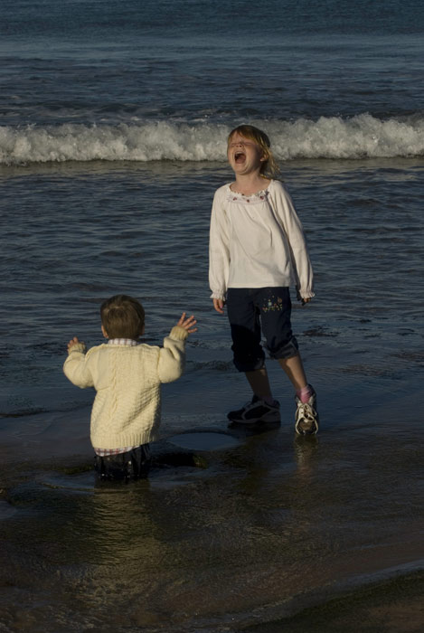
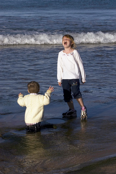
1. Evaluate the overall brightness and contrast of the image. In this image the brightness and contrast are both low.
2. Identify and describe the area(s) that should be neutral diffuse white highlights and/or other neutral areas. Here the girl’s white shirt is a diffuse white highlight and the white foam can serve as another neutral.
3. Identify any specular (no detail) highlights in the image. There are no specular highlights in this example.
4. Identify and describe other key areas in this image you can use to help you evaluate and correct the color in the image. Here we can use the skin tones on the well-lit skin surfaces.
5. Does there appear to be any color cast to the image? Visually in this image, there appears to be a yellow cast. (Color sampler measurements in Step Three will confirm this—always trust your numbers!)
STEP THREE:
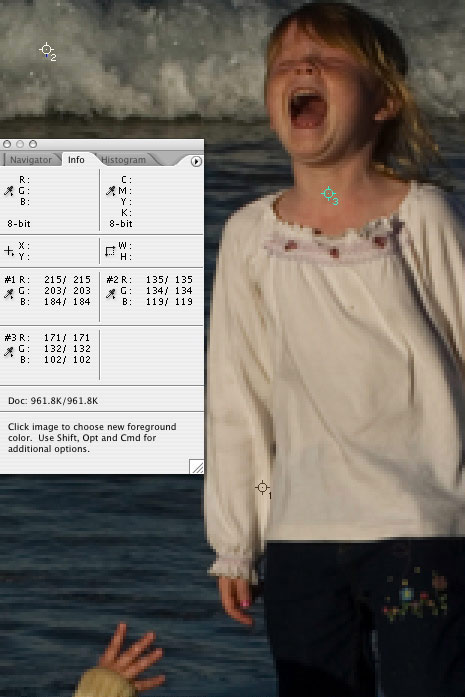
Now let’s measure and record critical RGB values. Activate the Info palette (F8) and create a Levels adjustment layer (Layer>New Adjustment Layer>Levels). With Levels open, press the Shift key to activate the Color Sampler tool. Locate and set color sampler points at key image areas: Here the neutral white highlight in the shirt (sampler point #1), neutral near-midtone in the wave foam (sampler point #2), and skin tone on well-lit area (sampler point #3). Note: You can create up to four color sampler points. Tip: To help you locate highlight and shadow points, try holding the Option (PC: Alt) key while dragging the highlight or shadow sliders in the Levels dialog.
In the Info palette, evaluate the RGB highlight values, and in the Histogram palette take a look at the histograms (composite RGB and individual channels). Note the higher numbers for the Red and Green values compared to the Blue value. Red + Green=Yellow color cast in both neutral areas: the white highlight and the wave foam. Always fix neutrals first!
STEP FOUR:
It’s time to choose your weapons and correct your neutrals. In this example, we’ll correct the white highlight by adjusting the Levels highlight slider on each individual channel, not the master RGB channel, until color sampler point #1 equals 242 for all three values. This neutralizes the highlight.

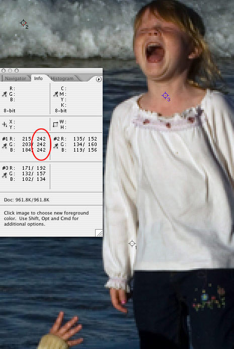
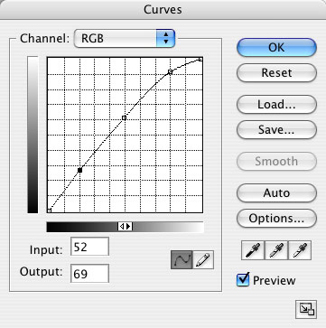
The wave foam still has a bit of a blue-green cast after the highlight adjustment. For a quick adjustment, you could use the midtone Levels slider on the Green and Blue channels to adjust this. But typically, I recommend creating a Curves adjustment layer, and then Command-clicking (PC: Ctrl-clicking) on color sampler point #2 to place correction points on the curves for the Green and Blue channels. Then, adjust these points on each curve until the RGB values are all neutral (all three values are the same).
Note: Not all color casts are wrong or bad, and if you like the green color cast in the wave foam, then leave it alone.
STEP FIVE:
Now we need to evaluate and adjust non-neutral critical areas (here, the skin tone). In the skin tones, red is greater than green which is greater than blue. Initially, the skin tone values looked a bit high in the red and green values compared with the blue, but after making the neutral adjustments above, the skin tones look just about correct. If you want to make further adjustments to the RGB ratios, you would do so by using a Curves adjustment layer as described in Step Four: Command-click (PC: Ctrl-click) on color sampler point #3 to create and adjust control points on your individual curves channels.
STEP SIX: Using your master channel RGB curve in your Curves adjustment layer, make any overall brightness and/or contrast adjustments to this image. You could pull the middle of the curve (midtone) up to lighten the image and apply an “S” shape to the curve to increase contrast, but in this example, we opted for only a lightening curve.
STEP SEVEN:
Duplicate your finished working version and name it (e.g., “Beach with Kids_Final”). For most images you’ll want to save four different versions: (1) Original unaltered image, (2) fully editable PSD image containing nondestructive adjustment layers and color sampler points, (3) a flattened high-quality TIFF for printing, and (4) a JPEG image for Web use. For each different image dimension I want to use, I return to the high-quality TIFF to copy and resize a new version. This way I’m always creating the highest quality images possible, rather than continually degrading a compressed image.
By establishing and sticking to a specific set of steps, your image correction workflow will improve in both speed and consistency.
