

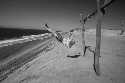
There are many reasons why I thoroughly enjoy using Lightroom, and near the top of my list is creating black-and-white images. Although the majority of my work is in color, I’m constantly drawn to black-and-white photography because it uniquely “…reduces, simplifies, goes deep, and gets beneath the surface,” as photographer Ryan Caldwell explains. Let’s dive into the process of how to use Lightroom to create better black-and-white images.
1 CORRECT COLOR AND TONE
Before beginning the black-and-white conversion, correct the color and tone to bring the image to a “normal” starting point (and minimize later exposure problems). With your image open in Lightoom, press D to select the Develop module, then press W to choose the White Balance tool. Click on an area of the image that should be neutral. It’s best to choose something other than pure white: Try something that’s off-white or gray. Next, adjust the Exposure, Recovery, Fill Light, Blacks, Brightness, and Contrast sliders so that the image looks good.

2 QUICK CONVERSION PREVIEW
How do you know if an image will look good in black and white? Certain photographers have the gift of being able to identify good tonal relationships and “see past the color.” But what about the rest of us? Using Lightroom, it’s as simple as pressing the V key, which will give you a quick black-and-white conversion based on the Develop module Temperature and Tint sliders. Think of this as a quick way to see past the color to determine the black-and-white potential. Don’t expect this conversion to look amazing: Remember it’s just a starting point!
3 CONVERT TO GRAYSCALE OR DESATURATE?
After we’ve determined that the image looks good in black and white, the most important step in getting good black-and-white images is to remove the color from the image in the Develop module. If you press V to Convert to Grayscale, Lightroom displays the Grayscale sliders, but…the more superior option is to “stay in color” and remove the saturation manually. Just go to the Develop module’s HSL panel and lower the Saturation slider for each color. While more time-consuming, this option allows you to make stronger adjustments without adding unnecessary noise (compared to converting to grayscale).

4 CREATE A DESATURATION PRESET
It would take forever to convert your images to black and white if you had to lower the saturation sliders for each color, so instead, let’s create a preset. Select an image that hasn’t been adjusted and in the Develop module’s Saturation panel, lower the sliders to remove the saturation from the image. Next, click on the plus icon in the Presets panel. In the New Develop Preset dialog, enter the Preset Name (Desaturation), choose the Folder (User Presets), and click Create. Now you’re set for the next time you want to convert an image to black and white.

5 VIRTUAL COPY
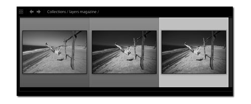
Now that our image is desaturated, we’re about ready to begin making adjustments. We’ll want to see a quick before/after to determine if the adjustments look good; however, by pressing the Backslash key (\) to do this, it will display the original color image. How can we ensure that our “before” is the desaturated image? The easiest way is to create a virtual copy, which will then act as our “original.” Just press Command-’ (PC: Ctrl-’) and the virtual copy will appear to the right of the original image in the Filmstrip.

6 TARGET ADJUSTMENT TOOL
Select the virtual copy from the Filmstrip and in the Luminance section of the Develop module’s HSL panel, click on the Target Adjustment tool. This tool lets you change the luminance of specific areas of your image. For example, to darken the tonality of the sky (which used to be blue), move the Target Adjustment tool over the sky, click, and drag down. To brighten the shorts (formerly red), click on them and drag up. As you progress, evaluate the quality of the adjustments by pressing the Backslash key (\) to toggle between the before and after view of the image.

7 BASIC ADJUSTMENTS
At this point, the image is looking much better but as a result of the Luminance adjustments, the overall contrast and tone of the image has become a bit muted. In the Develop module’s Basic panel, use the Tone sliders to make any needed final adjustments. In our example, we wanted to create a high-contrast image so we brightened the image using Exposure, Fill Light, and Brightness while at the same time increasing Contrast and Blacks, and slightly decreasing Recovery. (Although these adjustments are subjective, I based them on my knowledge of my printer and paper type.)

8 VIGNETTING
Lens Vignetting is a critical step that many photographers overlook. In Lightroom, Lens Vignetting allows to you darken or brighten the corners and edges of an image. In the Develop module, open the Lens Corrections panel. Under Lens Vignetting, move the Amount slider to the left to darken corners or to the right to brighten corners. Move the Midpoint slider to the left to apply the vignetting adjustment to a larger area or to the right to limit the adjustment to the corners.

9 NOISE REDUCTION
When you convert a color image to black and white and make significant tonal adjustments, you run the risk of adding noise—although there’s a risk, oftentimes the risk is well worth the reward. So, be on the lookout for noise. In this particular image, we made substantial tonal adjustments to the sky, so that’s where we need to look. Open the Detail panel in the Develop module. Click on the warning (!) icon, which will zoom the image to 100%. Examine the image and increase the Luminance slider to remove any noise.

10 SHARPENING
When you reduce the noise in an image, you simultaneously reduce sharpness. Therefore, we’ll need to add some corrective sharpening while being careful not to exaggerate any noise. First, increase Amount to adjust the overall intensity of the sharpening, then modify Radius to adjust the size of the details that are sharpened. On this image (as with most images), we’ll have a relatively low Radius because the details are small. Next, modify the Detail slider, using a lower setting to focus the sharpening on the edges. Finally, increase the Masking to further limit the sharpening to the edges.

11 BEFORE/AFTER
After all of this work, it’s easy to overlook something, so I find it invaluable to look away from the computer, stretch, blink a few times, and then look back. Next, use one of the shortcuts to toggle between the before and after view of the image. As mentioned previously, try pressing the Backslash key (\) to toggle between the before/after view of the entire image. But try pressing the Y key to get a more interesting side-by-side view of the before/after image, or Shift-Y to view a split view (as shown).

12 CREATE ANOTHER VIRTUAL COPY
Let’s make one final virtual copy so we can experiment with the image even further in the next step. (I use virtual copies almost like layers or history snapshots, as they allow me a certain amount of creative freedom.) Press the shortcut Command-’ (PC: Ctrl-’) to create a virtual copy. Remember that when you create a virtual copy, it’s automatically stacked with the master photo. To expand and collapse the Stack in the Library module Grid view, press the S key.
13 ADD COLOR TINT
Many of the traditional black-and-white printing processes add a bit of tone to the final print—there’s something compelling about a slightly toned black-and-white image. Here’s how: Select the virtual copy created in Step 12, then open the Split Toning panel in the Develop module. Determine the color by moving the Hue slider, and the intensity of the color by moving the Saturation slider. Try adding a mix of color to the Highlights and Shadows. Finally, use the Balance slider to fine-tune the strength of the Highlights/Shadows adjustments.

