
The Art of Type: Fractional Improvements
Back in third grade, Mrs. Ditzel taught us fractions. So nearly 50 years later, I ask myself why Adobe programs have such a hard time coping with this third-grade issue. Sure, if you happen to be using one of the few score OpenType Pro fonts on the market, your programs can build fractions automatically at the press of a button. But what if you’re using one of the other 30,000 or 40,000 non-Pro fonts out there? Read on.
The vast majority of PostScript Type 1, TrueType, and OpenType (non-Pro) fonts don’t contain the numerator and denominator glyphs needed to make fractions. To make professional-looking fractions using these fonts, you have to scale and then position the numerals manually.
Virtually all fonts, though, contain three pre-built—or piece—fractions: ¼, ½, and ¾. These consist of a numerator and denominator that are scaled to about 60% of the size of regular numerals, and they flank a special character called a fraction bar. On a Windows PC, you can access them by holding down the Alt key while typing their ANSI encoding numbers: 0188 (¼), 0189 (½), or 0190 (¾). Apple never saw the wisdom of including these fractions in the basic Mac encoding scheme, so there’s no keyboard access for them on the Mac. You have to fetch them using OS X’s Character Palette (Edit>Special Characters) or an Adobe program’s Glyphs panel.
These piece fractions are a great convenience if they’re the only ones you’ll be using in a document. But if you need others as well, you’ll often find that it’s hard to get them to look the same, as you can see here.
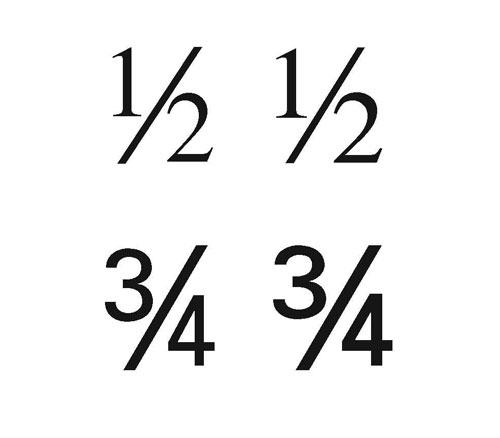
Matching hand-built fractions (left) with pre-built, piece fractions (right) isn’t always possible: The Times fractions on top are almost identical but the Univers 55 piece fraction is noticeably bolder than its built equivalent, which is commonly the case.
If you have to use any of these piece fractions together with others, you’re often better building them all from scratch. That sounds worse than it is…because after you’ve built the first one for any particular typeface and point size, you can use it as a template to build others in a jiffy.
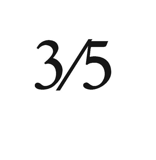
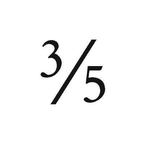
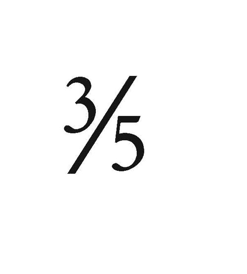
Finding the fraction bar The fraction bar ( ⁄ ) isn’t the same as the common solidus, or slash ( / ). For one thing, a fraction bar rests on the baseline (except in a handful of faces), so it bottom-aligns with the fraction’s denominator; however, a solidus extends below the baseline, where it typically bottom-aligns with a typeface’s descending characters. Another important aspect of the fraction bar is that it has special kerning characteristics so that numerators and denominators snuggle up against it more closely than they would with a solidus.
Finding the fraction bar on the Mac is easy, as it’s always been a part of the basic Mac character set: You’ll find it at Shift-Option-1. If you’re using Windows, it’s easier to find it using the Windows Character Map than using the Glyphs panel in InDesign or Illustrator, where you can’t search for a character by name, Unicode number, or glyph ID number. Nor do Adobe programs allow you to use a glyph’s Unicode number (in this case U+2044) to key in a code sequence to access a glyph. In the Windows Character Map (Start/All Programs), just type “fraction bar” in the Find field and the program will find it for you. Double-click the fraction bar to select it, click the Copy button, and then back in your program, paste it where you want it.
Fractions step by step
STEP ONE: To make a fraction in InDesign or Illustrator, first type the numerator, fraction bar, and denominator in a series without spaces.
STEP TWO: Drag a ruler guide down to top-align with the fraction bar. Now select the numerator and reduce its size to 60% of the size of the surrounding text (type “60%” in the Font Size field of the Character panel, and InDesign will do the math for you). Nudge it upward with the Baseline Shift control tool (in the Character panel) until the top of the numerator touches the ruler guide.

STEP THREE: Now scale the denominator to the same size.
STEP FOUR: At this point you’re close, but you’ll probably have to kern both the numerator and denominator a bit nearer to the fraction bar. Do this using your keyboard controls: Option-Right/Left Arrow (PC: Alt-Right/Left Arrow).

STEP FIVE: If you’re doing this in a magnified view (Zoom), it’s easy to over-kern. Remember that in text size, the numeral in a fraction is going to be very small—6 or 7 points—so print a proof to make sure that in kerning you haven’t crowded it too much against the fraction bar. Here’s our finished fraction.
Recycling your work To save this work for later use in InDesign, select the fraction and choose Export from the File menu. In the Export dialog, select Adobe InDesign Tagged Text from the Format (PC: Type) pop-up menu, give the file a name you’ll recognize, such as “one eighth,” and click the Save button.
Later, when you need it, you can use the Place command to bring this file back into a page, where it will appear in the correct fraction format. At that point, you can change the numerator and denominator as needed. (InDesign really needs a Library for saving complexly formatted text elements for future use.)
To save your fractions for later use when working in Illustrator, build them in a special file, from which you can cut-and-paste them into future documents—hardly an ideal system, but it works.
Note: When recycling fractions this way, if you change the typeface you’ll probably have to do some base-alignment and kerning tweaking. The sizes, though, should be okay unless the face you choose is bold or very light.
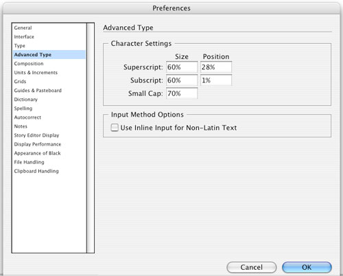
A quicker alternative There’s a faster way to make fractions with InDesign but it requires a little “bridge burning” by changing the specifications for how superscripts and subscripts are set. There’s not too much use of the latter (unless you write about CO2, for example), but superscripts are commonly used for footnotes.
If you don’t use either super- or subscripts, however, here’s the fix: Go to the Preferences>Advanced Type dialog and change the Size for both Superscript and Subscript to 60%. Now change the Position for Superscripts to 28% and for Subscripts to 1%. Click OK and from then on, you can just select a would-be fraction’s numeral, and in the Control panel, click on the Superscript or Subscript button to convert them to a numerator or denominator. Remember though that you’ll still have to tweak the kerning.
One problem with building your own fractions is that scaling down the numerals makes them a bit too light. Numerals intended for use in fractions—as in most piece fractions built into a font, or those used in OpenType Pro fonts—are made slightly bolder to make them more legible and more in harmony with the type around them. If you happen to be using a typeface family with a semibold weight, you might try using that weight for fractions within regular-weight type. Sometimes these appear a bit too bold, but often they’re preferable to fractions that are too wispy.

