Create Accessible CSS Layouts in Dreamweaver
When Web designers talk about creating sites that are “accessible,” they mean creating a site design that can be accessed by anyone who might visit a webpage—that includes people who are visually impaired and use browsers that read webpages aloud, as well as people who are using other kinds of special browsers, such as the ones used on handheld devices like Treos and Blackberrys.
One of the best ways to create a site that meets today’s accessibility standards is to design your site completely with div tags and CSS. There are some complexities to this design approach, and some limitations, but with a little creativity and some patience, you can produce complex and interesting Web designs that can be viewed by all of your visitors.
If you work for an organization that requires you to create these kinds of accessible designs, you should pay special attention to this lesson. But even if you’re not required to create accessible designs, it’s good practice.
STEP 1 Plan Your Design in Advance
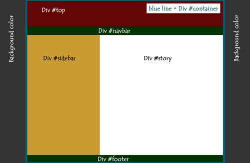
Because div tags are invisible in a browser, it’s difficult to see how they work in a completed page. And, until you create styles to position them, divs simply span vertically across the page. In this image, you see the structure that we want in our final design. Notice that we created one div that surrounds all of the other divs and called it “container.” All the other divs are contained within that div, and we’ll use that div to center the design. (Note: You can name divs anything you like, as long as you don’t use spaces or special characters.)
STEP 2 Create a New Page and Set Page Properties
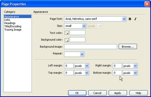
Choose File>New and then select Basic Page and HTML to create a new page. Choose Modify>Page Properties to set options for the entire page and Dreamweaver will automatically create the corresponding CSS styles for the body tag. In the Appearance category, you can set the font face, size, and color. In this example, we chose Arial, Helvetica, sans-serif; set the Size to Small; and left the Text Color set to the default black. We also set the margins to 0 so that the design will be flush against the top and left side of the page.
STEP 3 Insert Divs for Each Section
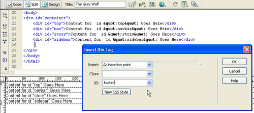
This step can get tricky, but the goal is simple—insert a div tag for each section of the page. To do so, click the Insert Div Tag icon in the Common Insert bar at the top of the page and enter a name in the ID field for each div. When you click OK, the div will automatically span across the top of the page. Make sure that you create the divs in order and that all of the section divs are placed inside the container div. Set the design area to Split so you can see the code while you work.
STEP 4 Add Content to Divs
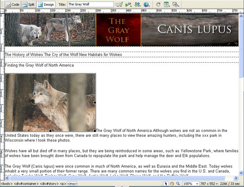
Although you can create the corresponding styles as you create the divs, it’s often easier to get all the divs and content in place before creating the styles to position them. As you can see in this image, the images and text have been inserted into each of the divs that will hold the content. You can add content to divs as you would add content anywhere else on a page; for example, use copy and paste to insert text from a Word document, and insert the images using the Images icon in the Common Insert bar.
STEP 5 Create a Style for the Container Div
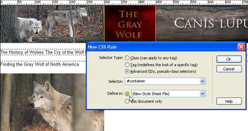
To create a new style for the container div, choose Text>CSS Styles>New. In the New CSS Rule dialog, select the Advanced radio button and enter a name (your style names must exactly match your div names). For each of these divs, create an ID style, which requires typing a pound sign at the beginning of the name. ID styles can only be used once per page and are ideal for positioning divs. (Note: You can let divs span the entire page so that they auto-adjust to fill the browser window, but I’ve chosen to use a fixed width for this design.)
STEP 6 Create New Styles in an External Style Sheet
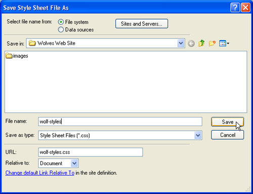
If you choose the radio button next to This Document Only, your style will be saved in the head area of your HTML file. If you choose Define In, you can save your style in an external style sheet. The advantage is that you can attach the same external style sheet to any page in your website—a more efficient option than recreating styles for every page, and an easy way to make global updates later. To create a new external style sheet, choose Define In and click OK. In the Save Style Sheet File As dialog, enter a name and click Save.
STEP 7 The Trick to Centering a Div
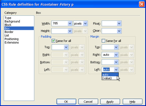
In the CSS Rules Definition dialog, chose the Box category and set the width for your container. In this example, we set it to 785 pixels (a safe width for display on an 800×600 resolution monitor). Now for the not-so-intuitive trick, you need to center the div: uncheck the Same for All box and set the Left and Right Margins to Auto. Click OK. This causes the browser to automatically position the div in the middle of the page by creating equal sized margins on the left and right sides of the div.
STEP 8 Do the Math
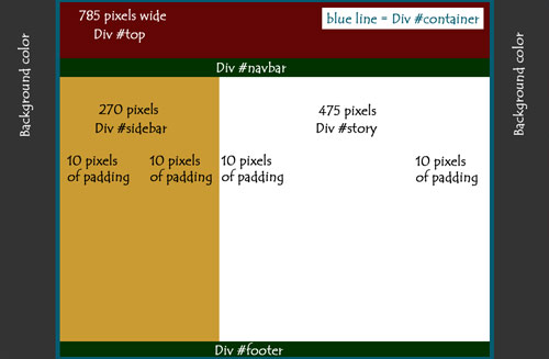
Now you need to calculate how wide to set your story and sidebar divs. As you see in this illustration, the #container div is 785 pixels, and we want the #story div to be 475 pixels. We also want 10 pixels of padding around each of our divs so our text and images don’t bump into each other, which means we’ve taken up 10+10=20 pixels per div in padding. Since we have two divs, that’s 40 pixels of padding total. If we add that to 475, we get 515. Now subtract that from 785 and we have 270 pixels left for the sidebar.
STEP 9 Create a Style for the Story Div
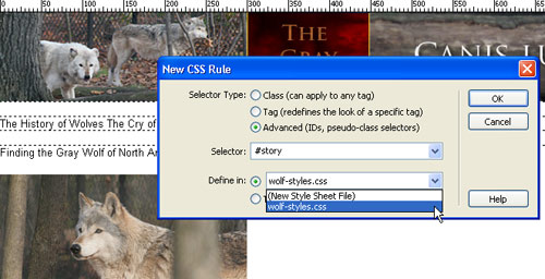
Choose Text>CSS Styles>New. In the New CSS Rule dialog, select the Advanced radio button and enter a name (in this case, “#story”). Select the external style sheet that you created from the drop-down list next to Define In and click OK. In the CSS Rule definition dialog, choose the Box category and set the Width to 475 pixels, the Float to Right, and Padding to 10, leaving the Same for All box checked. Then select the Background category and set the background color (we set it to white because we’ll later add a gray background to the entire page). Click OK.
STEP 10 Create a Style for the Sidebar Div
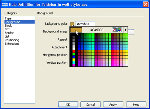
Choose Text>CSS Styles>New. In the New CSS Rule dialog, select the Advanced radio button and enter “#sidebar.” Again, choose the external style sheet from drop-down list next to Define In and click OK. In the CSS Rule definition dialog, choose the Box category, set the Width to 270 pixels, set the Float to Left, and set Padding to 10, leaving the Same for All box checked. Then select the Background category to set the background color of the div. In this case, we’ve used a golden color to better define the sidebar.
STEP 11 Create Styles for the Navbar and Footer
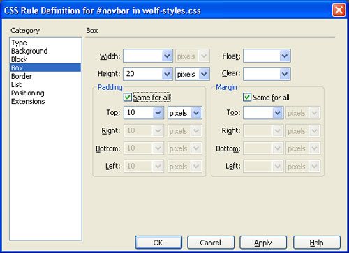
Choose Text>CSS Styles>New. Select the Advanced radio button and enter “#nav.” Choose the external style sheet from drop-down list next to Define In and click OK. In the CSS Rule definition dialog, choose the Box category, set the Height to 20 pixels, set Padding to 10, and check the Same for All box. For the navbar to span the full width of the design, simply leave the Width blank. Select the Background category to set the background color, and select the Type category to set the text color and style. Repeat these steps to create an identical style for the footer.
STEP 12 Use the Clear Div Technique
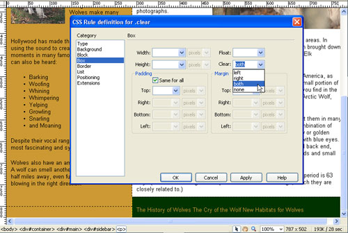
If your story and sidebar are not the same length, floating them left and right will cause the footer to wrap up under the shorter div. This is a common problem in CSS layouts, but there’s an easy fix: create a style that clears everything to the left and right of a div. Choose Text>CSS Styles>New and select the Class radio button. Class styles can be applied multiple times on the same page and must begin with a period (we named ours “.clear”). In the Box category of the CSS Rule Definition dialog, in the Clear drop-down menu, select Both and click OK.
STEP 13 Apply the Clear Class Style
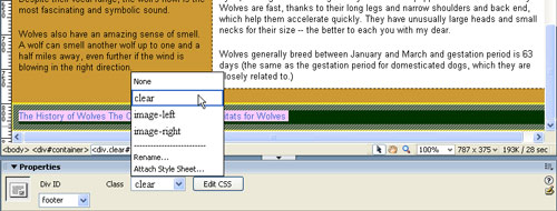
Unlike ID styles which are automatically applied to divs with the same name, you’ll need to apply the Clear style to the div. To do so, click to select the div (I find it easiest to select divs using the tag selector in the bottom left of the design area). Then, use the Class drop-down menu in the Properties inspector and select the Clear style to apply it. As you see in this example, the footer div drops to the bottom of the sidebar and story divs when the clear style is applied.
STEP 14 Add Styles for Images and Navigation Elements
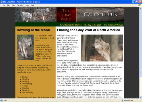
To achieve the final design you see here, Page Properties was used again to set the background color for the entire page to a dark gray. To align the images so the text wraps around them, class styles were created with the Float set to Left and Right respectively, and 10 pixels of Margin were added to keep the images from bumping up against the text. I also created a rather complex style for the links in the navbar and footer by redefining the Anchor, Unordered List, and List HTML tags. You’ll find tutorials for all of these tricks at www.layersmagazine.com.
