
Clarity, Vibrance, and Saturation in Adobe Photoshop Camera Raw
In this article, we’re looking at the bottom three sliders in the Basic panel: Clarity, Vibrance, and Saturation. (Note: These techniques work in both Adobe Photoshop Camera Raw and Lightroom.)
CLARITY ROCKS
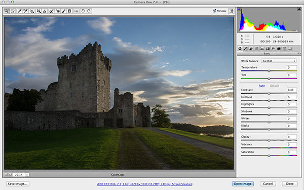
If you have Photoshop CS5 or later, you’re using the latest version of Clarity, which totally rocks. If you’re using CS4 or earlier, Camera Raw has Clarity but it’s using the older math, and while it’s still good, it’s not great. If you have the older version, what you’ll find is that a lot of Clarity will create a black halo around the edges of pretty much everything, so you’ll wind up not using as much Clarity as you’d like. The image you see here is the original image before adding Clarity.

WHAT CLARITY DOES
Although it’s not what it sounds like, Clarity actually adds midtone contrast to your image, and it makes your image look sharper, even though it doesn’t actually add sharpening. It does have its own look, which is more like an effect, and if you’re trying to create a tonal contrast look, this slider is pretty much all you need (well, opening up the shadows with the Shadows slider goes really well with Contrast for that tonal contrast look). Using Clarity is a no-brainer because all you do is drag it to the right—the farther you drag, the more midtone contrast effect it adds.
With the current math, you can usually drag it as far to the right as you want without getting a lot of black halos (like you did in the original versions of Clarity). One thing you’ll notice is that not only does it add this midtone contrast effect, but it also brightens the image a bit, so keep that in mind (especially if you’re using the Shadows slider, because your image is going to get brighter).
If you were to drag the Clarity slider to the left, you’d get a softening effect. In fact, you can use it to do simple skin softening in portrait retouching. (By the way, I have an online course exclusively for KelbyOne members on portrait retouching using nothing but Lightroom 5, which has Camera Raw built right into it, so even if you don’t have Lightroom you can still do the full class. I hope you’ll check it out on the KelbyOne website.)

SATURATION AND VIBRANCE
I have a simple rule for this: I only use Saturation for removing color—never adding it. Here’s why: Saturation makes every color in the image more colorful, so if something was already colorful enough, now it’s too colorful. The word "clowny" comes to mind because this slider creates colors that are nearly too colorful. That’s precisely why I love Vibrance. It’s like Smart Saturation (if there were such a thing).
Here’s what Vibrance does (this is some seriously amazing math, so let this marinate for a moment after you read it, pondering what it took to create this miracle on a slider): When you drag it to the right, it only makes dull colors in the image more vibrant and colorful. In other words, it senses which colors are already vibrant and it affects these less than the dull colors. It also has a special mathematical algorithm that avoids increasing any flesh tone colors, so you can use Vibrance in photos that have people in them. That is some seriously crazy math.

PAINTING SATURATION
Now, we’re going to jump to the Adjustment Brush. This tool lets you paint most of the controls that are in the Basic panel. You can paint Exposure. You can paint Shadows. You can paint one at a time, or both together, or all of them. In our case, we’re going to paint Saturation and Clarity. For reasons I can’t begin to understand, you can’t paint Vibrance—you can only paint Saturation, so at this point I have no choice but to use Saturation (but just know that I’m not happy about it).
In this case, we’ll start by painting some Saturation over the side of the castle that’s facing the sun. By painting over it, it will make some of the yellows and oranges that are already there from the setting sun stand out. Here’s how to do it: Get the Adjustment Brush (from the toolbar up top or press the letter K). Click the + sign to the right of the Saturation slider. This resets all the other sliders to zero and it increases the amount of the Saturation slider to +25. Each time you click it, it increases by +25 until you hit +100. Now just take the brush and paint over the side of the castle to bring out those colors.

PAINTING CLARITY
Now that we’ve opened the Adjustment Brush panel, let’s go ahead and paint over the whole castle with a lot of Clarity. If you already have one adjustment painted (in this case, Saturation), if you move any other sliders it just alters the previously painted area. In our case, we want to paint over a new area, so we need to click the New radio button at the top of the Adjustment Brush panel. Now click the + sign at the far right of the Clarity slider three times. That resets all the sliders to zero for this new adjustment and it increases the Clarity to +75 (each click=+25 each). Now you can paint Clarity onto the castle.

This article is courtesy of Photoshop User magazine, the official publication of KelbyOne, which provides quality online education for creative people. For more information, visit KelbyOne.com.
