
Artistic Expression: Where There’s Light…
…if it doesn’t comply with the way things work in real life, even the untrained eye will look at your piece and say, “That looks phony.”
I thought it would be fitting to write a column that discusses some of the functions of layers for a magazine aptly called Layers. I often write about the importance of layers because they serve so many functions—not only do they allow for easy adjustment of compositions but they also give you the flexibility to change their contents at any time.
One of the powerful features of layers is the layer style. Layer styles can be applied to create a variety of special effects, such as lighting or textures, that give an image dimension and set a mood. In these pages we’ll explore how layer styles can help create the effects produced by a light source that interacts with objects in a scene. It’s very important to notice what happens when light hits certain objects. For example, a strong light source hitting a glass window will have a dramatically different effect than if it were to hit a concrete wall. It’s crucial to understand how different objects react to light. Fortunately, you have a wonderful source for studying these effects—the world around you.
Become enlightened
I often tell my students that it’s not a good thing to guess at what something should look like. It might look right to you but if it doesn’t comply with the way things work in real life, even the untrained eye will look at your piece and say, “That looks phony.” I strongly advise that you study the way light works and how shadows travel along surfaces in order to recreate these effects in your images. If you import some object from one image to another and disregard things such as shadows and reflections, the new object will look out of place. It will look like it was pasted into the scene. If, however, shadows fall as in the rest of the scene and other objects are reflected onto the surface, the object will appear to have been there when the original shot was taken.
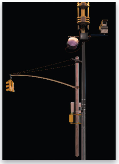
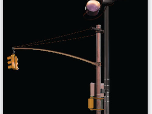
The two light poles shown here are but a tiny portion of my latest digital painting, a work currently in progress. The pole on the right is a lamppost that has two lights at the top that are out of our field of view. These two lights are lit; therefore, they cast highlights and shadows over the metal sections of the pole. The light sources are very close to the frame on the pole that supports the lights. This makes it necessary for the resulting highlights and shadows to be very strong.

Easy highlights
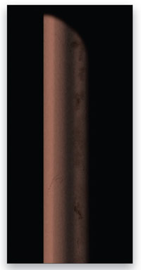 Here we can see the section of the rod that supports the actual globe for the light. In this version the highlights only simulate the reflected light from elsewhere in the scene; there’s no highlight for the globe at the top of the pole. Let’s add that strong highlight that’s needed to make this scene look real.
STEP ONE:
You can follow along by creating a simple rectangular shape in a layer similar to the un-highlighted pole above. (The pole or object that you’re using should be on its own layer above the Background layer.) Just click the Create a New Layer icon at the bottom of the Layers panel and then use the Rectangular Marquee tool (M) to draw your selection. Fill the selection with color and then use the Dodge and Burn tools to add highlights and shadows.
STEP TWO:
Now let’s create the highlight. Choose a bright yellow for your Foreground color and a round brush tip with zero Hardness for the Brush tool (B). (Note: You can select your brush tip and Hardness by clicking on the Brush thumbnail in the Options Bar to open the Brush Preset Picker.) Open the Brushes panel (Window>Brushes) and go to the Other Dynamics section. Under Opacity Jitter, set the Control drop-down menu to Fade. The amount of Fade will determine the length of the brushstroke. For example, a Fade of 10 will give you a short brushstroke while a Fade of 100 will create a longer brushstroke. 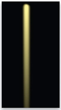
Set your Fade to whatever amount you need for your shape. Create a new layer, then click once where you want the stroke to begin. Press the Shift key and click beyond the point where you want the stroke to end. (Holding the Shift key will draw a straight brushstroke between the two points that you clicked.) The reason for clicking beyond the ending point is because you need to allow enough room for the stroke to lessen in opacity. For example, let’s say you set the Fade amount to 200. This means that when the stroke has applied 200 steps of the brush tip, it will fade out and disappear. So if you’re trying to create a stroke that will be about four inches long and you click at a point that’s exactly four inches from your first click, your brush stroke may not have enough room to apply all 200 steps of the fade. This will result in the brushstroke not having enough room to completely blend away to nothing (0% opacity). If you click at a point about six inches away from the first click, your stroke has plenty of room to apply all 200 steps and fade in opacity, thus giving you the effect you’re looking for. Press Command-D (PC: Ctrl-D) to deselect.
STEP THREE: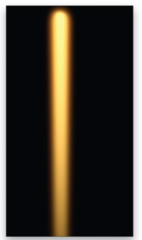
Double-click on the layer with the brushstroke to bring up the Layer Style dialog for that layer. Click on the Outer Glow layer style in the list of Styles on the left. (Note: In case you didn’t know this already, clicking on the title of the style will bring you to the control panel for that style; clicking on the checkbox for any of the styles will only activate that style and apply it with the default or previously used settings without giving you the ability to alter the settings.) In the controls for the Outer Glow style, set the color to a bright orange (click the color swatch to change the color) and the Blend Mode to Normal. Adjust the Size as needed to produce a bright glow around the yellow brushstroke, then click OK to close the Layer Style dialog.
STEP FOUR:
The glow is from the light directly above the pole and to the left. This means the reflection should be along the inside edge of the pole and not spill out into thin air. To constrain the effects of the glowing stroke and confine it to the shape of the pole, turn the two layers into a clipping group. To create a clipping group, hold the Option key (PC: Alt key) and click between the two layers in the Layers panel.
STEP FIVE: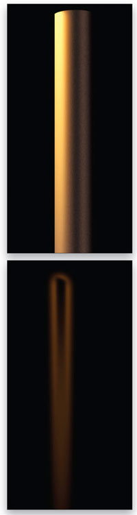
Now let’s add a little glow that seems to reflect off the surface of the pole, adding an atmospheric effect. To achieve this effect, drag the layer with the glowing stroke to the Create a New Layer icon at the bottom of the Layers panel to duplicate the layer. Make sure the layer with the pole is not clipping the new layer. To unclip the layer from the group, simply click between the two layers in the Layers panel while pressing the Option key (PC: Alt key).
This new duplicate layer should create a slight halo protruding beyond the surface of the pole. Double-click that layer to bring up the Layer Style dialog again. This time go to the Blending Options section and lower the Fill Opacity to 0%. This will make the original pixels of the yellow stroke invisible, but since the layer Opacity is still at 100%, the Outer Glow layer style remains completely visible. Reduce the Opacity if needed to soften the glow. (The image here shows just the glow with the other pole layers hidden.)
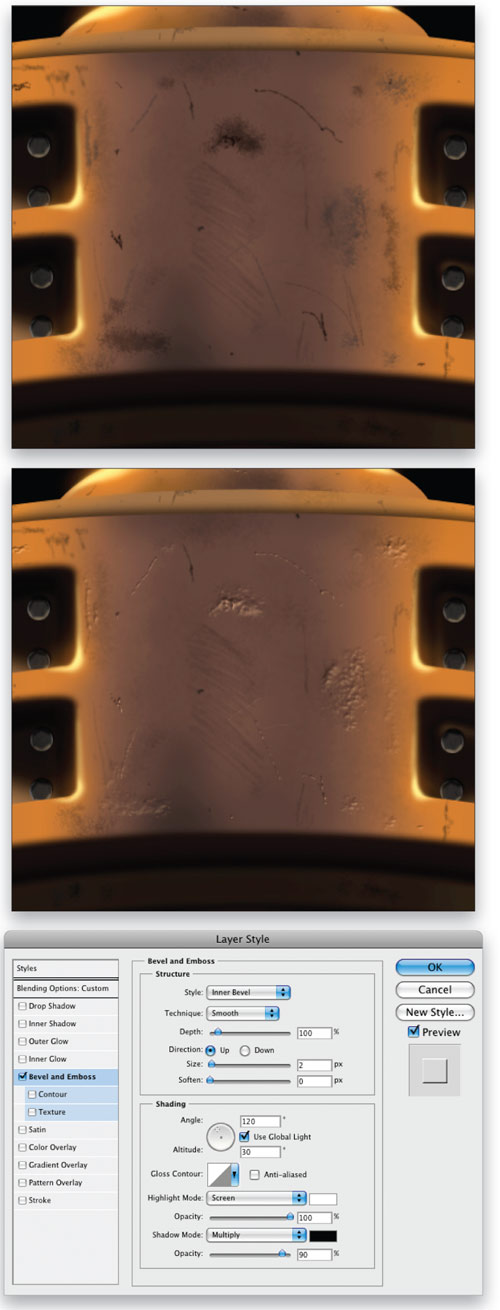
Damage control
Here you see multiple damages on the surface of the metal. You can create this effect with the Brush tool and customized brushes. If you apply brushstrokes in separate layers, you can treat the various strokes differently. To make some of the strokes appear like gouges in the metal, open the Layer Style dialog for those particular strokes, reduce the Fill Opacity to 0% in the Blending Options, and apply a Bevel and Emboss layer style. Modify the settings in the dialog to get the highlights and shadows necessary to complete the effect of gouges.
These are simple tricks but the end result is a believable lighting effect needed to make a scene look real. Along the way you will be faced with many dialogs with many buttons. Push them and see if it creates your desired effect. If not, push them again.
Remember to have fun and play.
ALL IMAGES BY BERT MONROY
