Using the Paragraph Palatte in Illustrator
Most people know Illustrator for its drawing abilities, but it’s also a powerhouse when it comes to working with text. In this tutorial, we’ll take a look at a number of features in the Paragraph palette, both visible and hidden, that can add professional polish to any text-heavy document.
STEP 1 Create Basic Layout
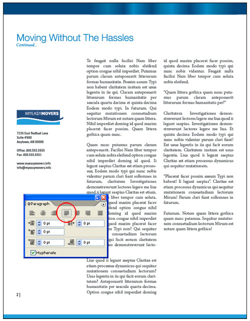
To begin, let’s create a layout that contains two columns of unformatted text. The first thing we’ll do is justify the paragraphs so both sides have clean, straight lines. Select the text object with the Selection tool (V). At the top of the Paragraph palette (Window>Type>Paragraph), select the fourth option, Justify with Last Line Aligned Left.
STEP 2 Choose Your Composer
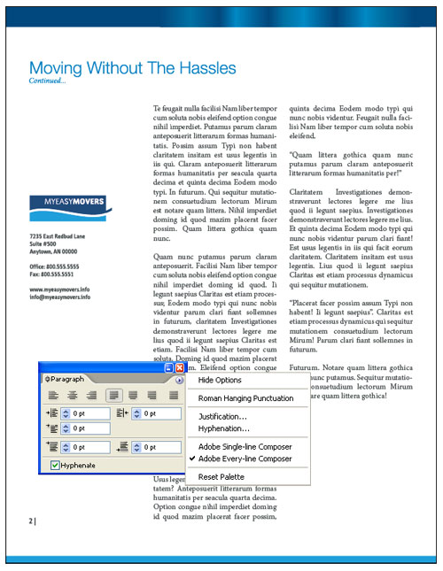
Justifying results in large gaps between some words. Let’s see if an alternate composition method will help. In the Paragraph palette flyout menu—accessible by clicking the arrow at the upper right of the palette—you can choose from Adobe Single-Line Composer or Adobe Every-Line Composer. The default Single-Line Composer decreases or increases spacing between words in favor of using hyphenation, while the Every-Line Composer goes for a balance in both letter and word spacing.
The image below shows the text formatted using Every-Line Composer (compare it to the text formatted with Single-Line Composer in Step 1).
STEP 3 Apply Composer to a Single Paragraph
You can apply both the Single-Line and Every-Line Composer to individual paragraphs instead of applying it to all paragraphs in the text container. To target an individual paragraph, click anywhere in that paragraph with the Type tool (T). For the first paragraph, Every-Line Composer eliminated many of the smaller spacing issues between words; however, we’re left with a paragraph that ends with a “widow.” It’s a bit unsightly, so we’ll use the Single-Line Composer (shown above) and fix the problem with some justification options.
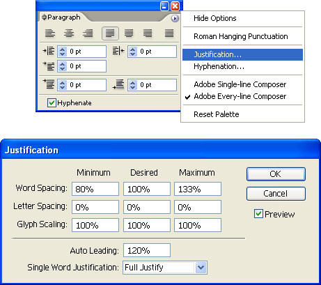
STEP 4 Open Justification Dialog
Choose Justification from the Paragraph palette flyout menu. In the dialog that appears, enable Preview so you can view changes as you adjust settings. Here, you can change Minimum and Maximum values for Word Spacing, Letter Spacing, and Glyph Scaling. In the Desired field, you can enter values that Illustrator will try to accommodate relevant to the Minimum and Maximum values.
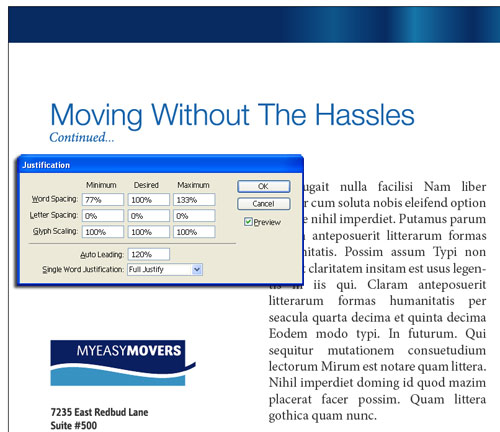
STEP 5 Adjust Word Spacing
A lot of what we’ll do in the Justification dialog is trial and error, so let’s first tackle Word Spacing to see if that fixes the spacing issues. In the Minimum field, we entered a value of 77%. Experimenting with higher and lower values didn’t alter the spacing as much as we’d like. As a result of the new value, there’s more even spacing, but only at the top of the paragraph. Let’s try adjusting Letter Spacing to fix the rest of the paragraph.
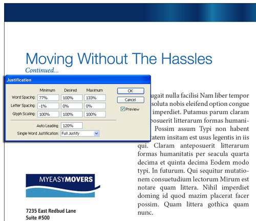
STEP 6 Adjust Letter Spacing
Letter Spacing can make or break the legibility of a paragraph. A little goes a long way with the values you enter. Too high or too low and it becomes quite noticeable. Rather than modify the Desired and Maximum values, we’ll enter a value of –1% in the Minimum field to start. If you choose to use a positive value, be sure to enter a value in the Maximum field that’s equal to or higher than the one in the Minimum field. Not doing so will result in an error message. With the negative value, spacing throughout is more balanced.
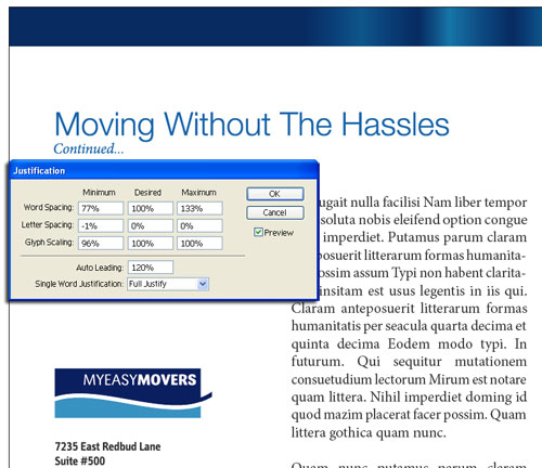
STEP 7 Adjust Glyph Scaling
Alas, the text widow mentioned earlier appears again. Now we’ll modify the last setting, Glyph Scaling, to fix this. With Glyph Scaling, Illustrator compresses or expands characters depending on the values you enter in the fields. For this reason, we avoid using it as much as possible. If you do use Glyph Scaling, try not to adjust the range more than 5% in either the Minimum or Maximum fields. Compressed or expanded characters will draw unnecessary attention to themselves and affect legibility. Upon entering a value of 96% in the Minimum field, the widow is, at last, under control.
STEP 8 Clean Up Paragraph Edges
Look closely at the formatted paragraph and you’ll notice the hyphens at the end of some sentences make the right margin look uneven. For clean paragraph edges, we can take advantage of Roman Hanging Punctuation. This command pushes various punctuation marks, such as hyphens, periods, and quotation marks, outside of a paragraph’s left and right margins. To apply the command, be sure a paragraph is targeted or the text object is selected, then choose Roman Hanging Punctuation from the Paragraph palette flyout menu. Note: This command may cause text to reflow in all paragraphs, disrupting formatting adjustments done through justification.
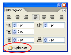
STEP 9 Eliminate Hyphens
If you prefer not to have any hyphens in your paragraphs, you can turn them off by unchecking Hyphenate at the bottom of the Paragraph palette. (If you don’t see the Hyphenate option, choose Show Options from the Paragraph palette flyout menu.) As with the Roman Hanging Punctuation command, this too may cause paragraph text to reflow.
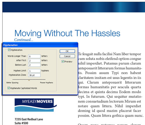
STEP 10 Control Hyphenation
If you want to keep hyphens but would like more control over where and when they appear in paragraphs, select Hyphenation from the Paragraph palette flyout menu. Make sure you have a paragraph targeted or the entire text object selected before you use this command. When the Hyphenation dialog appears, enable Preview.
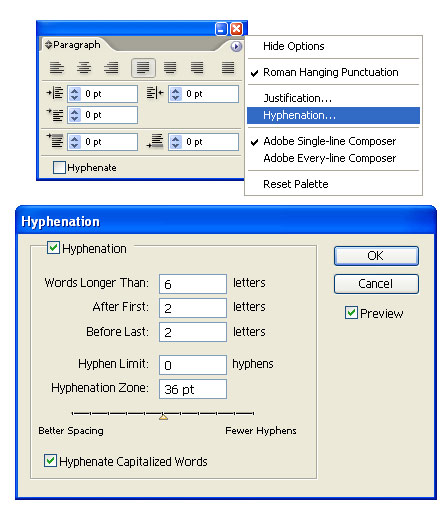
STEP 11 Adjust Default Settings to Suit
The first setting in the dialog, Words Longer Than, has a default value of 6 letters. This tells Illustrator to apply hyphens to words that contain 6 or more letters. In addition, you can control where hyphens appear within words by adjusting After First and Before Last. The default value for both commands is 2 letters. With the After First command, Illustrator can hyphenate the word “incorporated” as “in-corporated.” Before Last, with its value of 2 letters, can hyphenate the word as “incorporat-ed.”

STEP 12 Control the Number of Consecutive Hyphens
Hyphenation Limit allows you to place limits on how many consecutive lines can be hyphenated in a paragraph. With a value of 0, hyphens can appear on every line in a paragraph. By entering a value of 1, hyphens can appear on every other line in a paragraph. The last command to accept values is Hyphenation Zone. The default value establishes a 36 pt zone from the right margin of a paragraph where words will not be hyphenated. For example, if a word enters the zone, any word following it will be moved, in whole, to the next line.
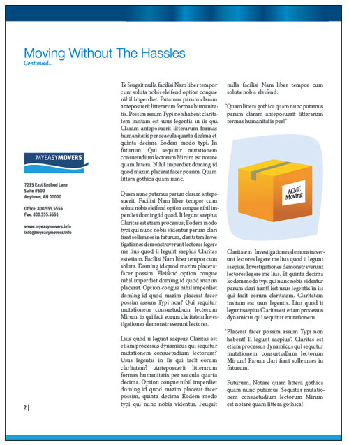
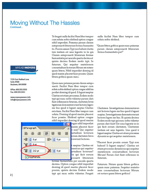
STEP 13 Prepare Text Container for a Graphic
After formatting the rest of the text, we’ll insert some artwork between two paragraphs in the second column. Instead of inserting the cursor between the paragraphs and hitting the Return/Enter key a number of times to create space, let’s take advantage of the Space before Paragraph command in the Paragraph palette. With the Type tool, we’ll click in the third paragraph from the bottom to target it. We’re using a value of 212 pt in the Space before Paragraph field. This aligns the bottom of the paragraph in the second column with the bottom of the paragraph in the first column.
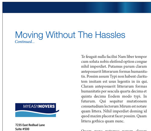
STEP 14 Place Your Graphic
Choose File>Place and navigate to the graphic you want to use. Choose the Selection tool to position and resize the image. Note that you can also use the Space after Paragraph command to alter spacing between paragraphs. One last thing, if everything goes awry with your formatting, select Reset Palette from the Paragraph palette flyout menu to remove any formatting you’ve applied.