InDesign has a slew of cool features; however, some of the most powerful timesaving techniques start with having the preferences set correctly. Too often we start using an application without ever going to the preferences and setting up the app to make us the most productive. Here are the preferences for InDesign that every user should know.
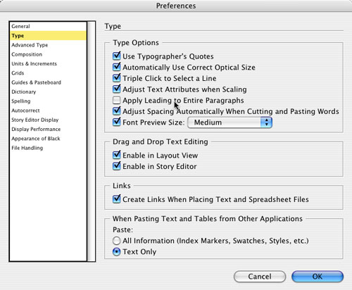
STEP 1 Apply Leading to Entire Paragraphs
Let’s start by opening InDesign and pressing Command-K (PC: Ctrl-K) to open the General Preferences dialog. Although the General Preferences are important, they’re not at the top of my most important list for this article, so click on the Type category on the left. The option to Apply Leading to Entire Paragraphs is a choice that tells InDesign to adjust all the lines in the paragraph when you make leading changes. The default is to apply leading only to the line(s) you’ve selected. You decide which way you like it best.
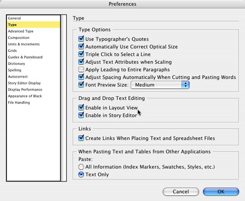
STEP 2 Drag-and-Drop Text Editing
I don’t know about you but I absolutely can’t live without drag-and-drop text. In the Type Preferences, however, the default Drag and Drop Text Editing is set to off (unchecked) for layout view. You should turn this on by clicking on the Enable in Layout View checkbox.
STEP 3 Drag to Another Location
When you have drag-and-drop text turned on for the layout view, you can select text with your Type tool, and then when you point at it, your cursor changes to an arrow with a little T below it. This is your indicator that you can now just drag the text to another location. What’s cool is that you can even drag it to an entirely different frame. Also, if you hold down the Option (PC: Alt) key after you start dragging the text, you can drag a copy of the text.

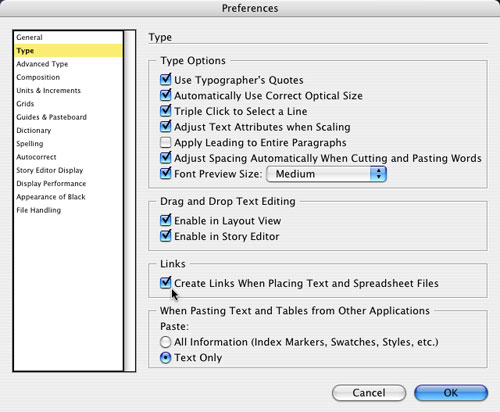
STEP 4 Create Links When Placing Text and Spreadsheets
This one threw me for a loop when InDesign CS2 shipped, because it’s changed from InDesign CS. Now by default, when you place a Word or Excel file into InDesign, it’s placed, but not linked back to the original document. This is fine if it’s what you want; however, in many cases and especially with Word docs, you’ll want to maintain a link so that if someone updates the Word document, your InDesign document will also update. So, I recommend that you turn on the Create Links When Placing Text and Spreadsheet Files checkbox in the Type Preferences.
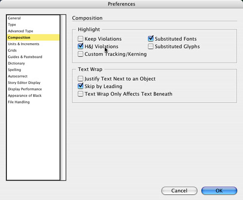
STEP 5 Highlight H&J Violations
Now we’ll move on to Composition in the Preferences dialog. These are set pretty well by default, but one that will appeal to the typographers out there is the ability to monitor hyphenation and justification (H&J) violations. You can set up your H&J preferences for a particular set of paragraphs. By turning on this H&J Violations checkbox, you’ll see various degrees of yellow highlighting when your rules are being broken.
STEP 6 H&J Violation Samples
As you can see in this example the lines that have spacing issues are darker yellow than the other lines. To repair these violations, you could do some manual kerning and tracking, adjust your glyph scaling, or adjust the hyphenation slider.

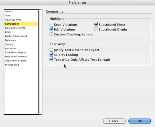
STEP 7 Text Wrap Only Affects Text Beneath
Another useful Composition preference is how text wrap affects text directly on top of an image. Think about stacking: If you place a graphic on top of your text, you’ll want the text underneath the graphic to wrap around it. If you then put a text frame on top of the image (say, the title of the photo), you don’t want that text to wrap, or in most cases, disappear. By turning on the Text Wrap Only Affects Text Beneath checkbox, you’ll now be able to place text on top of frames that have text wrap applied.
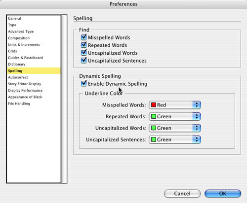
STEP 8 Enable Dynamic Spelling
(This feature was put in just for me!) In the past, I’d do my text entry in Word because it could spell-check as I typed. Well, I can do this in InDesign CS2 as well; however, like some other cool things we’ve discussed here, it’s off by default. So, bring up your Preferences, click on Spelling, and turn on the Enable Dynamic Spelling checkbox. You can also enable/disable it from the Edit>Spelling menu; but under the Preferences menu, you can choose what Underline Color to use for Misspelled Words, Repeated Words, etc.
STEP 9 Enable Autocorrect
Now let’s click on the Autocorrect dialog in Preferences. How many times have you typed “teh” instead of “the?” Turn on the Enable Autocorrect checkbox, and InDesign will automatically correct the most common words that people mistype. This is another one of those features that I can’t live without.
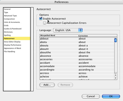
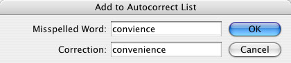
STEP 10 Add Your Own Autocorrect words
What if a word you constantly mistype isn’t listed? No problem. You can personalize the misspelled word list. Just click the Add button in the Autorcorrect Preferences, type in a word that you regularly mistype (and mistype it on purpose this time), and then add the correction for that word.
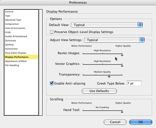
STEP 11 Adjust View Settings
By default, InDesign does a pretty good job with Display Performance; however, if you choose Fast (from the Default View drop-down menu), it grays out all the graphics. When you select Typical, it makes everything visible, but kind of low-res with jaggy vectors. But sometimes Typical is just not good enough. If you have a pretty fast computer, then you could stand to have your images look better in the Typical display mode, so crank up the Raster Images and Vector Graphics sliders a bit.
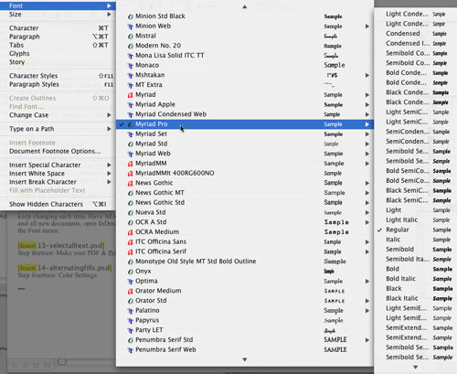
STEP 12 Set Your Default Font
Notice how every time you create a new document and key in some text, it’s in Times? If you’re a pro, you change it immediately. Instead of changing it each time, choose the default font for the app and for all new documents. Open InDesign, and with no documents open, choose the font you want to be the default from the Font menu. You can also set the default font for any open document by making sure you’re not in a text frame and then choosing the font you want from the Font menu.
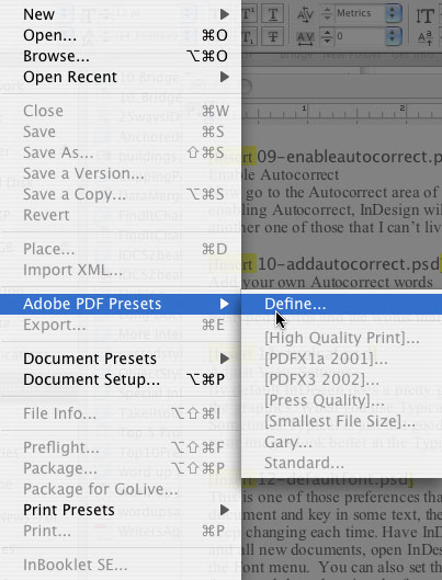
STEP 13 Make PDF and Print Presets
Each time you choose Export to PDF or hit Print, you probably have to make changes in the dialog. Try this instead: Under the File menu, choose Adobe PDF Presets>Define (or Print Presets>Define), choose New, set up your options in the New PDF Export Preset dialog (or the New Print Preset dialog), click OK, and then click Done in the Adobe PDF Presets dialog (or OK in the Print Presets dialog). Now the next time you need to make a PDF or Print, you can just go up to the File menu and go straight to the preset you made.
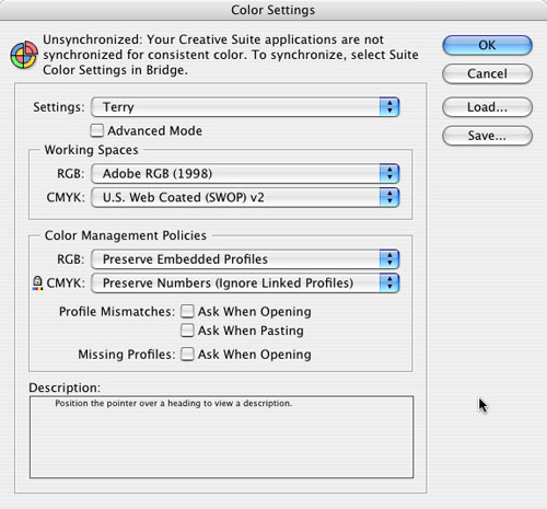
STEP 14 Consistent Color
Lastly, everyone wants his or her color output to match what’s onscreen. But I also want my colors to match from one Creative Suite app to the next. All of the apps in CS2 can use the same Color Settings, so if you get the settings the way you want in Photoshop, you can choose Color Settings from the Edit menu in InDesign and choose those exact same settings. Now images you place will look and print exactly as they did in Photoshop—same goes for Illustrator.