
The Art of Type: The Rap on Wraps
Text Wraps Can Wreak Havoc on Spacing—Here’s How to Restore Order
Wrapping text around graphics or other text has become commonplace. But as with most typographic automations, results often fall into the category “Close, but No Cigar.” While how to create text wraps is well documented in Adobe’s Help Center program, how to perfect them remains mysterious.
First, a couple of fundamentals: For rectangular wraps, a ragged margin generally looks good if the rag isn’t too wild; that is, there isn’t much variation among line lengths, giving it a clean shape. This is easier to achieve when lines are long. Text that wraps around curved shapes is usually more effective when set justified, or flush, so the margin is smooth, tightly following the shapes’ contours.
The conquest of space
Justified type, though, can create the most common problem with text wraps: inconsistent spacing. Ideally, as measure (“typographese” for line length) varies, so should the hyphenation and justification (h&j) settings that control the text’s composition. In narrow measures, for example, letter spaces should be allowed to expand more to avoid the overstretching of word spaces, and in InDesign, glyph scaling ranges can be liberalized (see Fig. 1). But in Adobe products, h&j specs are a paragraph attribute, so what applies to the longest line of a triangular paragraph also applies to the shortest.
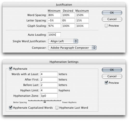
Fig. 1. For text set in very narrow measures, h&j settings have to be made much more flexible, as shown here. Ranges for Word and Letter Spacing border on the extreme, and hyphenation controls have also been liberalized.
As a general rule, when the value of your measure (as expressed in picas) is less than the value of your point size (as expressed in points), you’ll run into spacing problems. When using 11-point type, then, consider an 11-pica measure as the practical minimum. With shorter measures than this, there aren’t enough word and letter spaces on a line to allow your program the leeway to create consistent spacing from line to line. In text that wraps, this threshold is breached all too often, resulting in cascades of lines that are too tightly or (more typically) too loosely spaced. Even if you stay within this rule-of-thumb limit, for short lines your program will resort more often to the minimum and maximum allowable values you’ve specified in your h&j settings, resulting in undue spacing variations.
In InDesign and Illustrator, h&j controls are found by choosing either Justification or Hyphenation from the Paragraph palette’s flyout menu. Or in InDesign, use the keyboard shortcut Shift-Option-Command-J (PC: Shift-Alt-Control-J) to open the Justification dialog. Also in InDesign, head for the Composition Preferences dialog (InDesign [PC: Edit]>Preferences>Composition) and put a check next to H&J Violations in the Highlight section to flag lines that break your spacing rules. Prepare to be shocked at how often it happens.
For paragraphs containing lines of widely varying lengths, set your h&j settings to work for the longest lines and fix any spacing problems in the shorter ones by hand. These manual fixes are best done when your layout is otherwise complete, because if text reflows and your interventions appear outside the text-wrap area, they’re going to cause problems.
Tidying up
When InDesign or Illustrator can’t compose a line well, it almost invariably sets it too loose, so normally your adjustments will aim to tighten spacing. This is best done one line at a time, so select Adobe Single-Line Composer from the Paragraph palette’s flyout menu. This assures that any changes you make will affect only the current and following lines. With Adobe Paragraph Composer (or Every-Line Composer in Illustrator) turned on, changes you make can ripple in both directions, changing previous lines that you’ve already fixed.
When coaxing good spacing from short lines, a light touch is the right touch. For a tight line, perhaps the lightest touch you can apply is to add a discretionary hyphen (Shift-Command-– [PC: Shift-Control-–]) to the last word. This can force a fragment of that word onto the following line, even when the program is loath to do so. Never use a hard hyphen (simply typing a hyphen) unless you’re absolutely, positively sure the text will never reflow, causing that hyphen to appear in mid-line. Discretionary hyphens disappear when not needed. You can also sometimes use a discretionary hyphen in the first word of a line to force it up and tighten a previous, loose line.
In short measures, you can also increase the number of consecutive hyphens your program allows, because the more it can hyphenate, the better it can maintain consistent spacing. (Lots of hyphens are better than irregular spacing, although neither is desirable.) You can also change the minimum number of characters that must appear before or after a hyphen (the minimum being two) and allow more hyphenation in general using InDesign’s hyphenation slider control. These things are done in the Hyphenation dialog.
Your next—and more universally applicable—task is to alter the tracking of badly spaced lines. The easiest place to do this is in the Control palette, having first clicked the Character Formatting Controls button (A) at the far left. Select the troubled line by triple-clicking it, and then adjust its tracking in 5/1000 em increments (don’t exceed 15/1000) until you get the results you’re after. What you want is spacing that more or less matches that of the preceding line. By the time you’ve labored to the end of the paragraph, its overall color—the balance between the black of the type and the white space around the characters—should be consistent throughout.
In general, loose lines are more glaring than tight lines, so if you can’t get perfect results (and you often won’t), opt for a little tight rather than too loose. And don’t trust the screen when judging your work—printed proofs are far more revealing.


Wraps that create narrow measures create havoc with text spacing (left). In the “after” version (right), several lines have had their tracking tightened slightly. The most dramatic adjustment was –15/1000 em, but most lines we fixed with a tweak of a mere 5/1000. Slack spacing is particularly apparent in reversed type.

