
Graphic design is the Great Communicator—it’s problem solving. Good design translates and consolidates ideas or content, presenting them in a way that elicits a feeling or action from the viewer: read this, buy this, look here, feel this way, call now, or visit us at www….
Compare how a magazine layout—incorporating photography, typesetting, and thought—impacts you, versus being presented with the same content in 12-point Arial in your email application. There’s a world of difference. Photographers shoot with a keen eye, but some who are new to the business of photography often leave their eye behind the lens when presenting their work to the public. When branding yourself and showing your work to the world, you’ll need to apply some basic principles of graphic design to professionalize your look and lend visual appeal to your marketing pieces. Let’s expand your design knowledge beyond the rule of thirds and the golden ratio, beginning with composition.
Laying it out: Composition
Much as you would compose a shot, you need to compose your page. Think of all the elements you want to include. Grab some scrap paper before you head to the computer. Heck, go old school and draw it out on a cocktail napkin as your brethren have before you. Think: grid and hierarchy.
Grid: Start with a grid. This is the framework for any design; it helps you to organize your objects (images, headline, subhead, body copy, logo, etc.) on the page. If your page has only a few components, you may only need a simple six- or nine-square grid (like the rule of thirds). A larger or copy-heavy piece such as a brochure may need a more complex grid. Keeping things aligned on a grid helps create a nicer composition—aiding in organization, hierarchy, and readability. Generally speaking, if you look at a page and things appear as if they could align, make sure they do align. Elements that almost align but not quite ruin an otherwise good design, and the result is an unprofessional look.
When placing components on your grid, consider the feeling you want your design to convey. Symmetry and balance will give the viewer a different vibe than asymmetry and huge variations in proportion and scale. Adhering closely to a grid and making use of repetition will produce a very balanced rhythm to the eye, while upending your grid (or using a more complex grid and angles) will give a design visual tension (hopefully, the pleasing kind of tension), making it seem more dynamic.

Back in design school, an amazing professor of mine (the kind who rips things off the wall and drives you crazy but ultimately makes you better) gave us an infuriating task: Take a white sheet and bring back a perfect black square. We cursed him up and down. But darn if I don’t do that every time I put something on a blank page, and you do it too, with your photography. Every student came back with a different size square, with different placements on their white page. Each result was unique, and each was the perfect black square.
Once you get more than one item on a page, things begin to get complicated. Use your grid; it’s there to help you. But remember, a grid can be thoughtfully broken if the design calls for it. But ya gotta have the rules in place before you can break them.
 Hierarchy: The human eye instinctively knows many of these graphic design principles, and we need to learn to take advantage of that. For the most part, people experience a design top to bottom, left to right. Things that are larger are more prominent, gaining importance in the viewer’s mind. Items that are close together are seen as being related. If your caption is closer to your body copy than to the photo it belongs with, the reader will be confused: “Is this a subtitle or a caption?” Design is there to give cues to the user about where to direct their eyes first, next, and last. Ideally, your design will create good directional movement or visual flow, that is, lead the eye across the page where you want it to go. Beware of distractions, like the make-the-logo-bigger phenomenon. Do you really want viewers to focus on the logo, or would you rather they notice your photography, experience, or offer?
About Face: Choosing Type
There is so much more to typography than Helvetica and Times Roman. Thousands of typefaces exist, each meticulously designed for legibility, style, or both. Type goes a long way toward setting the mood of your designs.
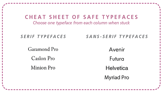
Be prepared to invest in at least two type families you feel represent your brand: one for headlines and calls to action, and one for body copy and captions. Sure, free typefaces can be your friend occasionally, primarily for decorative use, but for general everyday marketing and sales, choose quality faces from a real source. And please stay away from clichés. Don’t put your studio name under a photo in Papyrus and call it a poster. By now, everyone down to my fourth grader knows that Comic Sans is to be mocked. Stay far, far away, unless you need a flyer for a cookout.
When in doubt, use this formula: combine one midweight sans-serif font with one classic serif and call it your look. (Note: Serif fonts have lines on the main stroke of each character; san-serif fonts do not have these lines.) Even an experienced designer will more often than not stick with three typefaces or fewer per piece. That’s why type is sold in families. Type families will include variations of that font—roman (regular), italic, bold, bold italic, condensed, condensed italic, etc. Choose a family that includes at least bolds and italics. It’s not okay to use faux bold and faux italic in Photoshop. Type designers put a tremendous amount of time into how to alter shapes and curves for each of those uses. Show some respect. If you have the time and the interest, try several of each to find the type personality that fits your brand. You could look at a hundred sans-serif faces and observe slight variations in each that will make one look serious and corporate, another quirky, and another techy.
Keep usage in mind. Any typeface with a strong personality should be used only for headlines or subheads (known as display type), as those little quirks and touches that add personality can interfere with legibility at smaller sizes. Choose a font that will not become an eyesore when applied to supporting collateral. Let’s say you started with a business card and a postcard, but now have to create labels, folders, price sheets, order forms, gift certificates, surveys, welcome letters, etc.—all your pieces should have a similar look, like brothers (or at the very least, first cousins). You want to create a cohesive look for your brand that’s instantly recognizable.
An abbreviated Typographic Lexicon
I won’t diagram the parts of a typeface’s letterforms for you here, and I’ll assume you at least know what point size and leading are. But let’s review some things everyone should be aware of when setting type to achieve a professional-looking design. Neglecting these key areas of detail make the best of layouts look amateurish.
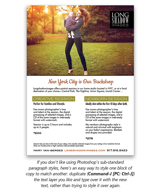
To be honest, most graphic designers frown upon setting type in Photoshop. It may be a holdover of pre-Creative Suite necessity (type can stay editable and crisp much longer these days), but I’ll mention it anyway. If you have access to and knowledge of InDesign or another leading page-layout application, that’s the correct place to do your typesetting. For a title or headline, I’ll set type in Illustrator and paste it into Phot[tps_header][/tps_header][tps_header][/tps_header][tps_header][/tps_header][tps_header][/tps_header][tps_header][/tps_header][tps_title][/tps_title]oshop as a smart object. But even if Photoshop is where your access or comfort level ends, all these still apply.
Tracking is the addition (positive tracking) or subtraction (negative tracking) of space, uniformly, between all characters in a body or section of text. In Photoshop and other Adobe applications, you achieve this by selecting the type to be adjusted and either changing the tracking in the Character panel (Window>Character), or by using the Option (PC: Alt) key and the Left or Right Arrow keys for tighter or looser letterspacing, respectively. Tight tracking can look great in large type, but I recommend positive tracking (+10 is a good place to start) for type less than 7 points to improve legibility. Extremely positive tracking of +200 or more can look great with all caps, like you might see in a subhead or when a photographer puts her studio name on a poster centered under a single image (just don’t use Papyrus).
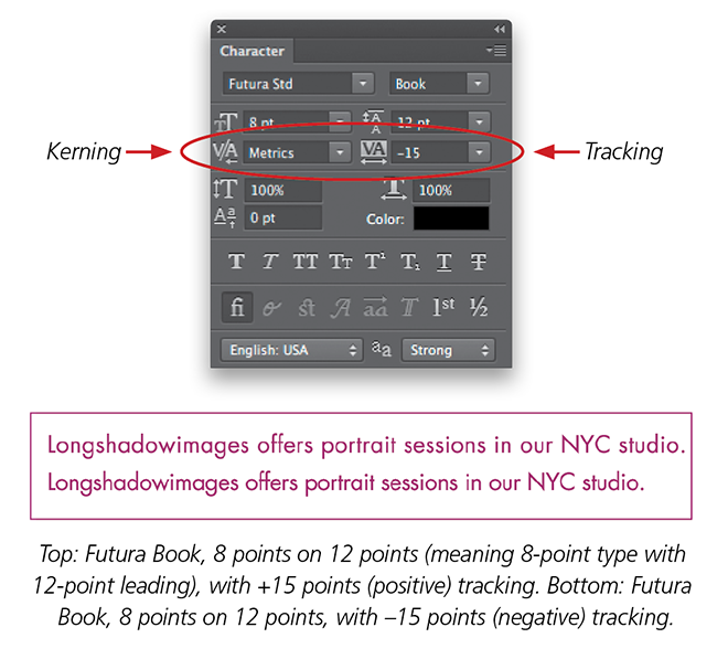
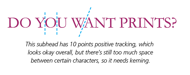
Kerning is the adjustment of space between two characters to further improve the appearance of type with smaller movements not provided by uniform tracking, or to correct problems that arise from tracking in or tracking out type. Typefaces have come a long way with their mathematical/automatic alignment, but often to create perfect spacing, you need to do some individual kerning. You do so by placing your cursor between the characters needing adjustment and changing the number in the kerning section of the Character panel, or again, using the Option (PC: Alt) key and Left or Right Arrows to decrease or increase letterspacing, respectively. You’ll find this is especially important with certain characters—W, T, K, A, etc. An uppercase W and A together will often leave a hole you “could drive a truck through,” as a typesetter would say. Negative tracking can create problems too, when letters touch and inadvertently create other letters: a lowercase c next to an l kerned too closely can look like a d; r and n too close together can look like an m;
L and I can create a U, etc. The results can be hilarious, but that’s probably not your goal.
Widows and Orphans can be tragic characters in typography, too. A widow is when you wind up with a paragraph-ending line at the start of a column or page. Orphans are single words or very short lines that appear at the end of a body of text or paragraph. They make for bad alignment and are hard on readability. Keep an eye out for these in your designs.

Dumb quotes are what designers and typesetters call the tic marks or prime marks (straight up and down, not curved), which should be reserved for mathematical use (indicating feet, inches, etc.). Use true typographers’ quotes and apostrophes (also called smart quotes). To use them, simply make sure you have the option to Use Smart Quotes checked on in the Type section of the Preferences in Photoshop. Then if you do need to list feet or inches, just turn that option off.
En dashes and em dashes are preferred over a standard hyphen in certain situations. I’ll let you ask your editor friends for the nitty-gritty (or hit up Google). In general, you use the longest dash, the em dash (named for its width matching the character m), for separating thoughts or phrases within copy—like this text here—by pressing Option-Shift-Hyphen (PC: Alt-Shift-Hyphen). En dashes (you guessed it, named for the width of an n) are used to denote “through” (e.g., “This article appears on pages 50–54”). You get an en dash by pressing Option-Hyphen (PC: Alt-Hyphen). Designers will often visually prefer an en dash to a hyphen in a title or headline because of its longer width.
There’s a world of typographic knowledge out there if you care to learn more, but mastering these few tweaks will elevate the look of your promotional pieces.
Let It Fly: Keep Designs Print-Ready
Even if you intend to only use a design for the Web, I suggest creating it as a PSD at a higher, print-ready resolution so you won’t have to re-create it should you decide to use it as a printed piece in the future. You can always size down; you can’t size back up. Each print vendor, either digital or offset, will have their own guidelines, so communicate with them about resolution, bleed, and safety, but the following are some widely used guidelines.
Resolution is something you should already be intimately familiar with as a digital photographer. Printers like to receive pieces at 300 ppi for good measure, but 250 is almost always sufficient. Again, this depends on the printer. For this magazine, most full-color (non-screen capture) images are sent to print at 212 ppi. Keep resizing in mind. If you’re dragging photos into a Photoshop layout and playing around with the scale, remember to make each a smart object before transforming it (Layer>Smart Objects>Convert to Smart Object). If your images are not smart objects, they’ll lose quality and detail with each adjustment. Best to work nondestructively. And don’t forget you’ll need to flatten your final design and convert it to CMYK before it prints. Make this conversion yourself, on a calibrated screen, so you have control over the color shifts that can and will occur. [See “Photoshop Workbench“ on p. 108.—Ed.] Always perform a Save As during these steps so you preserve your PSD for later edits, or to use as a template.
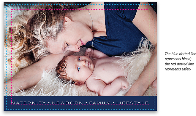
Bleed is the portion of the art that goes beyond the trim size of a printed piece, so when the paper is cut, there’s full ink coverage to the edge (white or otherwise paper colored). Usually, a 0.125″ bleed on all sides is sufficient, but this varies with press, thickness of paper, size of your printed piece, etc., so check with your printer. Yes, this means your image will be cropped somewhat if you want a full-bleed image that takes up the entire page. Design around this, extending the edges of your image in Photoshop if needed, or keep your image nonbleeding or within the safety.
Safety is just what it sounds like: the print-safe area that’s guaranteed to not be lost when a piece is trimmed. In most cases, safety is 0.25″ all around. Be certain to keep all type within this safe zone unless you intend for it to be trimmed off as a design decision. Sometimes with ganged-up designs such as business cards, you’ll have a smaller safety (such as 0.1875″ or 3/16″) to work within, giving you a little more wiggle room.

Graphic Designers improve their skills every day and every year, just as photographers do. When starting out designing your own pieces, remember the words of my favorite design icon, Paul Rand: “Don’t try to be original; just try to be good.” Pay attention to spacing, align elements on a grid, and leave no words widowed. By learning at least a few of the basic tenets of design, you’ll greatly improve your marketing and promotional pieces, in turn, improving your brand. Start with the eye for detail you already bring to your photography, add in the basics of layout, typography, and print outlined here, then build upon those skills by investing in a couple of design books. With every layout, your design sense should improve. If it doesn’t, you can always barter with a designer friend. Or better yet, hire her.
Need more design instruction? Check out The Essentials of Typography by Scott Kelby, a class on KelbyOne.com
Previously published in the May/June 2014 Issue of Photoshop User Magazine.
