It may sound like a simple thing, but you better believe that a lot of thought goes into the design of a magazine cover. Covers compete for attention next to dozens of other magazines on the rack. In this tutorial, we’ll not only take you through the process of creating a cover, but also reveal techniques that designers use to make their covers stand out.
1 [CREATE A NEW DOCUMENT WITH A BLEED]
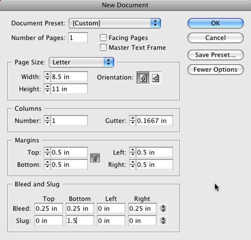
As usual we need a new document (File>New Document) to start. However, this time we’re going to do something a little different. Click the More Options button in the New Document dialog to expose the Bleed and Slug options. Almost all magazine covers bleed off the edge of the paper and we’re going to do just that. Turn off the Facing Pages option near the top and enter a 0.25″ Bleed for the Top, Right, and Bottom (click on the link icon to the right so you can enter different values in each field). Also add a 1.5″ slug at the bottom. Click OK to create your new page.
2 [TAKE ADVANTAGE OF SLUGS]
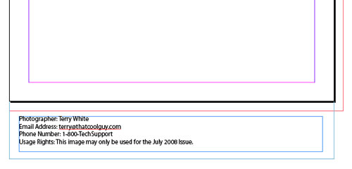
I recommend that you get into the habit of using the slug feature to store important information about the job itself. Think of the slug as a notes area that can be printed if needed. The one thing you’ll definitely want to put in this area for your magazine covers is the copyright information about the photo you’re using. Using your standard Type tool (T), you can include things such as photographer, phone number, email address, and usage rights to this area.
3 [CREATE FRAME AND PLACE COVER PHOTO]
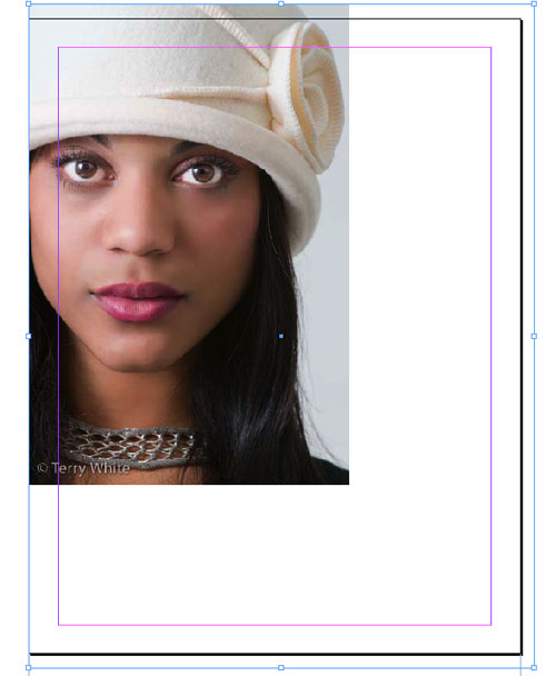
Using the Rectangle Frame tool (F), create a frame that goes to the edge of your bleed area. The cover image is usually what draws the potential reader into picking up the magazine. Things like, “Who’s that?” “Wow, check out that car!” or “He’s/she’s hot!” come to mind. Once you have your frame, use the Place command either from the File menu or Bridge CS3 to place your best photo.
4 [MAKE IT FIT]
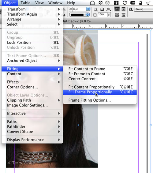
Unless you went into Photoshop prior to this step to size your photo, chances are it came in either too big or too small for your frame. What makes matters even worse is that it’s probably the wrong aspect ratio too. You want your image to fill the frame without distorting, so choose Fill Frame Proportionally from the Object>Fitting menu. While this will definitely fill the frame, it doesn’t mean that it will position the image exactly where you want it. Switch to the Direct Selection tool (A) and then you’ll be able to position the image to your taste.
5 [CREATE YOUR MASTHEAD]
The problem with this particular photo is that there’s no headroom. Photographers are often told to keep the headroom to a minimum in portrait photography. So in this case, we definitely need the masthead to be on top of the photo as opposed to behind it, with the head slightly overlapping it for effect. Create a text frame with the Type tool and key in the name of your publication. If your publication is established, then you probably already have the proper font, size, and kerning values; however, if you’re just starting out, then you’ll want to give your font choice some thought.
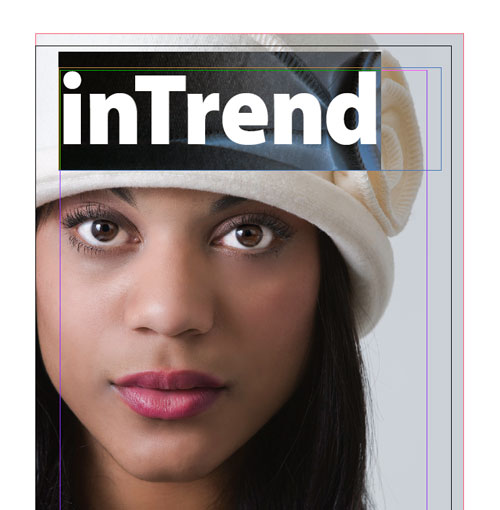
6 [CHOOSE FONT AND KERN]
Aside from your photo, the name of the publication is the next thing that people look at. So clearly it needs to be big, but it also needs to look good. Unless you’re using a script font, chances are your font will need to be kerned at the larger size. I’m using a chunky grunge font at 150 pt and tracking set to –10 in the Control panel. I also individually kerned each letter by eye for a better balance. (Tip: To change the kerning, insert your cursor between two letters and use your Option [PC: Alt] key in conjunction with your Arrow keys.)
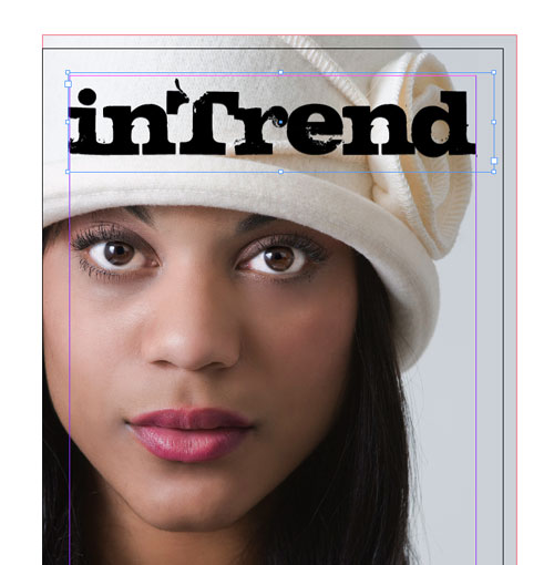
7 [ADD DATE, VOLUME INFO, AND GRAPHIC]
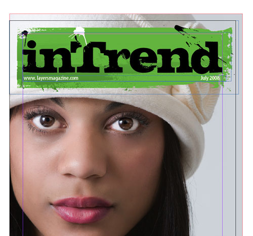
Now it’s time to put in the particulars about this issue. Usually that means the Month/Year and maybe either the volume number or the website address. In either case, you’ll want to create these in a separate text frame from your masthead for easy positioning. Don’t worry about font color at this point; we’ll get to that in a moment. You can also add a graphic element to anchor your masthead. I chose a rectangular paint smear created in Illustrator and placed it (File>Place) behind my masthead information (Object>Arrange>Send Backward) for more pop.
8 [YOUR LEAD STORY]
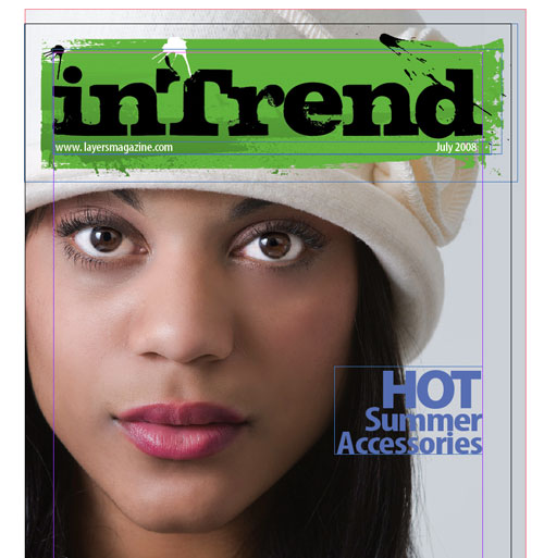
When you see someone on a magazine cover, you want to know why he or she is on the cover, so you need a teaser. This is the story that’s going to make people buy the magazine, thus this copy should be larger than any other teasers. Create a text frame with the Type tool in an area that will have the least impact on your main photo. Type your teaser in a nice large font, and never use the same font that you used for the masthead—it’s all about contrast. (Be sure to turn off the Hyphenate option in the Paragraph Control panel.) Experiment with different font sizes and combinations of upper- and lowercase words.
9 [BORROW SWATCHES FROM ILLUSTRATOR CS3]
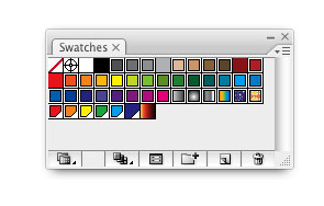
Before we go much further, we need some color swatches to start applying color to our text. If you’re good at picking colors, then you can just go ahead and create your swatches in InDesign. Truth be told, I struggle when it comes to picking colors, so I’m going to let Illustrator create my swatches for me. Open Illustrator CS3 and create a new Print document. Go to the Swatches panel and choose Select All Unused from the flyout menu. Now click the Trash icon to remove them.
10 [CREATE MATCHING COLORS AUTOMATICALLY]
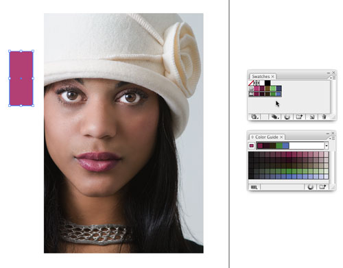
Place the same cover photo you used in InDesign into your page in Illustrator. Draw a box off to the side with the Rectangle tool (M). Now take the Eyedropper (I) and sample a color in your photo (in this example, the lips). If you bring up the Color Guide panel, you’ll now have a set of swatches that all work well with each other. (Tip: Click on the drop-down menu at the top of the Color Guide panel to view different Harmony Rules.) Choose Save Colors as Swatches from the Color Guide flyout menu to add those swatches to your Illustrator Swatches panel.
11 [EXPORT/IMPORT SWATCHES]
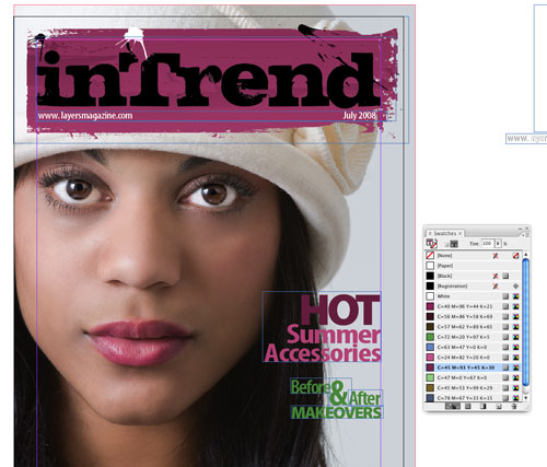
Lastly, choose Save Swatch Library as ASE from the Swatches flyout menu and choose a name and location to save your swatches. Back in InDesign, choose Load Swatches from the Swatches panel’s flyout menu and open the ones you just saved. You can now apply these “matching” colors to your text by simply selecting your text with the Type tool and then clicking the swatch you want to use. I also changed the color of the masthead element to tie it all together. Just Control-click (PC: Right-click) on the element and choose Edit Original to open and edit it in Illustrator.
12 [THE DROP SHADOW TRICK]
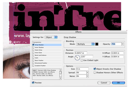
Applying different colors to your type often makes it easier to read against a photo in the background; however, designers use another trick to make their text stand out even more. Yes, it’s time for a drop shadow. The trick here is to apply a shadow with a hard edge that’s just slightly offset from the original text. Select your text frame with the Selection tool, and go to Object>Effects>Drop Shadow. Turn on Preview, and set the Size to 0 and your Offset to a small fraction, in this case .004″. Click OK when you like it. It looks great applied to the story titles as well.
13 [ADD MORE STORIES AND A PHOTO]
I prefer one main photo on my covers, but if you need to put another photo on the page, you’ll want it to be seen, but not overpower the main photo. One way to get around this is to use shapes tools to help hold your smaller photos. You can draw a shape with the Pen tool (P), fill it with color, and then lower its transparency (Object>Effects>Transparency). To see how your cover is going to look printed, go into Preview mode. You can enter/exit Preview mode (as long as you’re not in the Type tool) by pressing the letter W on your keyboard.
