

The default settings in digital photography software often make the photographer choose between detail in the sky or in the foreground. In camera, a photographer might use graduated filters to overcome these challenges, and in Photoshop, this can be fixed with masks and adjustment layers. Lightroom lets us fix these problems in the RAW file conversion process by using fine-tuned controls for color and tone mapping. Here’s an image that makes use of a number of Lightroom controls.
[If you’d like to download the image used in this tutorial to practice these techniques, visit www.layersmagazine.com/downloads.html. Image may be used for practice purposes only.]
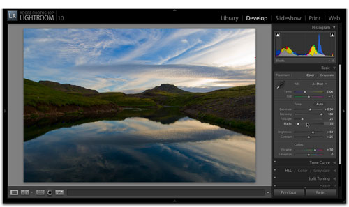
STEP 1 Select an Appropriate Image
Open or import (File>Import Photos) an image in Lightroom. In this example of an Icelandic landscape, I set the exposure to hold detail in the sky and in the lake reflection. In a default rendering of the image, the great color of the vegetation is hidden in darkness. In the Develop module, in the Basic panel, make a quick examination of both the highlight and shadow detail by moving the Exposure slider left and right. In this case, we can see that there’s great sky detail, and nice detail in the darker areas.

PETER KROGH ALL RIGHTS RESERVED
STEP 2 Set General Exposure
Lightroom lets us bring down overexposed highlights and boost underexposed areas. We’ll want to get that basic exposure set first. The art of this depends on the user knowing how much recovery is possible in Lightroom, and that only comes with experience. The clipping indicators (triangles in the top corners of the Histogram) are useful guides when making these rough adjustments, as they let you see where detail is being lost. In this case, we set Exposure to +.50.

STEP 3 Recover Highlights
Next, we want to make sure that we can get that highlight detail back. The Recovery slider works much like the Highlights part of the Shadows/Highlights control in Photoshop. The first 1/3 or so of the slider range generally only works on the most blown-out parts of the image, and as you move right, it will darken all highlights. Because we have a pretty extreme difference between the highlights and shadows that we want to hold, we set Recovery to 100.

STEP 4 Increase Fill Light
The previous step was the highlights part; now we’ll take a look at the shadows. The Fill Light slider increases local contrast in dark areas. This means that you’ll see more effect in areas with lots of dark pixels together, like our blocked-up hillside area. This is one of the most useful tools in Lightroom, saving many hours of work in Photoshop that would previously have to be done with layers. Because the next step, Vibrance, also increases brightness, we won’t take it up all the way. Let’s set Fill Light to 25 and see what happens.

STEP 5 Increase Vibrance
The Vibrance slider is similar to Saturation, but will often give better results. It’s much less apt to result in out-of-gamut oversaturation. Adobe has also built in some internal logic that minimizes the effect of Vibrance on fleshtone colors. The first time you play with Vibrance, you might think it’s cheating because it often makes images look much better with a single adjustment. Think of it as equivalent to a new film stock. Set the Vibrance to +50 and you’ll see that we get more blue in the sky, as well as better greens, reds, and yellows in the ground.

STEP 6 Set Blacks
When you raise the Fill Light, you often lose richness in the blacks of your image. We can use the Blacks slider to keep some punch in the dark end of the image. This could be done right after the Fill Light move or, in this case, after the Vibrance move. Keep an eye on your Histogram and clipping indicators as you work with the Blacks slider. Let’s move Blacks up to 10.
STEP 7 Decrease Blue Luminance
Scroll down to the HSL panel. The controls in this panel let you make lots of changes to images that would have required layer masks in Photoshop. One of the adjustments I use a lot, particularly for landscapes, is Blue Luminance. Reducing the brightness of blue pixels gives a more dramatic sky and, as you can see, increases the drama and visibility of clouds. As you decrease the Luminance, you may want to tune the Blue Hue and Saturation slightly. We’ll set the Blue Luminance to –50 and keep moving.

STEP 8 Increase Yellow Luminance
Contrary to what you might think, grass and trees are often more affected by working with the yellows than the greens. Because the darkest area of the image is in the grassy parts of the photo, lifting the Yellow Luminance gets us close to where we want to go (we used +100).

STEP 9 Check for Artifacts
While the steps above make a very nice image quickly, it runs the risk of introducing artifacts into the image. In this case, an examination at 100% (in the Navigator panel, click 1:1) shows that we have some haloing along the ridgeline. In this case, it was likely caused by an interaction between Fill Light and Recovery. The formula for making these corrections is constantly changing, so it’s possible that by the time you read this, Adobe has tuned the program to avoid this effect. In any case, let’s take a look at how we can fix this problem.

STEP 10 Adjust for Chromatic Aberration
We first want to rule out that the artifact is being caused by chromatic aberration (the inability of lenses to focus all colors identically). We’ll want to look at the image at 100% as we do this work. Open the Lens Corrections panel and start moving the sliders, paying particular attention to outer edges of the image and areas of high contrast. In this case, let’s set Red/Cyan to –13 and Blue/Yellow to +9.

STEP 11 Make a Snapshot
Although we’re about to fine-tune the image to remove the artifacts, it’s a good idea to keep a copy of this first attempt at correction. That way we can compare the new image to this version to see if we like it as much. We might also want to keep this copy around because we like it better for Slideshow use than a version that has the artifacts fixed. Open the Snapshots panel, click the + (plus sign), and name this snapshot something like “First Proof.”

STEP 12 Reduce Recovery and Fill Light
As we mentioned in Step 9, the most likely cause of haloing in our example is the interaction between Recovery and Fill Light, so let’s back those down then do some corrections with the Tone Curve. Taking Recovery down to 50 and Fill Light down to 20 gets rid of the objectionable halo.

STEP 13 Adjust Curves
Although the curve controls in the Tone Curve panel don’t have the local-area logic that Recovery and Fill Light do, they will be able to accentuate the work done in the Basic panel. We can compensate for the loss of some Fill Light by pushing the Darks to +60. We can compensate for the loss of Recovery by pulling back the Lights to –60. If you’d like to give the image more punch for straight output to inkjet, you might want to pull the Shadows down a few points, but keep an eye on the black clipping.

STEP 14 Make Another Snapshot
You can determine if you like the new version by clicking on the old snapshot, opening the History panel, and clicking between the two most recent steps. If you like the new version, create a snapshot and give it a name that means something, such as “Color-Reduced Artifacts.” This way you’ll know why you created each snapshot when you come back to them in the future.

