
Design Makeover: A Magazine for Athletes
Four Young Design Students Take on a Magazine for Older Athletes
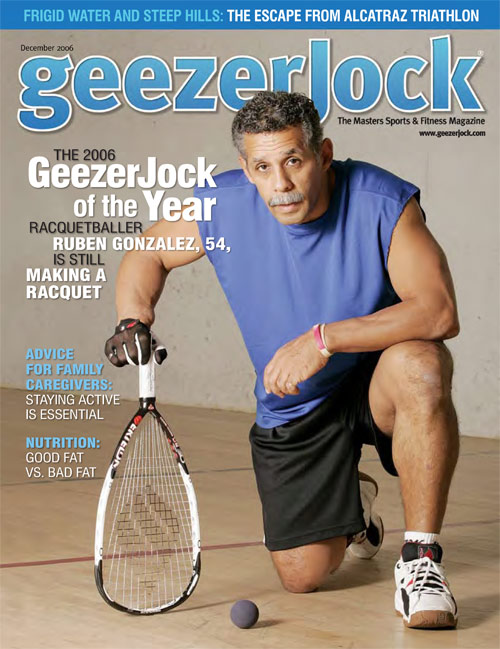
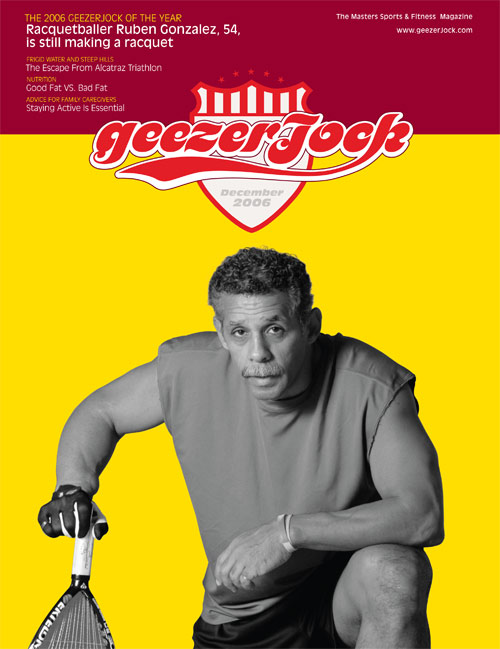
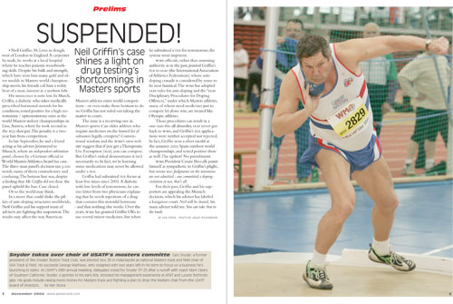
BEFORE
CLIENT: GeezerJock – www.geezerjock.com
“GeezerJock wants to emphasize fast, strong, vibrant people…so ‘photographs are very important to us.’”
GeezerJock is a magazine for aging athletes—serious aging athletes, like the 54-year-old racquetballer pictured on the December 2006 cover. Other articles introduce readers to a 59-year-old football player, a 50-year-old (female) powerlifter, and a 64-year-old triathlete. Mixed in with the inspiring profiles and sports news are roundups of exercise equipment, bits of dietary advice, and ads for knee braces and sports beverages.
The magazine has a circulation of around 51,000, according to editor Sean Callahan, and the average age of subscribers is 52. “But we say we target people 40 and over,” Sean continues, “and 20% of our readers are under 40.” The age range reflects that of the various “masters” sports leagues that exist for athletes past their prime competitive years—for some sports in which competitors peak early, such as swimming, masters competition can start in an athlete’s twenties.
The magazine started with a test issue in October 2004 and now publishes four times a year. Distribution is completely by mail, and they have no plans to add newsstand sales. “But we definitely look at the magazine as our billboard,” says Sean. They rely on the printed magazine to attract readers to the GeezerJock website (www.geezerjock.com) and to the events the organization promotes. So even though it’s not on the newsstand, the magazine has to look exciting. GeezerJock wants to emphasize fast, strong, vibrant people, says Sean, so “photographs are very important to us. They show what we’re about.”
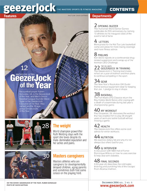
To pump up GeezerJock’s image, we called on four finalists in the 2006 Adobe Design Achievement Awards. We asked them to redesign both GeezerJock’s cover and one of the inside section openers. The Adobe awards competition attracts postsecondary students from 30 countries. For more about the awards program, visit www.adobe.com/education/adaa.
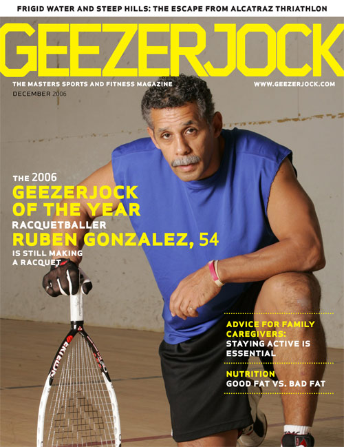
AFTER
DESIGNER: Mona Bagla – www.justcolours.net
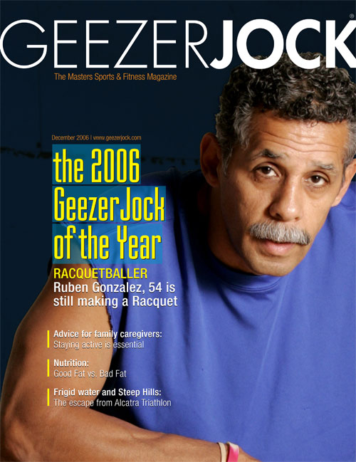

…I chose bright, vibrant colors to draw attention and give the magazine a trendier look.”
In his description of GeezerJock, the editor said, “The magazine is our billboard” and that photographs “show what we’re about.” My design for GeezerJock was based around these two statements. I wanted to emphasize the emotions and expressions of the athletes, so I cropped the images to show more of their faces. The original images showed more of the background, and I felt the real person was lost. I wanted to introduce the real person in the story, and wanted to create the feeling that you could almost touch these athletes.
With the “billboard” metaphor in mind, I chose bright, vibrant colors to draw attention and give the magazine a trendier look. Using different color bands on top helps distinguish the sections and makes the page more visually interesting. The overall effect conveys the message that this is no ordinary magazine but rather an upscale, sophisticated must-have.
The fonts are Futura for the logotype and Mekanik for all the key elements, such as the feature article title, section names, and so on. The body copy is Helvetica Condensed.
ABOUT THE DESIGNER: MONA BAGLA
2006 Adobe Design Achievement Awards finalist, Environmental Graphics and Packaging
Mona Bagla began her design career in 1992 as an interior designer in Mumbai, India. Over the years, she worked with several architects and pursued her own practice. A quest to learn something new led her to become a Web designer in 2000. After moving to the United States in 2001, Mona went back to school to pursue a career in graphic design. A graduate of Northern Virginia Community College and the Ringling School of Art and Design, she now works as an Art Director at Finelight Strategic Marketing Communications, an advertising and marketing agency in Bloomington, Indiana. Some excerpts from Mona’s book of life: Motto: “I can do it”; Loves: Color (the brighter the better); Believes: Small things matter; Goal I: Travel the world; Goal II: Design everything.
APPLICATIONS USED: Adobe InDesign and Adobe Photoshop
AFTER
DESIGNER: Jiwon Lee – www.typeandyou.com
“Understanding the visual language surrounding a subculture is crucial.”
A subculture is invisible unless it has a representative visual style. Whether the style is naturally generated by the subculture’s members or adopted from outside for a commercial purpose, it’s a graphic designer’s job to define and refine it. Understanding the visual language surrounding the culture is crucial. I relied on references to the boomers’ sports culture for my redesign of GeezerJock. For example, the new logotype suggests a team or club logo paired with a nostalgic script typeface. The logo font is ITC Motter Femina, slightly redrawn.
I wanted to give the cover a strong identity through not only the logo but also a unique treatment of the photo. I silhouetted the photo and colorized it to match the flat colored background. The color used can change from issue to issue.
Inside, I thought the magazine should give more space to the action shot, so I took the liberty of turning the Prelims opening page into a spread. The title typeface, Antique Olive, has both a very strong structure and decorative details; even though it was designed in the early ’60s, it still looks up to date. The typeface for the main text is Bembo, chosen for its legibility.
ABOUT THE DESIGNER: JIWON LEE
2006 Adobe Design Achievement Awards finalist, Print Design Single Page
 Born in Seoul, Korea, Jiwon Lee took his BFA in Visual Communication Design from Seoul’s Kookmin University College of Design in 2001. He practiced as a graphic designer with Hong Design in Korea until he moved to the U.S., where he took an MFA in Graphic Design at the California Institute of the Arts in Valencia, California. His MFA thesis was NU Project (interactive typeface design), a program for manipulating type in real time via a Web browser. Jiwon now works on interactive graphic design in the Boulder, Colorado, office of the Crispin Porter + Bogusky agency.
APPLICATIONS USED: Adobe Illustrator CS2, Adobe InDesign CS2, and Adobe Photoshop CS2
AFTER
DESIGNER: Albert J. Ignacio and Marcelo Viana
“We felt that by infusing the magazine with a more energetic design, we would be collaborating in creating a more equal representation of seniors…”
Thinking about the vibrant and exciting stories covered in the magazine, we decided to go with a bolder and more aggressive look for our redesign. We felt that by infusing the magazine with a more energetic design, we would be collaborating in creating a more equal representation of seniors who are still active athletes when compared to their younger counterparts.
The choice of vibrant colors and sans-serif typefaces came from that idea. The logotype is based on Foundry Gridnik, modified in Adobe Illustrator to make it more condensed and to tweak some character shapes, such as the R-J connection. For the headline type we used Apex Sans SmallCaps Bold, a clean and direct face but with a few idiosyncratic characteristics.
For the inside pages we wanted a clean, easy-to-navigate layout that would facilitate the access to information while keeping the magazine inviting and attractive. We set up a simple grid, stripped out any unnecessary components, and made sure the type was straightforward. Keeping the body type fairly quiet allows the headline and imagery to really pop. Bleeding the P in “Prelims” off the top of the page mimics the logotype and also contributes to the sense of openness. The overall look and feel is somewhat modern and is unexpected for such a magazine.
 ABOUT THE DESIGNERS: ALBERT J. IGNACIO AND MARCELO VIANA
2006 Adobe Design Achievement Awards finalists (with teammate Yaeger Moravia Rosenberg), Print Design Multi-Page
Albert J. Ignacio and Marcelo Viana are graduates of the graphic design program at the California College of the Arts in San Francisco. When they realized they shared similar visions of their roles as visual communicators, they decided to work together and, with others, formed the collective Miniature Horse. Their work in art and design is guided by the principles of solidarity, democracy, and equity.  Miniature Horse has won the AIGA Enrichment Scholarship in 2005 and the CCA Graphic Design Thesis Award.
APPLICATIONS USED: Adobe InDesign CS2, Adobe Illustrator CS2, and Adobe Photoshop CS2

