
From Photographs to Photo Graph
Let’s face it-graphs can be boring. When you think of pie charts and bar graphs, exciting is not the word that comes to mind. If you’ve ever been in a business meeting or a class where the presenter used a graph, you know what I mean.
Graphs and charts don’t have to be boring. In fact, with these techniques, you can turn a dull presentation into an exciting one.
Beach Photo Graph
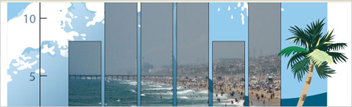
Instead of having a grayscale or even a color bar graph, let’s use a raster image (in this case, a JPEG downloaded from istockphoto.com) to fill the bar graph. The photo should be relevant to the subject of the bar graph.
1
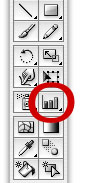
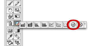
On the Toolbar, select the Column Graph tool. It should be the default graph tool-if not, click-and-hold the graph tool to see more options. Next, click-and-drag to draw out a graph, dragging it out to whatever size you need. Alternatively, click once and enter in the size of the graph.
2
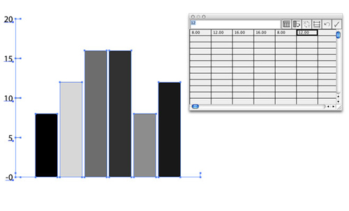
Enter in the values for the graph in the spreadsheet that pops up. As you enter in values, the changes will be reflected in the graph. When you’re done, click the Close icon on the upper-left hand corner of the spreadsheet.
3
Now let’s add a pattern to the Swatches palette to fill the graph with it. Go to File>Place and select a file to fill the graph. Make sure the Link checkbox is unchecked. Click Place.
4
With the Selection tool (V), click-and-drag the placed image into the Swatches palette (Window>Swatches). Click the placed image and delete it off the canvas, since we don’t need it anymore. Click the graph to select it. Click the new swatch in the Swatches palette to fill the graph with the image. I added title, names for the columns with the Text tool and used two vector elements to add even more interest.
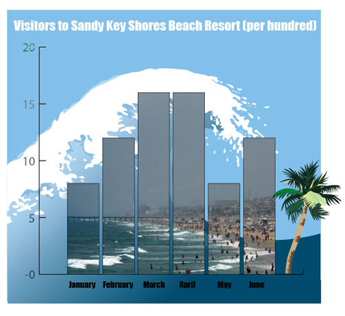
©ISTOCKPHOTO/ TOM YOUNG (BEACH PHOTO), LISA MCDONALD (PALM TREE), HELLE BRO CLEMMENSEN (WAVE)
Using the Transform Palette to Assign a Photo for Each Category
With our next example, instead of filling all of the bars with the same photo, let’s fill each pie piece with separate photo. We can make the each photo relevant to the pie piece it fills.
1
First, let’s click-and-hold the Graph tool on the Toolbar. This opens up a few more options. Click on the Pie Graph tool. Like earlier, click-and-drag to draw the pie chart or click once and enter in a size.
2
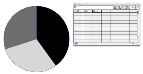
Next, enter in the values as usual. I entered in 40, 30, and 30 for percentages, though you don’t have to make the total equal 100 unless you want to do a percentage instead of a normal value. Close the spreadsheet.
3
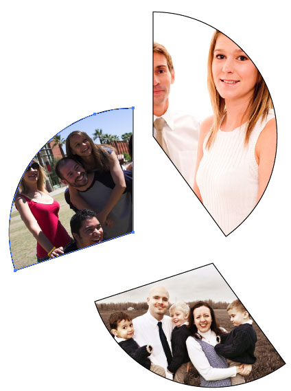
Now let’s add our photos for the patterns. Go to File>Place and select an image file to place onto the canvas. Repeat this for every photo you need and drag each into the Swatches palette (Window>Swatches). Click and delete the placed images on the canvas, since we don’t need them anymore.
4
Next, and this is very important, select the Direct Selection tool (A) instead of the Selection tool. It is to the right of the Selection tool on the Toolbar. Click on the canvas somewhere empty to de-select the graph, if it is highlighted. Click on one of the pie pieces. This should select only that piece, instead of the entire pie.
5
Select the corresponding pattern in the Swatches to fill the piece with that photo. Click another piece, and repeat the process for each piece. Unless you have a very small pattern that repeats a lot, you’ll have a problem with the photos matching up within the shapes like I do.

6
If you try to move the photo within the shapes, it just moves the shapes and the tiled photo swatches remain in the same place. Here’s how to fix this. Using the Direct Selection tool, move each piece so that the photo fits in the it nicely and makes sense. This will probably require you to take apart the pie chart-that’s okay.
7
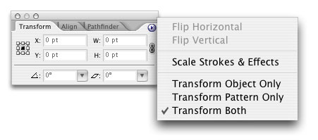
Once the photos are nicely showing through, go to Window>Transform. Click the upper-right arrow to get the menu. Transform Object Only should be selected by default, and that’s why we were only moving the object and not the pattern. Select Transform Both. Now click-and-drag the pie pieces back together. The patterns should move with the object.
8
Next, let’s have text wrap around the pie for a unique labeling. We need to draw a circle around the pie, but that’s difficult to do using the usual click-and-drag technique from one corner. Instead, with the Circle tool selected, move the cursor over the center of the pie chart (where all the pieces meet in the middle). Hold Option (PC: Alt) and click-and-drag to start drawing a circle out from the center. Hold Shift to make it a perfect circle. Once the circle is a little bigger than the pie chart, let go and the circle should be drawn perfectly.
9
Click-and-hold the Text tool to bring up more options. Select the Type on Path tool, third from the left. Click on the outside edge of the circle and enter the text, using spaces in between the titles to correspond to the pie pieces.
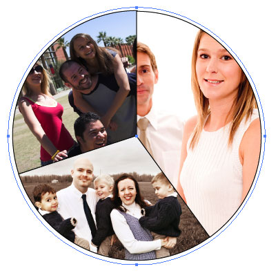
10
For a finishing touch, I added a gradient background rectangle and added some relevant vector art. I also added some text with the values with a 70% opacity (Window>Transparency) for each pie piece.
 ©ISTOCKPHOTO/ETHAN MYERSON (COLLEGE STUDENTS), PHIL DATE (SINGLE PROFESSIONALS), KEVIN RUSS (FAMILIES), ROYCE DEGRIE (GRASS), SIMON OXLEY (PLANTS)
