
Designing with Type
Type is the Tie Between Author and Reader
Different projects call for different type choices and combinations. Are you working on a book? Is the book a novel, or is it a coffee table book that includes lots of pictures and explanatory text? Are you working on a brochure, a catalog, a magazine, a poster, an invitation? Each project has different requirements as to readability, legibility, and impact. Your first task is to determine which part of your project needs readability, which needs legibility, and which needs impact.
• The lengthiest text needs to be the most readable.
• The text that people will skim through, such as items in a catalog or headlines in a newsletter, needs to be the most legible.
• The text that’s designed to catch someone’s eye in a hurry and create an instant impression needs to be the most impactful.
One project might include all three of these possibilities. For instance, you might have an annual report that has lots of boring copy that you hope people will read, many headlines they’ll skim through to find what they want, and some brave text here and there (like on the cover or section heads) that will grab their attention in the right way—”right” meaning in a way that’s appropriate to that particular audience.
So let’s begin by looking at some guidelines—then we’ll branch out from there.
READABILITY
Readability refers to how easy it is to read long blocks of text. The more text, the less you want the typeface to grab the reader’s interest; the more unbroken the text, the more invisible the typeface should be. For instance, in a novel a reader wants to get to the end of the novel without being interrupted by quirky letterforms; we don’t want anything to take us out of the story and make us think of something as silly as the interesting shape of the letter g.
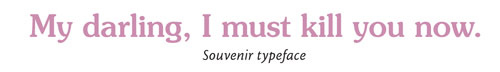
I once read a novel that was trying to be very intense and heavy, but I couldn’t take it seriously. For days I wondered why I was feeling a disconnect between the words and my reaction to them. It finally dawned on me: The book was set in Souvenir, a casual, friendly face. The unspoken impression the type gave me was in total contradiction to the words. It was very disconcerting.
The most invisible typefaces are in the oldstyle category, possibly because when that typeface structure was set in hot metal in the 1500s (based on ancient Roman letterforms), there wasn’t anything except books to use the type for—no billboards, no magazine ads, no packaging. Whether it’s because over the centuries we have become most familiar with oldstyles or because the actual structure of the letterforms is more conducive to the reading process, oldstyles turn out to be the easiest to read in long blocks of printed text.
[For more on type categories, see “Choosing Type Combinations,” You can find the article at http://www.layersmagazine.com/category/columns—Ed.]
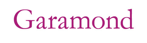
In my computer books, my point is to communicate clearly. Some of what I have to communicate is technical and complicated, so the last thing I want to do is make the typeface obnoxious. I use Garamond, Warnock, or Jenson, and my preference is still toward certain versions of Garamond as being the most readable face on the planet.
But in my book Sweet Swan of Avon: Did a Woman Write Shakespeare?, I allowed the oldstyle font, Brioso Pro (a gorgeous Robert Slimbach font from Adobe), to use some of the special ligatures. I realize they can be slightly distracting, but I allowed them for three reasons: (1) The book being on a historical topic, I appreciated the historical flavor the ligatures added to the look. (2) The book isn’t a novel—it includes a vast collection of documented data so I intentionally broke up the text into digestible chunks so a reader can feel comfortable skimming through the pages and dropping in anywhere. Because the text is in these smaller chunks, I could get away with the added attractions. (3) The subtle distinction of these special letterforms helps make the book less intimidating to read. Thus I was willing to accept the distraction of the ligatures.
Design for the audience
Starting with the premise of classic oldstyle for lengthy copy, expand your text face options depending on the project. Is it a formal project, such as an annual report or scholarly tome? Use the most invisible typeface you can find. Is it a newsletter? You can get away with a typeface with a little more character. Is it a brochure? Depending on who it’s for, you can experiment with quite a range of text faces and even move into sans serif fonts because the columns are typically narrower in a brochure.
In this magazine you’re reading, the body copy is sans serif (Cronos, also a Robert Slimbach font). Now, you might think that a magazine has lots of text and should qualify for an oldstyle font in the body copy, but this particular magazine has many small blocks of text broken up with lots of graphics, which means you don’t need a typeface as invisible as Garamond. Notice also that the text you’re reading has generous amounts of linespacing, which makes the blocks of sans serif much more inviting than usual.
Also, the small, open sans serif gives Layers a very trendy, upscale look, which is extremely important in its market and is an acceptable trade-off for “perfect” readability. A magazine such as Scientific American will never be set in trendy, small, sans serif with lots of leading because it just wouldn’t be appropriate for their particular audience, which includes a lot of people who believe that to be truly scientific, articles must look slightly dull and pedantic. My book Sweet Swan of Avon has been criticized by professional scholars because it doesn’t look scholarly (which, frankly, to me is a compliment, and professional scholars aren’t my audience).
We all have perceptions of what certain types of information should look like, and as a designer you need to take that into consideration. It’s a great exercise to take one particular piece, say a magazine article, and design it to fit a variety of magazines where each has a different market and different expectations from their readers. The magical design feat is to make something look terrific while staying within the boundaries of expectation.
LEGIBILITY
While readability refers to how easy it is to read lengthy text, legibility refers to how easy it is to instantly recognize short bursts of text such as headlines, freeway signage, catalog entries, etc. It turns out that sans serif faces are the most legible for short bursts of text. Apparently the clean and distinctive letterforms make it easier for the words to go straight into our brains when we need to get small amounts in a hurry.
Among sans serifs, you can find very strict, simplified forms, or ones that have a more casual edge to them by adding curves and quirky characteristics. As with readability, however, the quirkier it is, the less legible (that’s why you don’t see freeway signage set in Peignot). The extreme light weights and bold weights of sans serifs are also less legible.
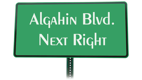
How often do you see a freeway sign set in Peignot?
All caps
Remember, type set in all caps reduces the legibility and the readability of any text. We don’t read letter by letter—we read in groups. Entire words go into our eyes, straight to our brains. We recognize those words by their shapes. Once you put words in all caps, all their shapes are the same and we have to go back to reading letter by letter.
I’m not suggesting that you never use all caps—just keep the reduced legibility in mind. Sometimes, of course, your design calls for those rectangular forms of words in all caps, and you know they’re not impossible to read. If you can put into words why that rectangular form is important to your design and why it’s okay to accept a little less legibility/readability, then carry on with all caps.
IMPACT
For the display text that constitutes the main elements of something like a book cover, poster, invitation, brochure, etc., it can be even more daunting to find the right typeface because it’s that typeface that’s going to set the mood. Jeepers, what a responsibility! One thing you must do is trust yourself—you know what feeling is evoked from a particular typeface. Your gut reaction to a chosen font is probably the same as that of your audience.
But what I encourage you to do is experiment beyond your initial reaction to type choices. For instance, perhaps you have to create a poster for a local gym. You might initially think you need a macho, thick, strong, bully face. But today, gyms cater to all sorts of different clientele—one might be limited to just women, just gay people, just mothers and pregnant women, just macho males, just seniors, etc. What is it about this gym that the owner wants to emphasize? The friendly atmosphere, the female-ness, the high energy, the low energy? Find the essence of what you want to evoke, not the surface cliché.
A high-tech brochure doesn’t need those awful “computery” fonts, the ones that look like computer type on old PCs from the ’70s. Apple, one of the highest tech of all high-tech companies, for decades used a slightly condensed version of an oldstyle Garamond font originally created in about 1530. Rather than evoke a “computer” look, they went for a look that captured classic elegance, elitism, stability. Lots of white space helped, too.
High-tech, high-end products tend to have a crisp, clean, sharp look (that’s one reason the Microsoft logos look rather dorky—they’re soft and blobby). Children’s products tend to be colorful and energetic; new age products tend to have warm, earthy tones; scientific and scholarly works tend to be very conservative. But you already know that—what you need to do is take those ideas that you already know and experiment with typefaces that convey that feeling in slightly new or different ways.
In praise of platitudes
Keep in mind, however, that sometimes the obvious is the best solution. With platitudes, everyone knows exactly what you’re talking about: blood dripping off the type on a horror poster, a lovely script for a wedding invitation, grungy type for a skateboarding poster. There’s a certain comfort for the reader in knowing what to expect; so don’t try to make everything so new and different that the basic meaning gets confused. Things become clichés precisely because they work so well.
GENERAL TYPE GUIDELINES
Below is an encapsulation of the general guidelines for the basic categories of fonts that I mentioned in last issue’s article, “Choosing Type Combinations,” and how to apply them to projects.
Oldstyles are great for long, uninterrupted text such as in a book or lengthy articles in magazines. The more invisible (the fewer quirks), the more sedate will be the overall impression. The smaller amounts of continuous text you have in the project, the more you can use quirkier oldstyles.
Moderns are less desirable for lengthy text because those thin strokes at body copy sizes (9 to 12) get too small to see or print clearly; they’re best used when you can set them a little larger than body copy or use them in small amounts for special text. Set large, moderns have a stunning classic beauty.
Slab serifs are a little too heavy for lengthy text, but create a good strong impression for smaller amounts of text such as newsletters or brochures. When set really large, slab serifs can be gorgeous and classy and make strong statements. Experiment with the light weights and heavy weights in combinations.
Sans serif, as I mentioned earlier, is terrific as headlines, signage, bullet copy, etc. It can also be used for short blocks of body copy, especially if you add extra linespace and try to keep the lines a little shorter in length. You might have an individualist desire to set a novel in sans serif, but I suggest you control yourself if you want people to actually read it. Save your anarchy for something else.
Scripts and decoratives are like cheesecake—absolutely divine in small doses. But these fonts are the most fun to play with! And because they’re so powerful in small doses, they’ll create a strong impact with minimal use. You might use a decorative font in your main title—try picking it up again in initial caps or special headlines as an element of repetition and unity.
EXPERIMENT
Once you have an idea of how to narrow down your choices, experiment. Go to someplace like Veer.com or MyFonts.com where you can choose categories of type, and then enter your own text and point size so you can see how different faces might look.
For body copy, take a paragraph of text from your project, set it in at least five different fonts, and narrow it down to a couple that you like. Then using those two or three faces, experiment with the point size and leading values. Even such miniscule changes as tenths of a point in both font size and leading values can change the look of the piece. Don’t rely on your monitor when making a text face decision—you must print out the samples before you make a final choice.
Make a decision as to what part of your design will set the tone, the impact. It might be the title, or the headlines, or the body copy. For instance, in a lengthy article that you want people to read, start with the body copy and its settings. From there, work with the guidelines in “Choosing Type Combinations” to find typefaces that will combine beautifully with your chosen face, plus support the essence of what you want to convey. For a poster, experiment with fonts for the largest text on the page before you begin to make decisions for the smaller text. Choose some fonts you might not think are appropriate and see what happens.
There’s no quick-and-easy solution to font choices, and having thousands of fonts to choose from doesn’t make it any easier. Keep in mind, however, that there isn’t one perfect choice, but thousands of perfect choices. With a conscious eye and thoughtful combinations, your problem won’t be to find the perfect solution, but which one of your many perfect solutions to choose for the final piece.
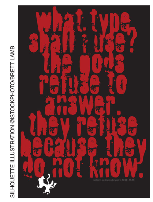
Sometimes “overwhelming” is the right choice. Font is Fragile.
CREDIT FOR SILHOUETTE ILLUSTRATION IN POSTER: ©ISTOCKPHOTO/BRETT LAMB
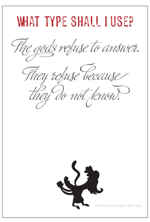
Remember those guidelines about combining fonts—the most surprising combinations can be just what you need. Fonts are Profumo and Ministry Script.
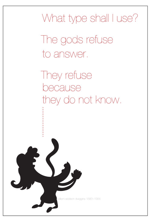
How about a nice ’70s look, when the only typeface designers would use was Helvetica? Font is Helvetica Neue UltraLight.
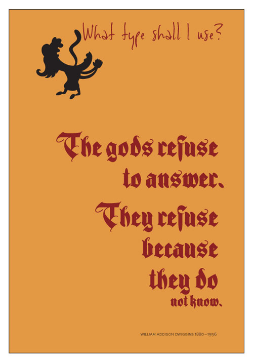
Sometimes the most obvious solutions can work. One font looks like a designer’s handwriting (Viktorie) and the other font is based on the type used in the first Bible in print (Ferox) in 1454.

