
This Designer Re-imagined Iconic Logos Using Hand-Lettering Techniques

In a world filled with sleek corporate logos and eye-catching billboards, graphic designer Sara Marshall’s work stands apart. The 23-year-old, New Zealand native recently received her Bachelor of Design from the Auckland University of Technology and she’s now working as a full-time freelancer. When it comes to her art, Marshall states, “I love creating, designing, and working with my hands.”
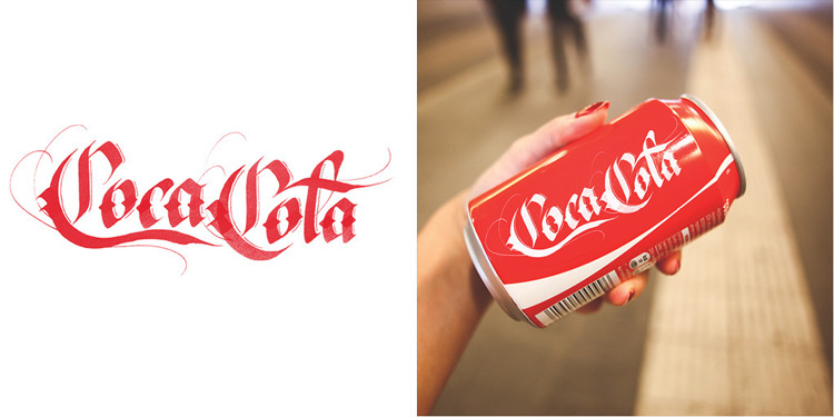
It’s this handmade approach that led to the designer’s latest project: the Brand by Hand series. This personal project aims to explore the distinctive attributes that define major brands like Coca-Cola, Burger King, and YouTube. “I’ve been describing it as an experimental lettering project, which it really is because I hadn’t done much lettering before this project,” explains Marshall. “But, personally, I think it ended up becoming what it was trying to parody, which is hilarious – the ultimate outcome really.” What resulted is a style that juxtaposes the formal, inflexible corporate world. Instead, viewers are greeted with hand-lettering that’s textured, ornate, and welcoming.

When discussing what inspired her to create Brand by Hand, the artist says, “It’s becoming more and more apparent lately that I’ve always had an affinity for letters. But I also had to make the most of the opportunity to do my graduate project with Dr. Peter Gilderdale. He’s an incredible calligrapher and I was so lucky to be able to work with him. There was no question that I would do anything other than lettering of some kind for that reason! The project was a reaction against popular graphic design projects that took brands and did ‘minimalist’ redesigns of their packaging. So it’s also partly that I thought it’d be funny to create frilly and overly decorative versions of famous and successful logos.”

While her initial idea did arise from a keen sense of humor, Marshall’s work does indeed bring up several important questions: Is there a place for hand-lettering in the digital world we’re currently living in? Will this old-fashioned art form withstand the test of time? “Someone once had to draw, by hand, the letters that progressed into the typeface you’re reading this in, so I think the importance of lettering speaks for itself. Our alphabet has transcended the lifespans of several languages already. That makes me think we’ll continue to draw and create letters probably/hopefully for as long as we’re communicating. Even if that’s not in the languages we know today,” states the graphic designer. “The most common argument for the importance of lettering in design is for the reason that there isn’t a typeface for every use. This makes a custom lettering solution desirable. Also, because it’s awesome.”

While Marshall’s objective was straight to the point, executing her plan was another matter entirely. Since this was her first lettering project, she faced many obstacles, which took a lot of practice to work through. Since this was also a deadline-based, university project, time was not on her side. She especially struggled when working to digitise her work. However, the creative persevered by practicing her craft and maintaining a perfectionist’s attitude.

“I mostly used brushes, brush pens, and Pilot parallel pens because that was all I had (and all I knew that existed) – this was my first lettering project so I started out as a novice. Then it was mostly a matter of practice. I only had a couple of months to complete the project so I had to spend all day, everyday, drawing and redrawing the logos to come up with the versions you see. It took hundreds of attempts at getting each letter right – that FedEx arrow was no accident,” the 23-year-old revealed. “Then I’d take the best version of each letter and string them together to make a complete design (in some cases anyway, the Skype one had to be done in one shot). And I always did the lettering work in black ink on white paper for the greatest contrast. This is important when you go to digitise it. The gradients in the Skype logo were done in reverse, so it would be the right colour when I inverted it. I coloured them in Photoshop so I could get perfect matches to the original brand colours. That was really important for them to retain their brand image.”

As she went through this comprehensive process, Marshall wanted to incorporate every brand’s actual aesthetic. The FedEx logo was tailored so that it symbolized speed, while the Skype one embraces the shape of a cloud. As for Burger King’s logo, it has a similar vibe when compared to the original. By including each brand’s personality and superficial traits, the artist managed to make her designs both original and iconic.

The creator also has an abundance of advice to offer those who are interested in a similar career path. “The letterforms of the Latin alphabet are over 2,000 years old. There is a wealth of history and information behind their design that will inform your practical skills more than you might think – doing some visual research is important! And where you look for this material is crucial, too,” Marshall advises. “Good penmanship and calligraphy skill used to be one of the hallmarks of a cultured person. When writing skills were essential, handwriting was extremely important, which is why it was taught in schools. But now that we tend to type instead of picking up a pen, anything done by hand is applauded. Quality or not. I’m the first to admit that my own project is a good example of this. I love that so many people have found my project inspiring. The extra attention it has brought to lettering arts is awesome. However, for anyone serious about pursuing lettering – I’d recommend centering your visual research outside of social media like Pinterest or Instagram. There are so many calligraphy and lettering greats who should have your attention instead! To name a few everyone should check out (this list got out of hand and is by no means complete but a place to start): Doyald Young, Job Wouters, Jean Larcher, Marian Bantjes, Herb Lubalin, Louise Fili, Jessica Hische, Dana Tanamachi, John Passafiume, John Downer, Hermann Zapf (did some calligraphy as well as type), Keith Morris, Julian Waters, John Stevens, Denis Brown, Niels Meulman. And to drop some Kiwi names, Sarah Maxey and Kris Sowersby have done some excellent stuff. And, of course, my lecturer Peter Gilderdale.”
Images used with permission.

