
Design Makeover: Outdoor Recreation Enthusiasts
Magazine for Outdoor Recreation Enthusiasts
BEFORE
Client: BlueRibbon Coalition www.sharetrails.org

“We’re not wedded to the traditional. Basically what we’re looking for are vastly different options, so that we can choose a direction.”
BlueRibbon Magazine is a 35-page monthly published by the BlueRibbon Coalition in Pocatella, Idaho. This national nonprofit works to educate the public about responsible recreation on public lands and acts as an advocacy group to keep outdoor recreation available to the public.
The four-color monthly goes out to the Coalition’s 11,700 members, who include snowmobilers, dirt bikers, ATVers, four-wheel drive owners, equestrians, mountain bikers, rock hounds, and prospectors. Many businesses and organizations also receive the publication, and the group sends complimentary issues to people in the forest service and the federal government’s Bureau of Land Management. According to membership manager Mary Jo Foster, the organization is evolving from a mostly male-dominated group to one with a more equal gender distribution. She says that readers range in age from late teens to retirees.
Once a tabloid, the publication morphed into a magazine about four years ago, designed in-house. But the coalition now wants to enhance the appeal of the magazine by streamlining and modernizing it. “We’re not wedded to the traditional,” explains Foster. “Basically what we’re looking for are vastly different options, so that we can choose a direction.”
For budgetary reasons, BlueRibbon relies on amateur photography, usually submitted by a member, because it doesn’t have a photography budget. But month after month of nature shots lends a sameness to the covers that makes them indistinguishable. The opening editorial page has its own challenges: It’s crammed with a table of contents, a list of staff members, a list of Board members, and a letter from the BlueRibbon Coalition’s Executive Director. This page sometimes runs in color and sometimes in black and white, so the design has to work both ways.
We asked three designers to take a fresh look at BlueRibbon Magazine and update it inside and out.
AFTER
DESIGNER: Craig Maher www.modulationdesign.com
“I thought a clean, bold, and playful look would appeal to the magazine’s readers, and I wanted to create a new, less-condensed logo that would have more impact.”
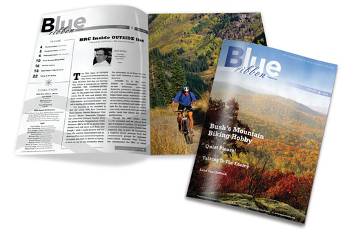
My goal was to give the magazine a fresh, contemporary, open feel and to create a memorable, iconic insignia. I thought a clean, bold, and playful look would appeal to the magazine’s readers, and I wanted to create a new, less-condensed logo that would have more impact. At the same time, I also wanted to retain some of the old identity, by keeping the blue color and stylized fonts, so that readers would still recognize the magazine.
For the logo, I chose Avenir, a clean, legible sans serif font with a nonabrasive feel. For the word “ribbon,” I selected Berthold-Script because it suggested a ribbon. I used Rockwell, a sporty, bold font, for the coverlines because it blends well with Avenir.
Because readers often report that they can’t tell one issue from the next, I used a photograph for the cover that I shot at Bear Mountain National Forest in New York State. I thought it would help to vary the covers and represent a region other than the west.
For the opening page, I went with a black-and-white layout. Overall, I reorganized and cleaned up the page to make it easier to navigate visually. I set up a three-column grid and carried over some of the type families from the cover to give a sense of editorial continuity. I also tried to inject some fun into the layout by adding ornaments, such as trees, the sun, and mountains, which help break the grid and lend an organic aspect to the page. Plus, I decided on large, bold numbers for the Contents to help readers find the cover stories.
ABOUT THE DESIGNER: MODULATION DESIGN
 Craig Maher, a freelance designer who works out of New York City, studied at the School of Visual Arts in Manhattan. He currently combines freelance work for various advertising agencies and design firms with solo projects he handles through his own design studio, Modulation Design. His most recent project, Stand Ye Steady, is a DVD/CD packaged set for the West Point Military Glee Club. Maher received two Graphis New Talent Design awards in 2005. Maher also composes music, recently completing the music score for Brooklyn Lobster, a newly released film starring Danny Aiello and Jane Curtin. He draws his graphic design inspiration from the works of Hipgnosis, Bauhaus, and Stefan Sagmeister.
APPLICATIONS USED: Adobe Illustrator CS, Adobe Photoshop CS, and Adobe InDesign CS
AFTER
DESIGNER: Jeannette Gutierrez
“I brought the relationship between the parent organization and the magazine into the masthead, linking the Coalition’s logo to the magazine’s and strengthening the brand identity of both.”
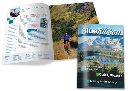
Because the client is a nonprofit with a small budget, it’s important that they be able to reproduce their new design without having to rely on an outside designer. A design that depends on Photoshop wizardry and custom spread layouts isn’t going to maintain its integrity in a low-budget environment. So I tried to keep things simple and consider how the client might set up an in-house production environment to produce a professional-looking publication.
I propose that they invest in a copy of Adobe InDesign because the program has special features that allow a nondesigner to give things a designer’s touch. For example, I drew the colored squares with the program’s simple Rectangle tool. The only special technique I relied on was the built-in InDesign drop shadow, which I used on the cover to make the blurbs more readable. To make in-house production easier, the cover art remains a full-bleed photograph. BlueRibbon’s challenge is to vary the cover shots enough to enable readers to distinguish between issues. They can achieve this by sometimes using nature close-ups and sometimes using shots of equestrians, off-roaders, and the like enjoying the outdoors.
I freshened the magazine’s logo with clean, readable Chocolate Script, but combined it with a sans serif to give it presence. I brought the relationship between the parent organization and the magazine into the masthead, linking the Coalition’s logo to the magazine’s and strengthening the brand identity of both.
ABOUT THE DESIGNER: JEANNETTE GUTIERREZ
Jeanette Gutierrez graduated from the Center for Creative Studies in Detroit with a degree in Industrial Design. A Detroit native, she has worked in corporate communications and as a marketing art director for Consumers Energy, Automotive News, and Waldenbooks. She is currently Creative Director/Art Director at Group 55 Marketing in Detroit. Group 55 (www.group55.com) is a full-service advertising and marketing agency specializing in branding and identity for a national clientele.
APPLICATIONS USED: Adobe InDesign CS2 and Adobe Photoshop CS2
AFTER
DESIGNER: Andrew Bass www.adbassdesigns.com

“I decided to concentrate on giving the publication a look resembling a consumer-style recreation magazine, making it more stylized, upbeat, and fun.”
To get a better understanding of BlueRibbon and its organization, I studied their website and looked at other outdoor recreation titles in the market. I decided to concentrate on giving the publication a look resembling a consumer-style recreation magazine, making it more stylized, upbeat, and fun.
My overall design had to be easily replicated by the staff, so it couldn’t be overly complicated. I chose to give the magazine a clean but rugged look, beginning with a more readable logo using the Acropolis typeface. BlueRibbon has a limited photo budget so creating more upbeat and varied covers requires some ingenuity. I suggest using free photo sources, such as the National Park Service. For this cover, I used a portrait of George W. Bush, playing up the coverline for a little levity. With many of the cover images donated by members, alternating nature shots with members’ action shots on snowmobiles, horseback, ATVs, and so on would create more variety. Cheltenham, the typeface I chose for smaller coverlines and body text, gives the text a clean feel without competing with Acropolis. Images on the inside pages can be punched up more by using silhouettes, to give the pages more energy.
ABOUT THE DESIGNER: ADBASS:DESIGNS LLC
 Principal and creative director of adbass:designs LLC, Andrew Bass has more than 16 years’ experience developing effective visual communications. Bass, who prides himself on his ability to assemble photographers, illustrators, and designers to give a unique identity to visual media, has applied his creative methodology at corporations, such as VNU Business Media USA and Essence Communications, and at smaller companies and nonprofits such as TaylorMade Media and The Blues Babe Foundation.
Bass holds a BFA in Communications Design from Pratt Institute and has won several design awards: American Graphic Design, American Society of Business Publication Editors, The Ozzies, and American Business Media (Neal Awards). He’s also an adjunct instructor of typographic design at the New York City College of Technology.
APPLICATIONS USED: Adobe Photoshop CS2, Adobe Illustrator CS2, and Adobe InDesign CS2

