
Welcome to Part 2 of my series on creating custom photo books in Lightroom 4. As I mentioned in Part 1 (click here to read Part 1), creating these custom photo books can be one of the most rewarding parts of your entire photographic process because it gives you another "leg" to your photography experience. When you hold your first printed pro-quality photo book in your hands (and Lightroom lets you easily create just that), you will be totally hooked and you'll be making them from here on out.

In Part 1, I talked about putting the images you want in your photo book into a collection and finishing them off (in the Develop module). Then, heading to the Book module to choose your book's final size, paper quality, and stuff like that, and then using Auto Layout to at least get your images into the book. Now, we're going to learn how to tweak those layouts.
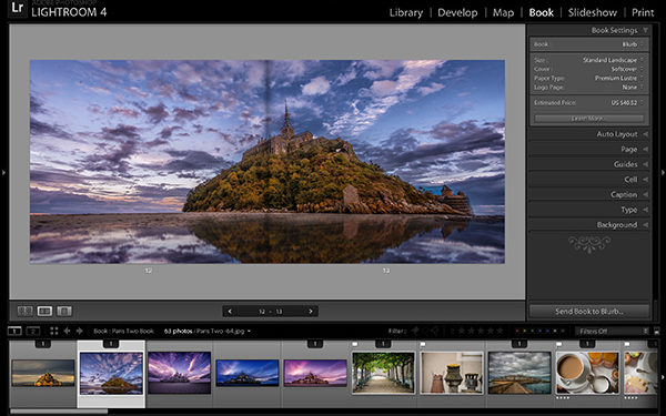
Seeing Your Book Layouts
There are actually three different views for your book, and you'll need to know these for layout purposes, so let's cover them first. What you see here is Multi-Page View, and you choose the different layouts either by going to the left end of the Toolbar and clicking on the different icons (shown circled in red), or using the keyboard shortcuts—the shortcut for Multi-Page View is Command-E (PC: Ctrl-E).

What you see here is Multi-Page View, and you choose the different layouts by going to the left end of the Toolbar and clicking on the different icons
The next layout view (and the one you'll probably wind up working in the most) is Spread View, which shows you a full two-page spread as large as possible (it's keyboard shortcut is Command-R [PC: Ctrl-R]). Since people viewing your photo book will see it in two-page spreads, this view is particularly important because the images on these two pages have to look good together.

Spread View
Finally, here's Single Page View, and although you probably won't work in this particular view all that often, if you need to add text to your book pages, this view is the one you'll want (so you can clearly see the text as you're entering and formatting it. Its keyboard shortcut is Command-T [PC: Ctrl-T]).

Single Page View
Tip: Those Keyboard Shortcuts Are Easy to Remember
If you're working on a standard U.S. keyboard (a QWERTY keyboard), you'll notice that these shortcuts are right in a row—Command-E, -R, -T—and all right next to each other in a line across the top row, so you can toggle them, and remember them, really quickly.
Changing a Page's Layout
In the bottom-right corner of each page is the Change Page Layout icon (shown circled in red here), and when you click on it, a pop-up menu of Lightroom's built-in templates appears (and thankfully, there are a bunch of them!).

To change the current layout of your page, first you choose how many photos you want on it (let's just stay with one for now, since that's all we have on the page). To choose a new layout, just find the layout template you want and click on it, and the page updates automatically. Here, I switched to the full-bleed layout, so the image fills the entire page edge-to-edge.

Working with Page "Zoom"
When you add an image to a page, it actually appears inside a cell, and to change the size and position of your image, you change the position of your cell guides (if you're used to working in either the Slideshow or Print modules, you're already familiar with the whole cell concept). Well, by default, your image is set to fill the entire cell, and when you choose a full-page edge-to-edge layout like you did a moment ago, your image zooms in a bit, so it fills the entire page. If you don't want it to fill (you'll have gaps at the top and/or bottom of the page), you can zoom out. Just click on the image and a Zoom slider appears at the top of the cell (as seen here). If you drag the slider all the way to the left, it reveals more of the photo (returning it to its original aspect ratio), but it also leaves a gap(s).

This Is Not Such a Bad Thing
Doing this on a full-bleed page template like this is not a bad thing, because now you can just click-and-drag the image up/down the page to exactly where you want it, without trying to find a page template that places the photo where you want it (as shown here, where I've dragged it to the bottom of the page).

It Works Similarly for Edge-to-Edge Templates
Since your photo is zoomed in by default for the regular template, you can also reposition your image within the page (well, within the full-page cell, if you want to be technical about it). Just click-and-drag side to side on the image (as shown here, where I changed the position of the umbrella by dragging it to the left).

Now Let's Try a Two-Image Layout
Click on the Change Page Layout icon and let's create a two-image layout (I chose this layout with two pano-like stacked horizontal photo cells). Of course, I only have one photo on the page, so that photo gets put into one of the cells and the other cell is blank (as seen here).

To get a second photo on the page, just go down to the Filmstrip (along the bottom of the interface; if it's not visible, press F6), click on the photo you want, and drag-and-drop it right onto that cell. Now, you can click-and-drag it to position it and zoom in to crop the image tighter (if you zoom out, the image won't fill the cell any longer and you'll have a gap, which usually doesn't look good, but it's your call).

Tip: See How Many Times an Image Appears
You see in the image here how the thumbnail for the image we just used has a number "2" at the top (down in the Filmstrip; it's highlighted)? That's a warning telling you that this image appears two times in your book, so you may want to go and find out where else it appears and remove it from that other page by clicking on it and hitting the Delete (PC: Backspace) key. It will just remove it from that page, not from Lightroom (or from any place else in your book).
The Perils of Working in Single Page View
Once you press Command-R (PC: Ctrl-R) and switch to a two-page spread view, you might realize that this two-image layout you just created for this one page doesn't work very well with the page that you have opposite it in the spread. So, as soon as you place a photo into an empty cell and you think it looks good on that page, switch to a two-page spread view and see how the spread looks as a whole before you start tweaking that second photo. It might save you a little time and aggravation.
In Part 3, I'll cover how to customize the Auto Layout feature, which we touched on back in Issue #1. It's a big enough subject that it calls for its own article. See you back here then. Cheers.
This article originally appeared in Lightroom Magazine published by KelbyOne.com.
