
Color Management in the Creative Suite 2
You hear a lot about color management, and if you’ve heard Adobe talk about the Creative Suite 2, then you know that they’ve really spent a lot of time thinking about how to make color management easier and more effective across the entire suite. On the flip side of the coin, however, you need to understand what to do with color management and what it really gives you the power to do. Along with the wealth of information out there, there’s also just as much misconception about what exactly color management is supposed to do.
There are many ways we see color. We see colors reflected off of magazine pages and billboards; we see colors in light emitted from television screens, monitors, and cell phones; and colors are “seen” and “re-represented” by capturing existing objects with our digital cameras and scanners.
With all these mediums, the definition of a “color” changes depending on the device. And by “definition,” I mean how the color is perceived by our eyes, not the digital settings that define the color.
So if you have a color you’re trying to reproduce, you can play around with the color settings and eventually you’ll get one device’s color to look exactly like another device’s color. The problem is, who has that kind of time?
Why colors “change”
Each manufacturer has a different way their devices represent color. Two different digital cameras set side-by-side to take the same shot will still represent the subject differently. One brand may have a greater sensitivity for capturing color, while another brand is better at capturing detail and tonal range. The same is true for printers, monitors, and televisions, even though we can feed these devices the exact same colors.
In addition to manufacturers and devices, there are also two color spaces to keep in mind. Our eyes see and process colors in RGB. This is the same color model for all devices that emit light. However, for any printed surface, we see reflected light. Unfortunately, after colors are reflected from a surface, the color properties do not mix the same way anymore; meaning red and green no longer make yellow. The four-color process was developed as a way for us to re-represent colors we see in the natural world. This color model, CMYK, is the standard by which we mix colors on surfaces (remember blue and yellow making green in grade school?).
Lastly, we have colors that are premixed, just like getting a custom gallon of paint at your home improvement store. In commercial printing, there are a few manufacturers widely used such as Toyo (www.toyoink.com), Pantone (www.pantone.com), and TRUMATCH (www.trumatch.com) to name a few. However, these colors still need to be represented using reflective color properties.
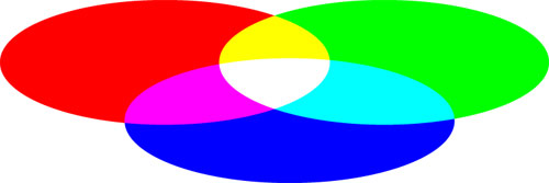
RGB is what our eyes see and the color model for devices that emit light.
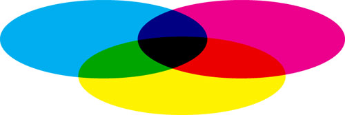
CMYK is used for the printed page—the color properties in reflected light do not mix the same as colors in emitted light.

Swatches show examples of premixed colors.
The fact that we design and develop our files on a computer means that all colors we specify are represented in RGB on the monitor, even if the color is representing a CMYK color. Scanners and digital cameras also need to use the RGB color space because they are capturing light, the same way our eyes do. This means that all workflows involving printing on physical surfaces must involve RGB as well as CMYK.
Setting up your project
The solution to changing colors is called “color profiles.” Most devices have a color profile that describes how that particular device represents a series of colors. These profiles typically follow a format provided by the International Color Consortium (ICC) as a way for manufacturers to define how their device represents color. These profiles are used in conjunction with your color management software to create a set of “rules” for how colors are supposed to behave. Adobe’s color management software, built into the Creative Suite 2, uses these profiles along with its own color settings files (CSFs) to create workflows for you to choose from.
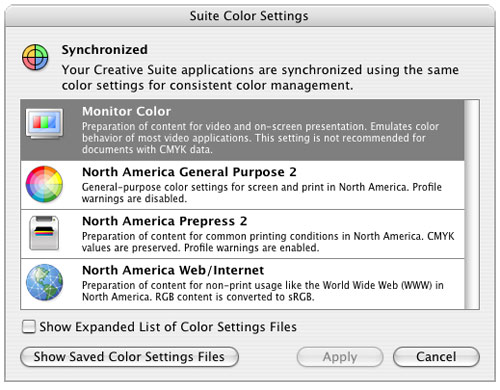
The easiest way to choose a color management workflow is to use Adobe Bridge. When you select the Bridge Center in the Favorites tab, you’ll see the Color Management button in the bottom center. You may also notice that this button will give you instant feedback on whether the applications in the suite are synchronized, meaning, they are all set to use the same CSF files. If they are synchronized, Bridge will tell you so. If not, that means at least one of the applications is set to use different color settings.
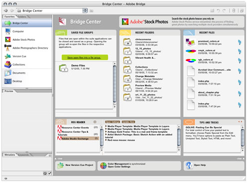
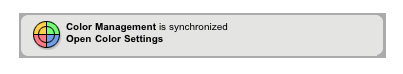
The Bridge Center lets you know immediately if your Adobe applications are synchronized or not.
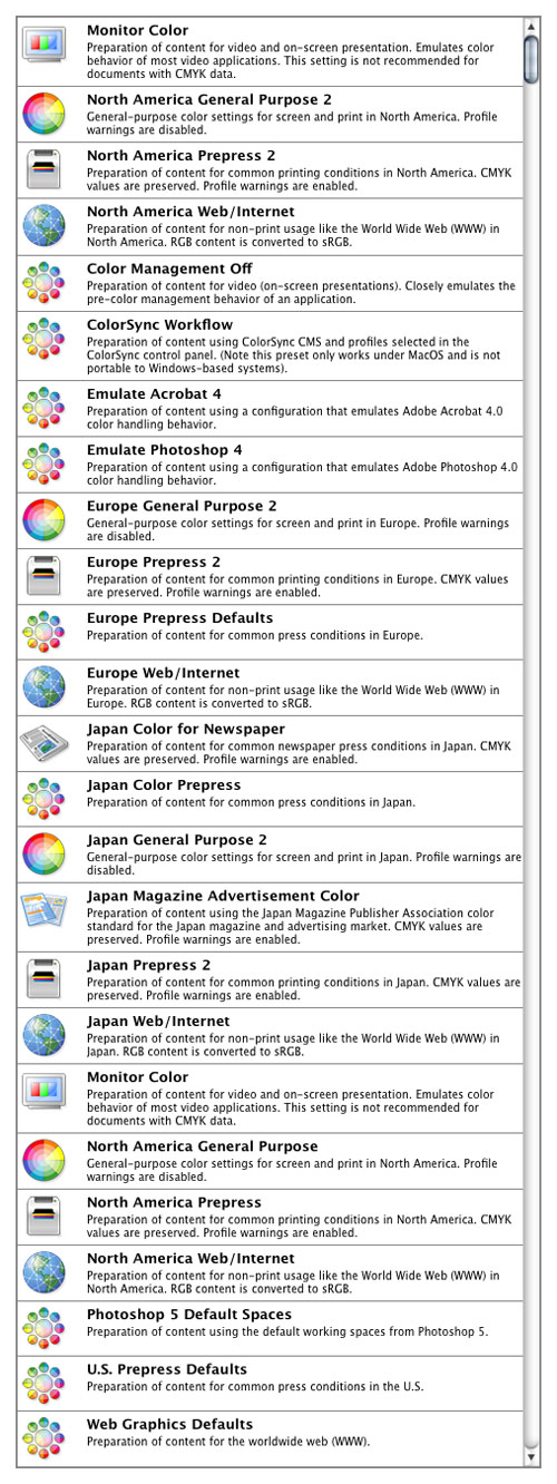
To make a selection for color management, click the Color Management button, and you will see a list of predefined color setting files. These predefined settings include brief descriptions to help you decide which settings are best for your project. Adobe has provided a list of the most commonly used settings in the publishing industry. In addition, if you select the option for Show Expanded List of Color Settings Files, you’ll see even more settings.
And, of course, you can make your own color settings as well. To create your own color settings file, start with any Creative Suite application and choose Color Settings from the Edit menu (in Acrobat, select the Color Management category in Acrobat>Preferences [PC: Edit>Preferences]). Once you create and save your custom settings, you’ll see this new CSF option available in all of the other Creative Suite applications. What’s more, you can use Bridge to deploy these settings to all of the other applications, as well.
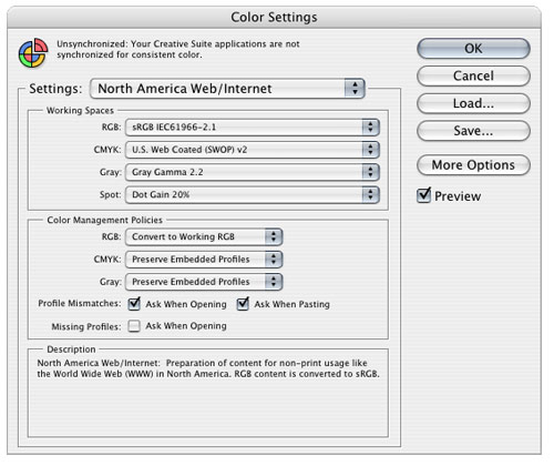
The “anatomy” of a color settings file includes your Working Spaces and your Color Management Policies. A Working Space tells the Creative Suite how you would like the different color models to look both onscreen and when printed. In the top option of the Working Spaces is the RGB setting. This will control how the monitor represents your colors. Adobe recommends using sRGB for Web graphics and Adobe RGB for printing (since it includes some printable colors in its gamut). The CMYK settings are used when printing your documents. These settings are supplied based on standard commercial print conditions.
Color Management Policies are set to represent files that were created before you started with color management—files from cameras, scanners, or from other people. When you’re using Color Management and you get a file that has no profile, or a different profile, you can tell the Creative Suite applications how you would like to represent the colors in that file. Your options include converting the colors to your settings, preserving the settings in the file, or preserving the numbers and ignore linked profiles. This process will give you more consistent color representation across a wide range of files and sources.
Evaluate your colors and begin management
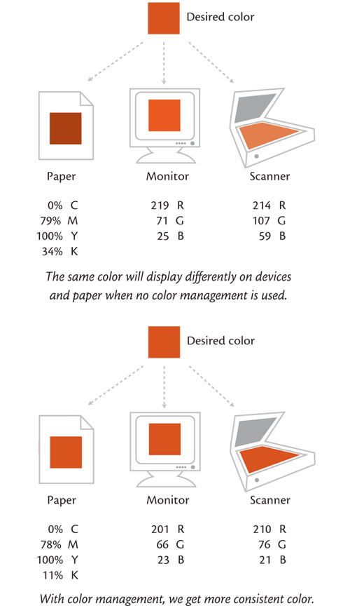
Now that we have chosen some settings, now what? Well, it’s important to realize that these settings do not change the information in your files. You can think of color management as “stylesheets for color.” The actual numbers that represent a color in a file are constant; however, the color settings you choose affect the way that color is represented onscreen and on paper. It’s the same idea as changing the font used for a headline; the actual words in the headline remain the same, just the display looks different. In the example shown below, we have a color we would like to be represented both onscreen and on paper, and to be accurately captured from our scanner. As we discussed earlier, each device is representing the same color a little differently.
After choosing a color workflow that best represents the equipment you’ll be working with, you can start to see how the device profiles are taken into account when applying your color management settings. In the example, we are still replicating the same color; however, the settings for each device have changed as they attempt to replicate the desired color. Again, the original color has not changed from the previous example; but the color combinations for each device have changed.
You can make a few test prints and screen adjustments to fine-tune your settings if you wish, and use Bridge to set the rest of the applications. It’s also a good idea to talk with anyone you share files with, such as your commercial offset printer, video production house, or Web development company, and see if they have specific color profiles or color management in place that you can take advantage of when preparing files for their equipment.
Apps without color management
Sometimes you may need to use applications that do not have their own color management component. For example, the current version of Flash doesn’t support color management—directly. If you have color management activated at your system level, you can successfully translate colors by making sure the operating system is set up with the same RGB profile that you’re using in the Creative Suite. On the Macintosh, use the Color tab located in the Displays pane of the System Preferences; for Windows use Adobe Gamma in the Control Panels.
Once these settings are consistent, you can save a file from Photoshop, Illustrator, or from GoLive as a SmartObject and import the resulting image into Flash. The display of the colors in Flash will match the display of the same colors in the rest of the Creative Suite. This will be the case for most applications that support color settings provided by the operating system.
When you get a new piece of equipment, such as a new color printer that supports RGB, or a new fancy widescreen LCD monitor, how do you add the device into your workflow? When adding a new device into a color management workflow, the device will be treated as if it supports the current profiles. So for example, a new monitor and printer by a manufacturer who already has established profiles will most likely have built the same color management into their device. If you find, however, the device does not “plug-and-play” nicely into your color workflow, there are a few things you can check.
1. Check with the manufacturer about their support for ICC profiles. Find out which profiles they support.
2. Refer to the ICC website at www.color.org to see if the device is listed.
3. Check Adobe.com (www.adobe.com/support/downloads) for updated ICC profiles that may include your new device.
If you still need to tinker with the device’s performance, you may have to create your own custom CSF. From any of the Creative Suite applications, go to the Edit>Color Settings (for Acrobat, go to Preferences>Color Management). Under the RGB and CMYK pull-down menus, make alternate selections based on similar devices or color spaces. For the Gray and Spot options (for printers), choose dot gain amounts that will correct your test prints. When you select Save, name your profile; it will then be available to all other applications in the Creative Suite. You can even use Bridge to set all applications to your new color settings at once.

