
Color Control, Exposure, and Creativity
Editor note: This article is from the December 2014 Photoshop User Magazine
The photography session is finished and the camera, props, and lights are all put away. The work is complete. Not really. Postproduction includes refining the exposure, color correction, and creativity—all in Adobe Camera Raw.
Once the shoot is complete and the RAW files (you are shooting RAW, right?) have been downloaded and backed up, the rest of the work begins in earnest. There’s the necessary color corrections and exposure refinements, then the fun begins: exploring the depths of photographic goodness in those versatile RAW files.
Color First
The best place to start is with neutral color. Eliminating highlight color cast is a snap in both Camera Raw and Lightroom. The key is having a colorimetrically neutral target in the photograph. The standard tool is the 24-patch ColorChecker brand target from X-Rite. Model Jennie Carroll is holding the ColorChecker Passport that I carry everywhere my camera goes.
The white patch (#1 sampler) reads R:243, G:244, B:240; the middle gray (#2 sampler) is R:138, G:140, B:132; and the black (#3 sampler) shows R:37, G:37, B:36. In each instance, the red and green are brighter than the blue. The color cast is slightly yellow.
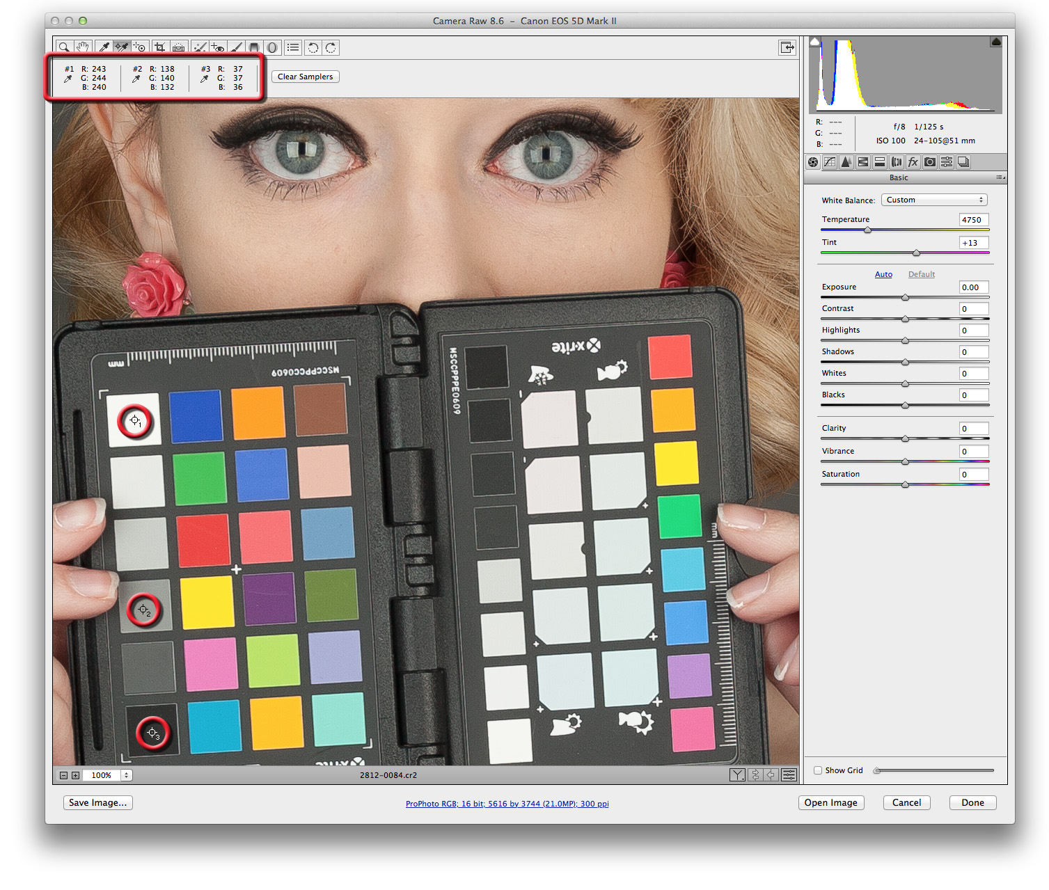
Correcting the highlights couldn’t be easier. In Camera Raw, tap the I key for the White Balance tool, or press W for the same tool in Lightroom. Click on the patch just below the white one on the ColorChecker. That’s it.
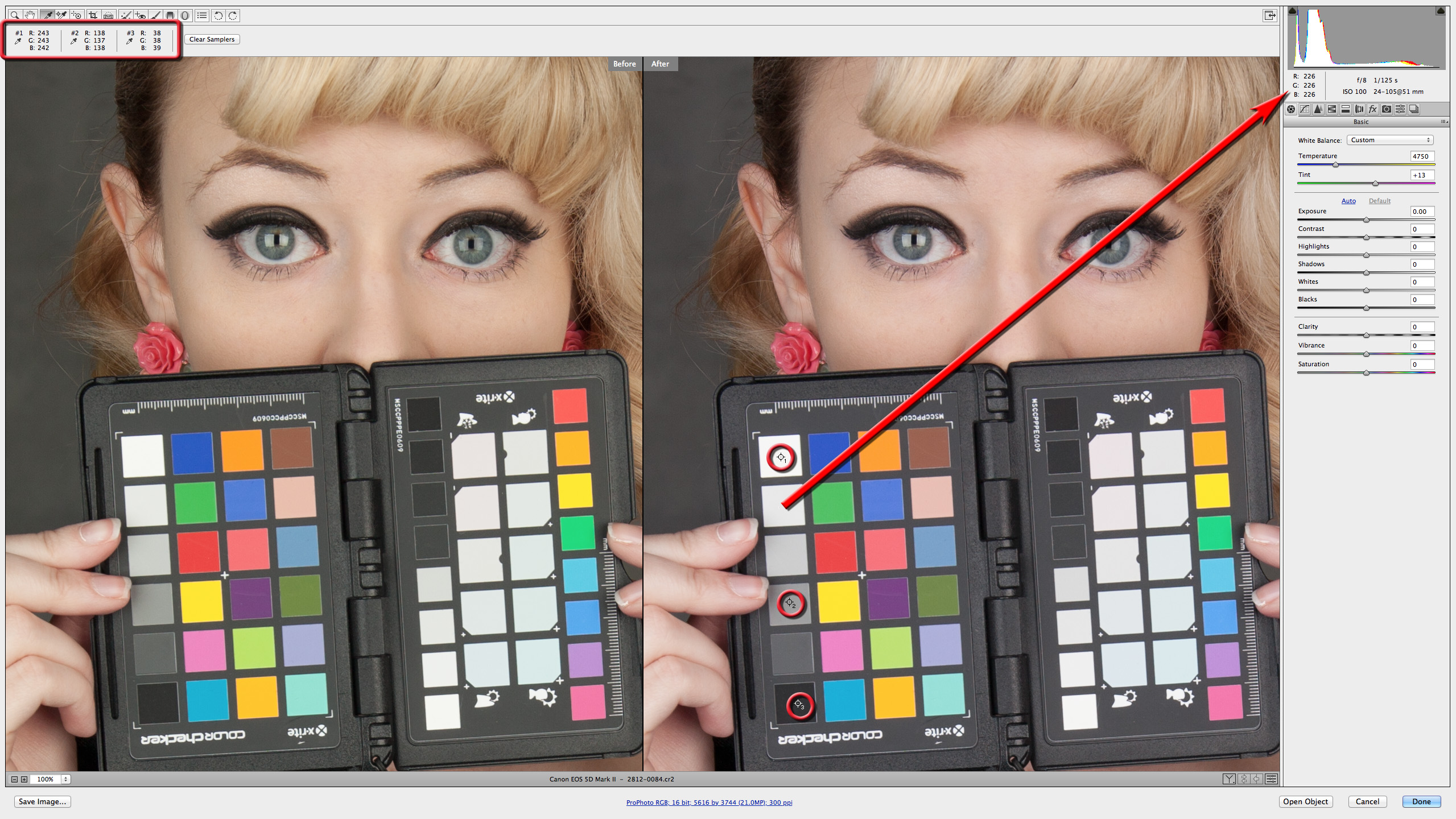
After correction, the numbers are much closer to neutral. Sampler #1 is now R:243, G:243, B:242; sampler #2 now reads R:138, G:137, B:138; and #3 shows R:38, G:38, B:39. The White Balance tool was clicked on the patch immediately below the #1 sampler to neutralize the photograph. Their numbers (R:226, G:226, B:226) are the same, so that patch is completely neutral. A one-point difference on the other patches will be more than close enough for all but the most hypercritical color outputs. There are tools in Photoshop that can make the numbers match perfectly. The difference in the example is subtle and yet quite noticeable when they’re compared. Camera Raw 8.6 has before and after comparisons in the preview window. Press Q to cycle through the preview modes.
Refining Exposure
Light meters, particularly incident meters, provide a great starting point for a correct exposure, one that accurately reveals the true tone of the subject. Making certain that the photograph is optimized for reproduction is part of the work in post. A lot of photographers refine exposure using the histogram. Others rely on their monitors (that are calibrated) and judge the result by eye. While that may work for some, the human eye, for all its sensitivity to amounts of light and color, is forever prejudiced by the human brain. The brain does auto exposure and color correction, saying to us, “That looks great! It must be the right color and exposure.” Unfortunately, no matter how skilled, the eye and brain combination have a really hard time getting exposure and color right.
Correct Exposure by the Numbers
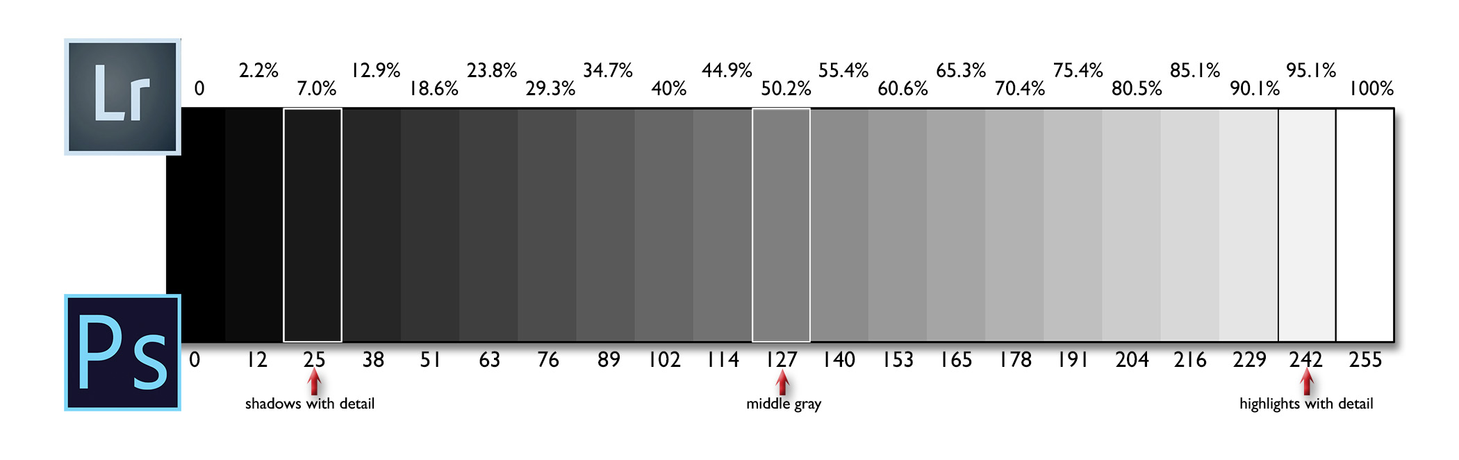
Computers are great tools for getting technically correct exposures. These are done by comparing readings of known reflectivity patches against reproducible detail in the highlights and shadows. Generally speaking, highlight values with detail fall between 242 and 248 in Photoshop and 95.1% to 95.5% in Lightroom. The shadow detail threshold is 25 for Photoshop and 7% in Lightroom. Readings below will very possibly be completely black.
It’s important to maintain shadow detail when working in Camera Raw. As tempting as that Contrast or Blacks slider may be for creating drama, resist them at least until you print. It’s easy to increase contrast and deepen blacks in Photoshop. It’s impossible to get details in the shadows back once the file is converted to pixels.
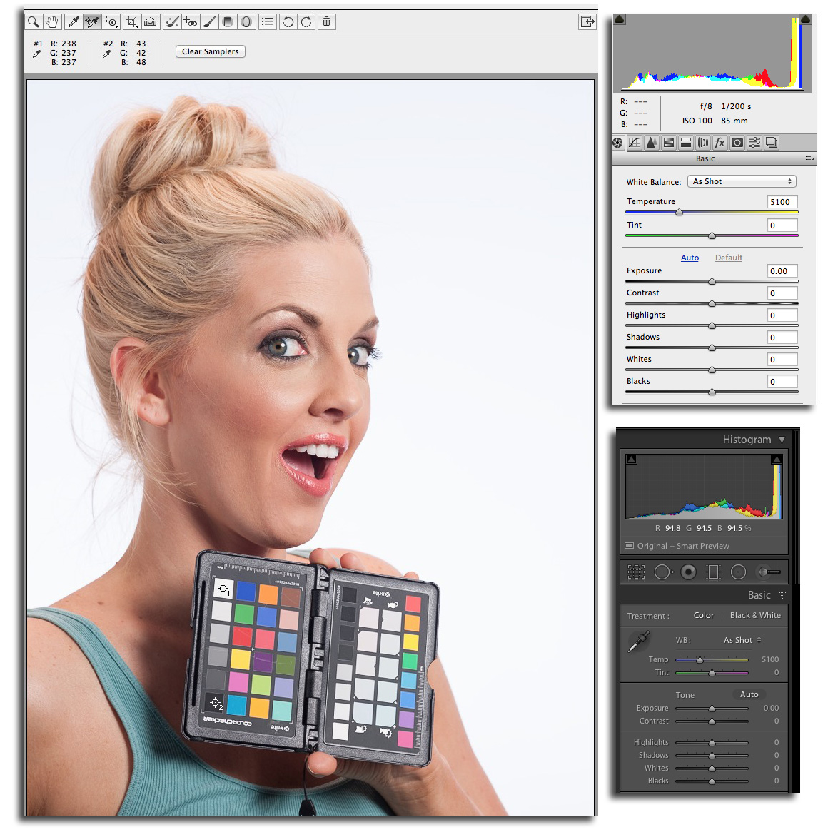
This example shows the ColorChecker Passport being held by our model Hope from Presence Models in Atlanta. The exposure of her looks good. The histogram looks good. The numbers tell a different story.
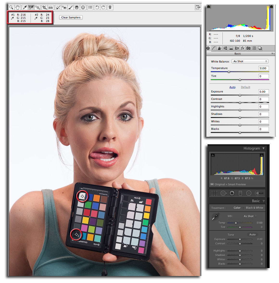
Look at the results for the two color samplers on the white patch (#1) and the black one (#2). Values of R:216, G:215, B:215 are considerably under the target of 242-ish (I say “ish” because these are guidelines, not absolutes). The values in #2 (R:24, G:23, B:28) are so low there would be almost no shadow detail. What’s going on here?
Two things. First, the light is coming from Hope’s left. The incident meter measuring the exposure was aimed directly at it. The exposure on the camera, shown under the histogram, is f/8 at 1/200, ISO 100. Second, the ColorChecker is pointed directly at the camera. It’s seeing less light than the meter did. It’s important that the ColorChecker is angled toward the light the same way the meter was and not at the camera.
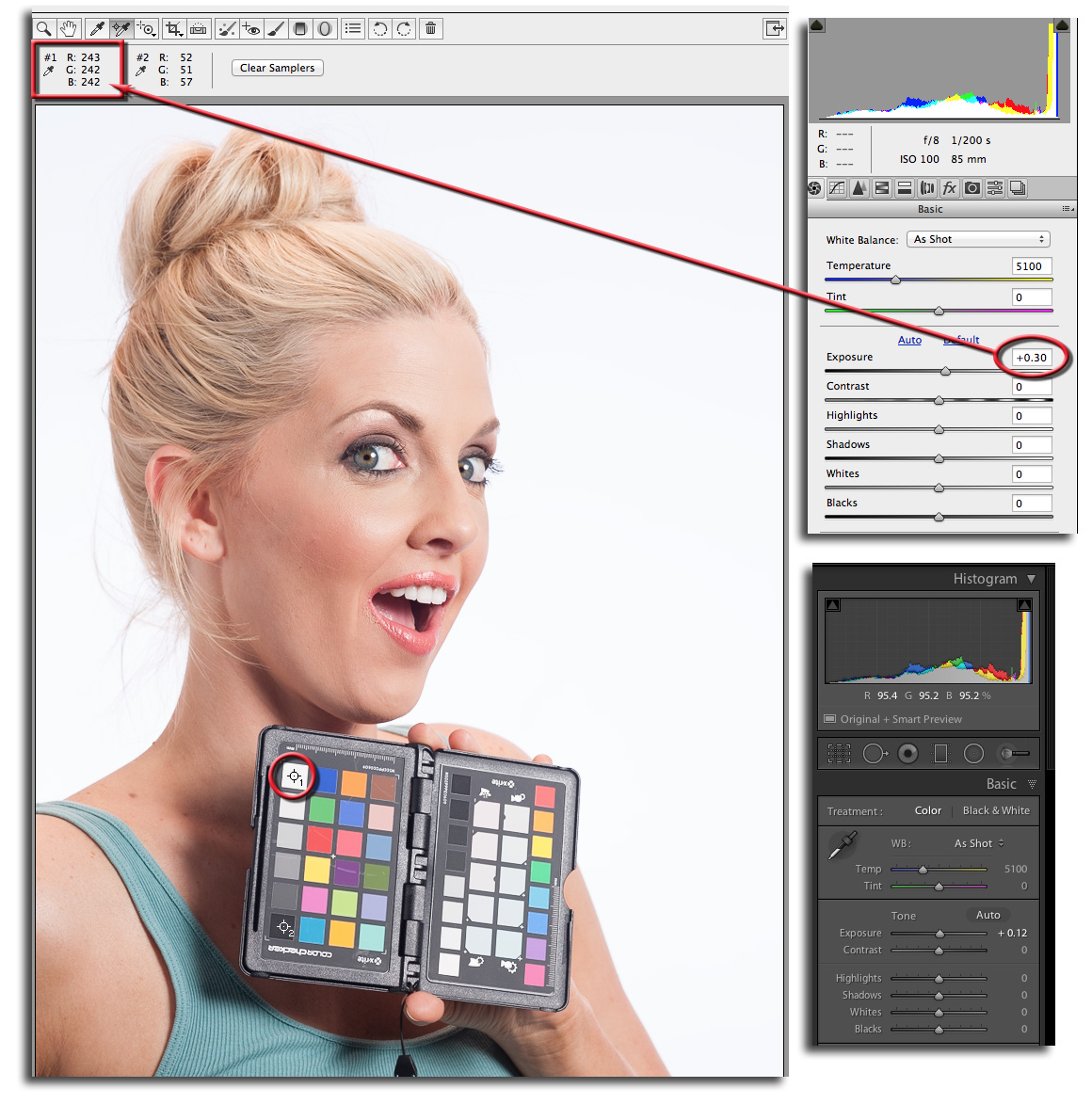
When Hope holds the ColorChecker at the source of light, the highlight numbers are now just below the lower highlight with detail threshold. Notice that Hope’s left side is the same brightness in both of the photos.
Tweaking the Exposure Slider
The last part of the exposure refinement is to get the numbers up to approximately 242 or 95.1%. This guarantees there will be detail in those important highlights, such as a bride’s wedding gown. I’ve moved the Exposure slider to +0.30, or an increase of a third of a stop.
The shadows benefit, too. They’re now in the 50s, giving lots of detail to the dark side. All that’s left is to apply the tweak to the rest of the photo shoot. I allow myself plus or minus a half-stop adjustment on exposure before changing the camera. Any more than that and I’m wasting the depth of data in my capture.
Diving into RAW Captures
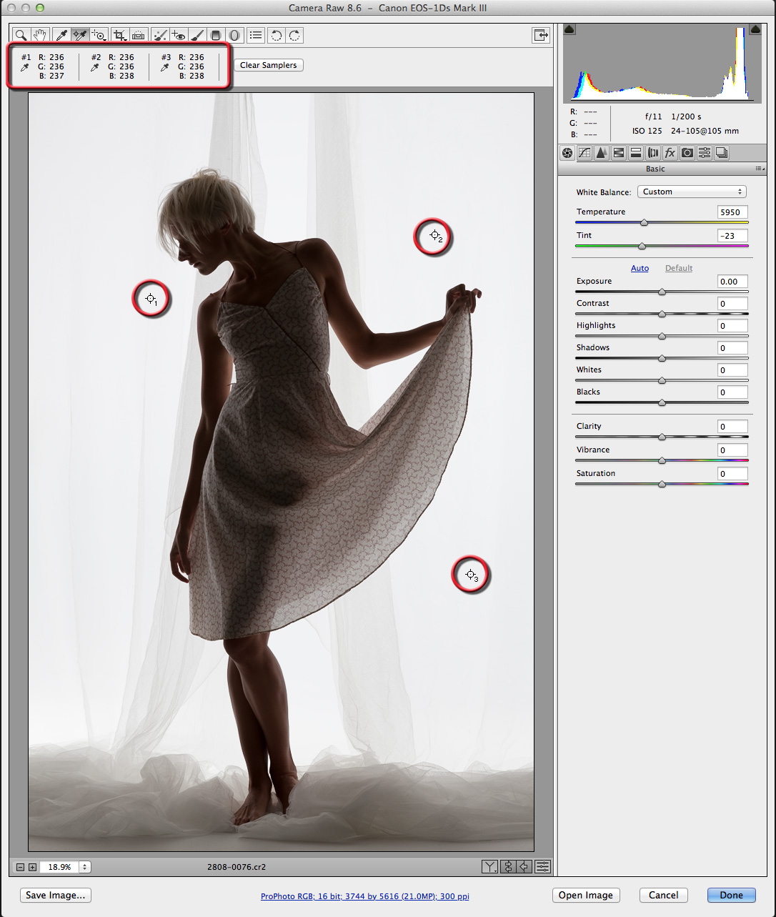
This is the fun part. There’s so much more data in a RAW capture than what shows on the monitor that the creative opportunities are seemingly endless. We’ll start with a silhouette of Vanessa who is standing in front of some sheer curtains.
White or Just Light Gray?
The exposure, f/11 at 1/200, ISO 125, renders the background through the curtains as white. Or are they? A quick look at the numbers on the three color samplers shows that the background is evenly lit. The numbers also reveal that its brightness is well below the white, with a detail threshold of 242 to 248. Let’s look at how we can tweak the RAW capture.
KelbyOne members may download the file used in this tutorial at http://kelbyone.com/magazine/issue/december-2014. All files are for personal use only.
Step One: Making this photo into a true silhouette is done differently than you might think. First, drag the Highlights slider to +100 and Shadows to –100. The numbers show that you’re almost there. Next, bump up the Whites to +63 and drop the Blacks down to –59. Use the Color Sampler tool (S) to mouse over areas of the photo. The curtains are completely blown out at RGB:255, while Vanessa is completely black at RGB:0. The point to note here is that neither the Exposure nor Contrast slider is involved.
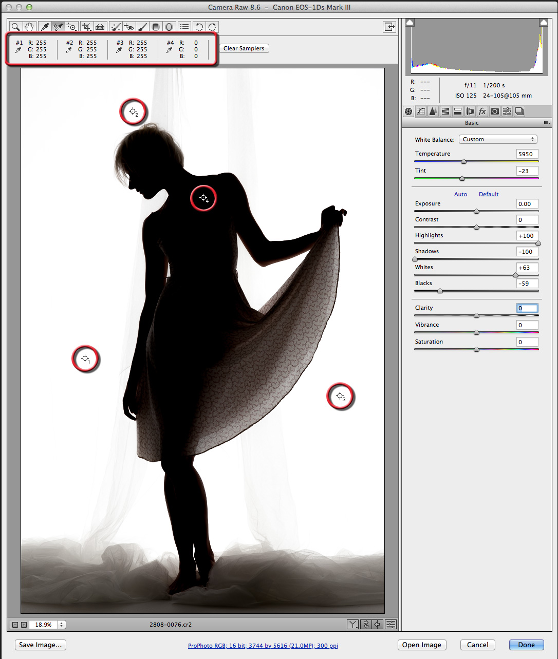
The Highlights slider works on values from middle gray (PS: 127, LR: 50.2%) to white (PS: 255, LR: 100%). The Shadows slider controls middle gray and goes down to black (PS: 0, LR: 0%). The Whites and Blacks sliders work on the same ranges as Highlights and Shadows, respectively.
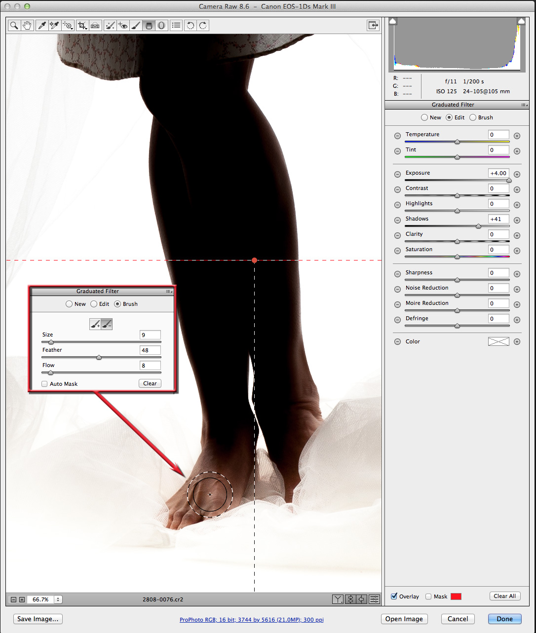
Step Two: The floor and the curtains want to be closer to white, too. Use the Graduated Filter (G) in Camera Raw or (M) in Lightroom. Click-and-drag a Graduated Filter up from the bottom of the frame. Set Exposure to +4.00 and Shadows to +41. The floor is white and the curtains are a much lighter tone, but her feet are too bright. Camera Raw 8.6 has a Brush radio button at the top of the Graduated Filter tab. Click it and an Add to (+) and Subtract from (–) brush icon appears. Click the Subtract from brush, then paint away the excessive brightness using a 9-pixel brush with a Feather of 48 and Flow of 8. This will darken her feet to make them look like they’re lit by the light on the floor. When you’re done, press G to exit the Graduated Filter (press M in Lightroom).
Step Three: Color! The monochromatic version is good, but how about some color? Drag the Temperature slider all the way left to 2000 to make it blue. Set Clarity to 100 and Vibrance to 13 and the sheers are now much more detailed. To lighten them, click the HSL / Grayscale tab (fourth icon). Click the Luminance tab then drag Blues to the right to about +40.
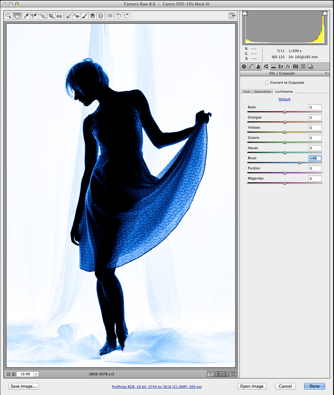
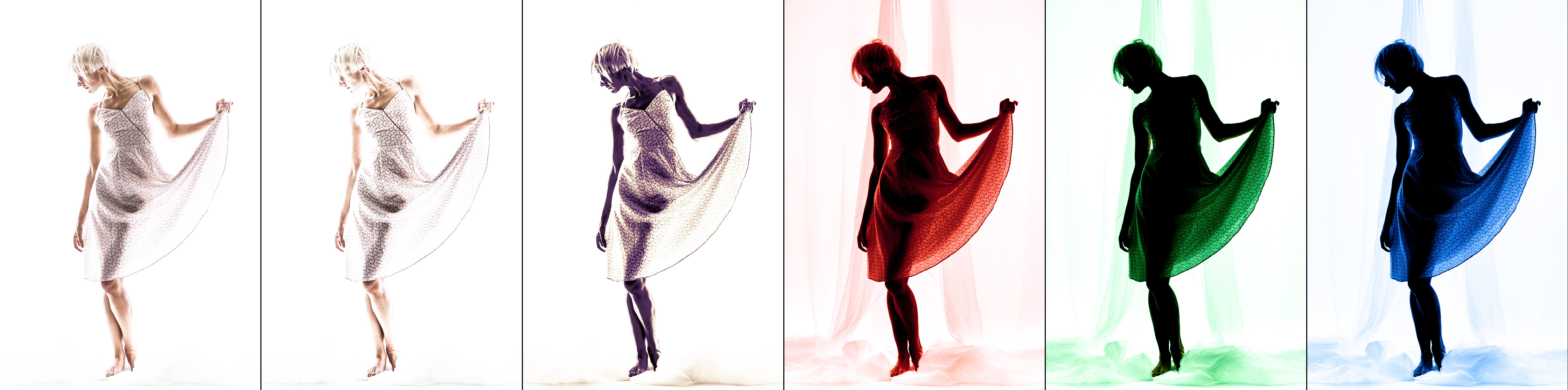
This is quite a change from the original photograph. Experiment with other colors, starting with a warmer temperature. Check out the Tint slider, too, and mix in the HSL / Grayscale panel.
The new tools in Camera Raw make creative exploration of all of the data you’ve captured available to use as your imagination dreams. Go play!
This article is courtesy of Photoshop User magazine, the official publication of KelbyOne, which provides quality online education for creative people. For more information, visit KelbyOne.com
