

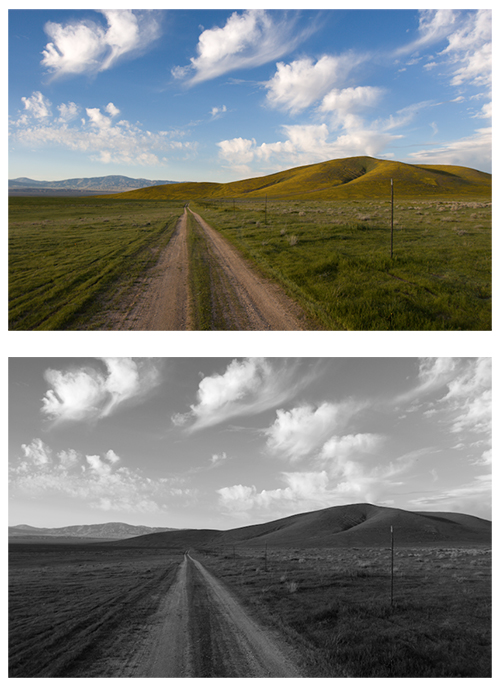
I recently asked a friend of mine, “Why shoot black and white?” His eyes lit up and voice softened as he responded, “Oh, it’s the beauty, simplicity, passion. Life is so cluttered, and the minimalism of black and white is so compelling—it revitalizes who I am and how I see.” And I agree! There’s something moving, poetic, and profound about a good black-and-white photograph. If you haven’t experimented with black and white or if you’re an old pro, this article will give you the skills to create stunning black-and-white images and we’ll dig into black-and-white conversion with a landscape and a commercial photograph.
STEP 1 Color or Black and White
In digital capture, one of the most important steps in black-and-white (B&W) conversion is making the decision to go with color or black-and-white. It takes vision to see beyond the complexity of color and imagine what the image would look like without color. Lightroom has a built-in shortcut that speeds up this process: Press the V key for a quick B&W conversion (and press it a second time to return to color). The B&W conversion may not be exactly what you want, but it will help you decide quickly if B&W is a good option.
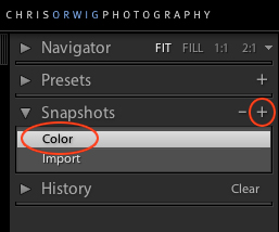
STEP 2 Take a Snapshot
Before we begin the B&W conversion, we’ll take a snapshot of the color image. This will provide a built-in “history” that will give us the ability to jump back to color if the B&W conversion doesn’t work out. To create a snapshot, go to the Develop module, expand the Snapshots panel, click the + (plus sign), and name the snapshot “Color.”
Note: If you haven’t integrated snapshots into your photographic workflow, now’s the time to try it. Snapshots will speed up your workflow, helping you to accomplish more creative results.
ALL IMAGES CHRIS ORWIG
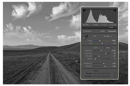
STEP 3 Exposure
After pressing V to convert the image to grayscale, the next step is to dial in an initial exposure setting in the Basic Grayscale panel. For our example, we want to make sure we have good tonal range with detail in the shadows and highlights. We’re not interested in creating the ideal image, yet we want to set the stage for the more intense adjustments that we’ll be making later with the Grayscale and other sliders.
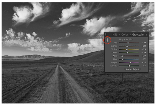
STEP 4 Darken the Sky
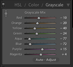
In many cases, when I convert to grayscale, my intent is to add a bit of drama, depth, and intrigue to the image—and this is definitely the case here. So, let’s begin by going to the HSL/Color/Grayscale panel and clicking on the word “Grayscale.” Next, we’ll click on the icon at the top-left corner of the Grayscale Mix panel (circled). This little tool is amazing! It allows us to adjust a grayscale image by clicking-and-dragging in the image. We then clicked in the sky near the horizon and dragged down to darken the sky.
STEP 5 Modify Grass
Now that the sky is in a good place, we need to work on the grass and the path. Our first plan of attack is to deepen the tones of the grass and here’s why: Our eyes are attracted to brightness and we want the path to become more dominant. To accomplish this, we can brighten the path or darken its surroundings. We’ll click on the grass using the same tool as in the previous step and drag down to darken the grass and the hills.
STEP 6 Brighten Path and Hills
To brighten the path and the distant hills, we’ll manually drag the sliders, so we need to click on the icon at the top-left corner of the Grayscale panel to turn off the click-and-drag functionality. It’s important to experiment because at times clicking-and-dragging works best because it can affect more than one slider. At other times, you’ll need to focus in on a particular color/tone with an individual slider.
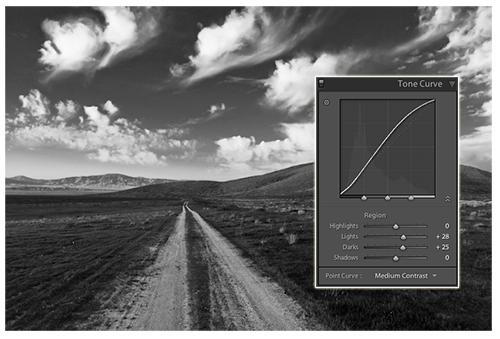
STEP 7 Contrast with Tone Curve
I like to use the Tone Curve panel to fine-tune contrast; the intensity of the contrast is going to depend on the final output. In this case, I’m planning to print the image on one of my favorite papers—Epson Velvet Fine Art—so I’ve increased the contrast a little, knowing that when printed, the contrast will be backed off a bit due to the gamut of velvet papers. To achieve the desired contrast, we increased the Lights and Darks by clicking-and-dragging on the Tone Curve (or sliders).
STEP 8 Noise Reduction
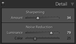
For the next step—reducing the noise in the image—we need to focus on the sky because of its gradations in color and tone. When gradations “fall apart” in the sky, there’s nothing to hide them. In comparison, many potential problems are hidden by the texture of the grass. For this particular image, we went to the Detail panel and increased the Noise Reduction Luminance to 79.
Note: Before printing at a specific size/resolution, you’ll want to add a final touch of sky noise reduction in Photoshop (Filter>Noise>Reduce Noise).
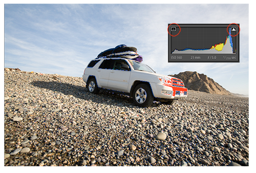
STEP 9 Discovering Exposure Problems
In this next image, we’ll start by making some important corrections with the Exposure setting. The overexposure may not have been noticed because the vehicle is white. To train your eye to see exposure problems, go to the Develop module and press the J key to show/hide clipping (or click on the clipping icons at the top of the Histogram). The color-highlighted areas warn you of clipping and, as you can see, the front of the vehicle is overexposed.
Tip: Always press J at least once per image even if you think the exposure is okay.
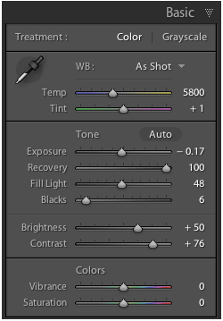
STEP 10 Correcting Exposure
With the clipping warning visible, it’s now time to correct the exposure. Here, there are a number of paths that will lead to the same destination. (That’s one of the nice things about Lightroom: There’s no one prescribed way to achieve quality results.) For this image, we first lowered the Exposure and then increased the Recovery to 100. While making these adjustments, watch the clipping warnings. Next, we brought up the Fill Light and then increased Brightness and Contrast.
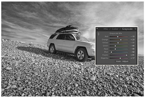
STEP 11 The Grayscale Mix
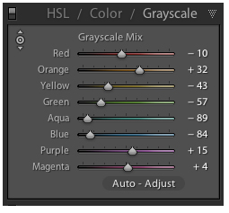
If you’ve ever mixed paint, you know that it’s a very fluid, give-and-take process. And so it goes with the Grayscale Mix (in the HSL/Color/Grayscale panel). To achieve the best mix, you need to modify one slider, then another, and then go back to the original slider. For this image, we’re interested in creating a high-contrast, moody effect so we’re going to keep things relatively bright and build up the contrast and tone. Thus, you can see the sliders mix and the resulting image at this stage.
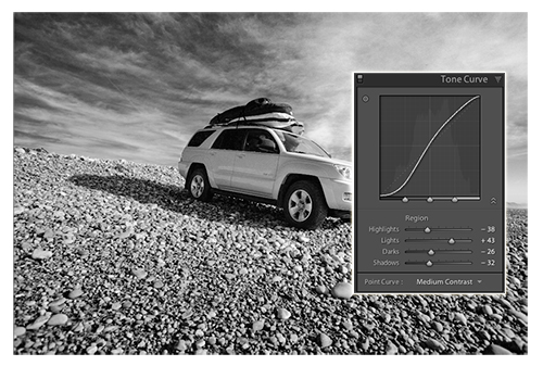
STEP 12 The Tone Curve
The next step is to build up some contrast with the Tone Curve. Here, we’ve brought the Highlights down because we don’t want to lose highlight detail. Then we increased the Lights and decreased the Darks and Shadows.
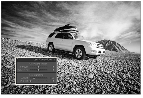
STEP 13 Adding a Vignette
The Lens Corrections panel is where we’ll add the final dash of dramatic tone. Because we want to create a strong vignette, in the Lens Vignetting section we decreased the Amount to –55 and the Midpoint to 0—Amount controls intensity and Midpoint controls how far the vignette “reaches” toward the center of the frame. This tool was created to fix vignetting problems when shooting with a wide-angle lens, but here we’re using it for creative results. Typically after applying a vignette, you’ll need to go back to the Basic panel to increase Exposure or Brightness, which we did for our image.
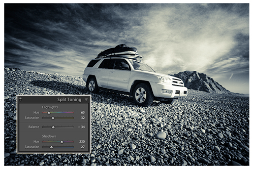
STEP 14 Split Toning
For the final step, we decided to add some color using the Split Toning panel, which provides you with the ability to add color in the Highlights and Shadows. Click-and-drag the Hue slider to a specific color and then control the amount of color with the Saturation slider. Tip: When you first try Split Toning, it may seem a bit awkward because the Hue selection is difficult. Try this shortcut: Option-click (PC: Alt-click) and drag on the Hue slider and it will show you the Hue at 100%.
(If you enjoyed this tutorial, you can find more of my Lightroom training at Lynda.com.)
