
Artistic Expressions: Wear and Tear
Making things look old and dirty is another matter and a little tougher.
People usually use Photoshop to make things look “nice and clean,” and many times the Clone tool will suffice to get the job done. Making things look old and dirty is another matter and a little tougher, however. Whether you’re creating something from scratch or retouching an image to show the effects of time, the process is similar.
The myriad billboards and signs that populate my Times Square painting are supported by an endless maze of girders that usually lie hidden from the eyes of the public on the street. Time and the elements have a dramatic effect on these structures. Creating these elaborate support systems is one thing but making them appear as if they’ve been there for a long time is what you’ll learn in this tutorial.
STEP ONE:
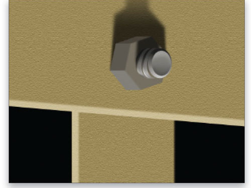
We’re going to focus on two girders and the bolt and nut that hold them together. The first step is to create the paths that form the shapes of the two girders and the bolt and nut that hold them together.

Additional paths were generated for the shadows and threading on the bolt. In our example, these paths were generated from scratch but you could also trace the shapes in an existing photograph. Note: In the case of a photograph, it’s important to select individual sections so that they can be altered to add the worn look.
STEP TWO:
Here, we filled each path with the appropriate color in a separate layer for each element. A filter of Texturizer (Filter>Texture>Texturizer) in Sandstone was added to the beams and they were also given layer styles to create the edges.

To make the effect look believable, it’s important to portray the damages correctly. Guessing at what something would look like isn’t always effective. It might look good to you but not quite right to someone else looking at your work. To try for a genuine effect, it’s best to study reference material. For instance, simply walk down the street and look at an old structure to see how dirt builds up, paint peels, rust forms, and look for any other characteristics of the effects of wear and tear. It’s a great idea to take a couple of shots of the damages to not only serve as reference material but you might actually use them to create the effect. More on this concept later.
STEP THREE:
Use the Brush tool (B) to create these weathered effects. The right brush tip is important, and Photoshop comes equipped with many tips that can do the job. Spatter, Chalk, Charcoal, and a few others will give you the desired effect provided they’re modified in the Brushes panel (Window>Brushes). The Spatter tip will work perfectly, so that’s what we’ll use.
In the Brushes panel, click on Brush Tip Shape on the left and increase the Spacing a little. Click on Shape Dynamics on the left and set the Size Jitter and Angle Jitter to 100% to complete the steps necessary to randomize the brush tip. That will allow you to create very realistic dirt and grime. You might want to up the percentage of the Minimum Diameter for the Size so that no tips are applied that are so small they look like dots.

STEP FOUR:
As mentioned earlier, a photograph of damaged surfaces can be turned into a very effective brush tip. Here’s a photograph of a weather-beaten stone façade. [Insert Fig04] Select a rectangular section of the photograph, leaving about 1/2″ of space on the outer edges. Feather the selection (Select>Modify>Feather) with a setting that’s high enough to soften the edges, thus eliminating any hard lines. (Note: Adding the feather through Select>Refine Edge allows you to preview the amount of feathering being applied.) Finally, choose Edit>Define Brush Preset to turn the image into a brush tip.
STEP FIVE:
In the Brushes panel, modify the tip to make it work the way you want. In this case, the most likely first step is to reduce the Size of the brush tip. The current size will be that of the original selected image, making it too big to be effective. Then apply the same alterations in the Shape Dynamics section that were outlined above for the Spatter tip. Because the selection of the photograph is a specific shape, you might want to soften the edges of the strokes. To accomplish this, choose a soft-edged brush tip in the Dual Brush section of the Brushes panel. Play with the settings in that section until you see the desired effect in the brush preview at the bottom of the panel.

You’re now ready to start rendering the ravages of time on your image. If you’re creating the image from scratch, each section should have its own layer above it to contain the damages for that section. In this example, the different sections are the crossbeam, bolt, nut, and upright. The layer containing the object being weathered should then clip that second layer containing the damages. To clip the layers, Option-click (PC: Alt-click) between the two layers. If you’re creating these damages over an existing photograph, then your damages will still be created in their own layer but the layer will be masked to confine the damages to the specific area being weathered. That’s where those paths mentioned at the beginning come into play. They help to create the appropriate layer mask for the layer.
STEP SIX:
This image shows where we’ve added the dirt and grime to the crossbeam. Using the Spatter brush, the effects are added using different sizes of the brush. To get the larger stains, a large brush size is chosen. It’s also important to lower the Opacity for the brush so it will apply what seems like an overall stain of weathered grime. After raising the Opacity and lowering the size for the tip, you apply random stains throughout the section. Note that the area around the nut and bolt has more dirt than the rest. This gives the illusion that the space between the crossbeam and the nut has accumulated additional grime. It’s even seen running down the edge as if smeared by falling rain. The stream also follows the bend in the beam.

STEP SEVEN:
Here, the vertical beam is weathered; you can see where the stream of dirt from the crossbeam above has continued to flow. There’s also a buildup of grime at the seam of the two beams. These little touches add realism to the finished product.

STEP EIGHT:
The nut and bolt also have some corrosion so, besides dirt and grime, they’re also rusty. The same brush tip will do the trick with one additional modification: In the Color Dynamics section of the Brushes panel, we set the Foreground/Background Jitter to 100%. All the additional settings are set to 0%. This will allow the brush to randomize the color of each tip shape as the stroke is applied to the canvas. By choosing a dark brown for the Foreground color and a medium orange for the Background color, you’re now ready to corrode your metal parts. Note the way some of the rust travels along the edges of the nut. This is synonymous with how things look in real life.

It’s these little touches that make things look real. Now open Photoshop and do some damage.
ALL IMAGES BY BERT MONROY UNLESS OTHERWISE NOTED

