
Art of Type: Out of Scale
There was a time when few designers dared to venture into the murky world of the Adobe InDesign justification controls. The good news is that more and more users are starting to take charge of them. The bad news is one of them—the powerful glyph scaling control, unique to InDesign—is often misused. In this column we’ll look at how to apply it well.
Justification controls have traditionally determined to what extent a program can alter spaces between characters and words—squeeze them, stretch them—when fitting type into lines. The goal is to create the most even and consistent spacing possible among lines and paragraphs by allowing the program to find optimal places to end lines, either at word spaces or after certain punctuation marks (such as the em dash), or by hyphenating words.
Glyph scaling
InDesign has added another variable however: It can also flex the width of the characters themselves. Adobe calls this glyph scaling, and it can help the program find more of those optimal line-breaking locations, avoiding the reliance on unsightly stretching or squeezing of spaces. After all, there are as many characters on a line as there are character spaces, so the cumulative effect of tiny, undetectable adjustments to character widths can yield big results. But there’s a catch: You have to keep the alterations to a character width small enough so they’re invisible. Here’s an example of what can happen when those variations are allowed to get too large.

Misusing glyph scaling control, creates lines of type with starkly contrasting character widths.
The designer of this French election brochure was looking for a way to solve a common type composition problem: Relatively large type (12-point, in this case) set with justified margins over a narrow measure (13.5 picas). Some of these lines contain only two or three word spaces, and there just aren’t enough character spaces to allow the program to fit the type without making some lines look too crowded or too spaced out. The typical result in such situations is inconsistent type color, with loose lines looking too pale and tight ones too dark. In our example, the designer tried to help the situation by choosing to let character widths be flexed as well, but got carried away.
At first glance, it’s the inconsistent type color that catches your eye. The second, third, and fourth lines, for example, look particularly tight and dark. But in fact, this effect isn’t caused principally by variations in spacing, but by variations in character width. This example shows a closer look. After the first line, the rounded characters (look at “o” and “e”) get progressively more compressed, until by the fourth line the type looks like it came from a different typeface, a condensed member of the same family. This isn’t a pretty sight. And ironically, in addition to distorting the type, the strategy fails to fix the fundamental problem of type color varying from one line to the next.

Variations in the shapes of the round characters are striking, as though several typefaces were used for the same paragraph.
Justification dialog
The damage here was done in the Justification dialog, accessed via the Paragraph panel’s (Type>Paragraph) flyout menu. The justification values shown here is my recipe for the composition problem at hand. (The best solution begins with reducing the size of the type by at least half a point, but that’s another issue.) Over such a narrow measure, I’d allow InDesign fairly generous ranges in which it could flex word and character spaces. But more importantly, I’d keep the glyph scaling range small, normally not more than plus or minus (+/–) 1%.

These justification settings allow the wide leeway for the flexing of word and character spacing necessary for composing text over a narrow measure. To protect the integrity of the type design, glyph scaling should always be strictly limited.
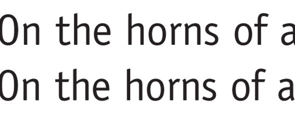
This example shows two lines of type whose character widths vary by 1%, and apart from the relative line lengths, there’s virtually no difference between the appearances of the type in each line.

The top line is set in normal Officina Sans, while the bottom line has had its character widths reduced by 1%.
Line-ending possibilities
Ultimately, glyph scaling works best in lines with many characters. In such lines, the compound effect of all those tiny width adjustments can allow InDesign to find line-ending possibilities that don’t require spaces to be distorted too much. This means a line could end without a hyphen, or that a hyphen could be inserted at a more felicitous place (demon-stration, for example, instead of de-monstration). But even in narrow columns, it can make an important contribution in reducing apparent spacing variations from line to line.
To successfully use glyph scaling, the trick—as with so many type tools in InDesign—is moderation. All things, you could say, in their measure.

