The Art of Type: Suffering the Reverses
White Type on a Dark Background Turns the Laws of Typography on Their Heads
A basic assumption that makes type work—and the key to which issues of spacing and proportion hinge—is that it’s black on a white background. Computers make it easy to reverse type, to make it appear white on black, but in doing that, you’re bucking the system, and some adjustments are necessary.
Black type appears to lean out into the white space surrounding it, and when it’s reversed, the black background tends to crowd in on the white type, making it look pinched. To boot, black ink does spread, encroaching into white areas, especially when the paper is absorbent.
How to create reversed type
To create a reverse, select the Type tool (T) and any font and click the white swatch named [Paper] in the Swatches palette (Window>Swatches). This won’t really create white type—there is no opaque white ink outside of screen printing. Instead, your program uses the type’s outlines as cutout stencils, through which you can see the background color of the paper you print on. If that paper is green, your type will be green too, even if there are intervening layers of color behind the type frame. This is not evident on screen.
Avoid the small
The most obvious strategy in reversing type is avoiding small type, finely proportioned graphics (such as hairlines), and typefaces with unusually thin features. A modern face such as Bodoni, for example, isn’t a good candidate for reverses because its thin serifs and wispy hairlines (the thinnest parts of a character’s stroke) tend to look too thin or fill in with ink (a problem called plugging). The same goes for very thin sans-serif faces or any face that has high contrast between thick and thin strokes.
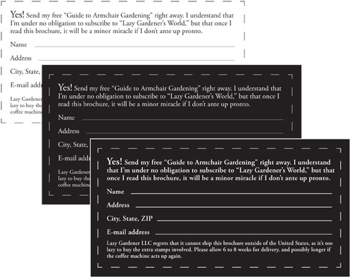
Consider bumping up the size of reversed text type by a point. This makes the type’s fine features more robust and resistant to breaking up so it’s easier to read. Another option is increasing the typeface’s weight (see Fig. 1.)
In general, the problems surrounding reversed type fade to zero as type size increases. By the time you get to headline size, reversed type can be handled like any other.
Mind the spacing
Because we’re used to seeing the black as the foreground image, negative space—the “air” around characters—takes on a positive force in reversed type, and variations in spacing become more eye-catching. For example, the variations in word and character spacing that typify justified type become more obvious, and spacing that looks okay in black on white can look sloppy when reversed. The solution: Avoid reversing justified type over narrow measures (line lengths).
Likewise, leading tends to look pinched in text-size reversed type, so add a point or two of added leading, particularly over wide measures.
Finally, loosen up the tracking of reversed type, except in display sizes, where it can stand its own. How much to loosen depends on the typeface you’re using (italics profit by relatively looser tracking) and the point size you’ve chosen. Kern display type after it’s been reversed, not before.
The only way to judge your success is with printed proofs, at as high a resolution as possible. Your computer’s screen, which compounds problems by making reversed type glow white, is no place to judge the eventual printed appearance of reversed type. On inkjet printers, use glossy photo paper—copier paper is too absorbent and exaggerates ink spreading.
Screens, tints, and colors
White type on black is the simplest of all of reverses. When backgrounds are tinted or other ink colors are used, things get worse.
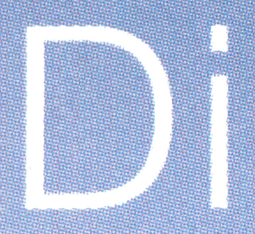
Reversing type out of a tint is dicey because tints in print are created using an array of halftone dots. Unless the screen density of the tint is quite high (say, 120 lines per inch and up), the white matrix among the screen dots can merge with the white of the reversed type to create a hazy edge to the characters, possibly causing adjoining characters to merge (see Fig. 2.). This is hard to proof on the desktop, because most printers don’t use the screen patterns used for commercial printing. It’s best to pull a true dot proof, which produces the same dot pattern as the RIP used by your service bureau’s or printer’s imagesetter.
Reversed type on black

Fig. 1.
A black-on-white coupon (top) goes faint when it’s reversed (middle). At the bottom, the 1/2-point border and hairline rules have been upped to 3/4-point. Because space is so tight, the typeface weight has been stepped up from regular to semibold instead of increasing point size. Leading has also been upped by 1 point, and tracking has been opened by 15/1000 em as well.
Reversed type on a tint
 Fig. 2.
This close-up view shows how the background white and the 4-color rosettes creating a screened background can interfere with the crisp edges of your type, making them wobbly and irregular. The original sample was 30-point Helvetica on a 50%, 100 line-per-inch screened background. Darker tints and higher screen densities yield better results.


