
10 Beautifully Crafted Wine Label Designs
We often judge books by their cover, so it should come as no surprise that wine labels come under the same scrutiny. Like publications, wine labels don’t all fit in the same categories. The pictorial real estate, despite being small, can convey a range of feelings and attitudes: from serious to edgy to timeless and carefree. And depending on what kind of mood you’re in, or how much you enjoy the label’s design, it can convince or dissuade you from picking a particular bottle to consume.
It’s not easy to craft the perfect wine label, but here are 10 designs that have done it beautifully. Some use inventive typography while others have fantastic illustrations. Regardless of their style, each of them is thoughtful and less straightforward than the typical tag.
1. The Hidden Sea by Jon Contino
This label has beautiful lettering, crafted with pen and ink by Contino and then translated into digital form. The scripted text has the feeling of old-world correspondence, and conjures images of a sea captain writing to his loved ones at home. With a nice glass of wine, of course.

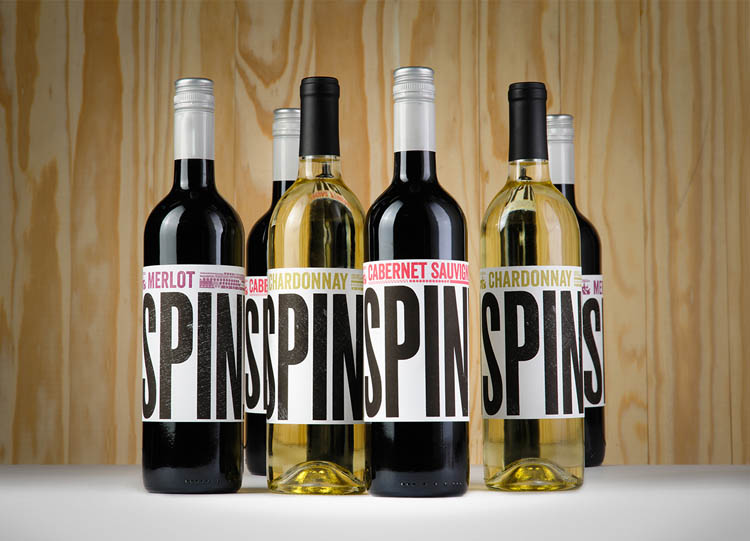
2. SPIN! Wine by Willoughby Design
The pizza restaurant SPIN! commissioned Willoughby Design to create a label for their private wines to be paired with their signature food. Although simple in execution, the design is playful and clever: the SPIN! brand appears twice on the label. The “S” is displayed properly whether the bottle is right-side-up or upside-down. In addition, the words “the bottle” appear in each exclamation mark and invite those imbibing to give it a twirl.

3. Rojalet Wines by Atipus Barcelona
The word “rojalet” refers to the unique red strata of the soil where the grapes for Rojalet Wines are grown. Barcelona-based studio Atipus wanted to reflect this fact in their design, and they created a series of labels that are a representation of soil. “The layers tell the story of the soil,” creative director Eduard Duch told Fast Co. Design, “its composition, and thus the character of the grape.”

4. Gatsby Vineyards by Rhonda Boisseau
Thanks to F. Scott Fitzgerald, the name “Gatsby” conjures imagery of opulence and fancy parties. These two labels, created by Rhonda Boisseau, translate this elegance in an art-deco style. You want to be the women on that label, or at least sharing a glass of wine with them.

5. Le tour de Monde by Valerii Sumilov
The concept for “Le tour de Monde” was inspired by the popular adventure novel Around the World in 80 Days—it’s what informed the overall vintage-style design. Each of the labels represents a unique “storyline” and European country: France, Germany, Spain, and Italy. Look closely at the labels, and you’ll see they have landmarks from every place.


6. Sangwine by Lydia Nichols
Few labels communicate a carefree and laid-back lifestyle better than Lydia Nichols’ (fictitious) Sangwine. Each bottle represents something that’s quintessentially Californian, such as the Pacific Coast Highway, redwood forest, and the beach.

7. Evil Eye (‘Mal de Ojo’) by Simon Frouws
Designer Simon Frouws created the custom stenciled lettering that’s on the ominous “Evil Eye” bottle of wine. The design appeals to those who like to explore the darker side of life, and not superstitious—it starts with unlucky vintage no. 13.

8. Bendita & Salvaje Sweet Wine by GENOUD ITOIZ
“Bendita & Salvaje” translates to “Blessed & Wild,” and studio GENOUD ITOIZ designed it to appeal to women. They did so with a striking illustration that intertwines the concepts of good and evil: a floral drawing represents the feminine, but as you look closely, you’ll see there’s a snake between the leaves that’s waiting to attack.

9. Whym Wine by Caleb Heisey
The charming illustrations seen on the “Whym Wine” label communicate a carefree attitude that loves taking advantage of all life has to offer. And that’s what Heisey wants evoke. “The inspiration behind the imagery and brand was to romanticize small excursions (like a day on the lake, or a picnic) into a whimsical adventure,” he writes, “one that you’d remember forever.”

10. Empyreal 75 by Brandon Oltman
Wine labels are rarely interactive, but Brandon Oltman’s limited-edition design for Cargill’s Empyreal 75 bottle turns the tag into a fun game. The target audience for the beverage was pet food manufacturers who were considering using the Empyreal 75 protein as an ingredient for their product. There needed to be a conceptual tie to red wine and animals, which is where the dots come in—a white grease pencil allowed drinkers to connect the points, implying that this was the clear choice for them.


All images used with permission.

