
Four Ways to Create Contrast in Adobe Photoshop Camera Raw
When we do live photo critiques at my workshops and on The Grid (my weekly podcast about photography), one of the most common problems we see in photos is that they look flat (in other words, they need contrast—like the flat-looking image you see below). You can create contrast right in Camera Raw.
There are four different ways to do it. Each way applies contrast slightly differently, so each has its own slightly different look.

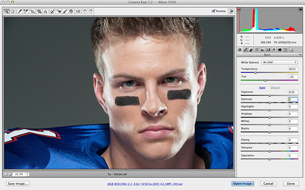
#1: THE CONTRAST SLIDER
If you’ve been using Camera Raw for a while, you might find this surprising, but in the latest two versions, the Contrast slider actually works (don’t laugh—we used to joke that the Contrast slider in CS5/Lightroom 3 wasn’t actually attached to anything, because you could drag it back and forth and it barely did anything). Here’s what this same image looks like when you crank up the Contrast slider big time. That’s right, it actually works now! Of course, this is the easiest way to add contrast—just drag the slider to the right. But, since it works so well now, be careful not to drag it too far. Of course, it all depends on the image—some can handle more contrast than others—and the only way to know is to apply a lot and see for yourself. If it looks too contrasty, it probably is.

#2: THE WHITES AND BLACKS SLIDERS
When you think about what adding contrast does, it’s pretty simple—it makes the brightest parts of your photo brighter and the darkest parts darker. That’s why a lot of folks use the Levels adjustment in Photoshop to add contrast, because it’s easy—you drag the Input Levels highlights slider to the left and the shadows slider to the right, and your image looks more contrasty. You can now do something very similar in Camera Raw using the Whites and Blacks sliders. Better yet, you even get to use the clipping warning trick from Photoshop as you make your adjustments.
I usually start with the Whites slider (since I move through the Basic panel’s sliders from top to bottom). Press-and-hold the Option (PC: Alt) key, and then click-and-hold on the Whites slider. Your image should turn solid black, and that means that nothing is clipping. Now, drag the Whites slider slowly to the right (while still pressing-and-holding the Option key) and, at some point, you’ll see parts of your image start to appear—these areas are now clipping. If those areas appear in red or blue, it just means that one color channel is clipping, which isn’t disastrous in most cases, so I usually let it slide (unless it’s a red skin tone in somebody’s face). But, if they appear in white, that’s a clear warning sign that you’ve dragged too far and you’re clipping off highlight detail in your image. So, drag back to the left a bit until that white clipping warning goes away. At that point, you’ve pushed the whites (the brightest parts of your image) as far up as you can go without destroying your image, and at the same time, you’ve maximized the top-end range of your image.

Now, let’s do the same thing with the Blacks slider to add lots of contrast by pushing those shadow areas as dark as they can go without totally clipping them into solid black (though I don’t usually mind if some parts go to solid black, because I think some things should be solid black). Press-and-hold the Option (PC: Alt) key, then click-and-hold directly on the Blacks slider, and your image should turn solid white. Now, drag your Blacks slider slowly to the left and, at some point, you’ll see parts of your image starting to appear—these areas are now clipping. But, again, unless they are areas of important detail, I’ll let a little of this clip, but not too much.

Here’s how the image looks after increasing contrast using the Whites and Blacks sliders to set your white and black points.

#3: CURVES
Since the Contrast slider really didn’t do all that much back in CS5/Lightroom 3, I used to tell my students to just leave it alone and create contrast using Curves. Luckily, the Contrast slider now works, so it’s not as necessary today, but what if you crank the Contrast slider to +100 and it’s still not enough? Then, you make a contrast curve.
Click on the Tone Curve icon (the second icon from the left) at the top of the Panel area to make the Tone Curve panel visible. In the Point tab, you’ll see a Curve pop-up menu with a list of preset contrast settings. It’s set to Linear by default. Choose Medium Contrast and look at the difference. Better, but not enough. Next, choose Strong Contrast, and you can really see the difference as it creates a curve that bumps the amount of highlights and shadows, which creates (you guessed it) contrast.

CREATE YOUR OWN CURVE
Okay, so what do you do if you choose the Strong Contrast preset and it’s still not enough contrast? Then, you can edit the curve yourself. First, look at the curve shape it added in the grid. It’s a subtle S-shape, right? Right. So, to add even more contrast, you simply need to make that S-curve steeper—the steeper the curve, the more contrast it adds. The highlights control is that point (little dot) near the top of the curve. Just click-and-drag that point up a bit to make the brightest parts of your image even brighter. Now, do the same thing to the two points near the bottom of the curve. Click-and-drag those down just a little and it makes the darker parts of your image even darker, adding more contrast.

Note: Adjustments made in the Tone Curve panel add contrast on top of any contrast you’ve already added with the Contrast slider back in the Basic panel. Just so you know.
#4: ADD MIDTONE CONTRAST
So, imagine if there were a Contrast slider that you could actually apply as an effect? Well, there is one in the Basic panel. It’s called Clarity and what it does is increases midtone contrast, which adds contrast, makes your overall image a little brighter, and enhances detail big time. Just drag it to the right and you get all three effects applied at once. The farther you drag to the right, the more intense the midtone contrast effect you get.

PUTTING IT ALL TOGETHER
When I think of a situation where I really want to add lots of contrast, it’s when I’m doing black-and-white images—where creating a high-contrast image can really make the photo. The first step is to convert your image to black and white by going to the HSL/Grayscale panel and turning on the Convert to Grayscale checkbox (this makes it a black and white, but it’s a really flat-looking one).
Now, I put it all together: I use the Contrast slider to increase overall contrast, then I use the Whites and Blacks sliders to push the image as far as it can go without clipping too much in the highlights. Then, I go to the Clarity slider and boost that up a bit, as well, and if I think it needs even more contrast, I head over to the Tone Curve panel, try both the Medium Contrast and Strong Contrast presets to see which one looks best, and steepen the S-curve, if needed. Lastly, I’ll add some sharpening right here in Camera Raw. Here’s how the image looks after converting to black and white and adding lots of contrast.

This article is courtesy of Photoshop User magazine, the official publication of KelbyOne, which provides quality online education for creative people. For more information, visit KelbyOne.com.
