
Note: Before starting the tutorial, please download these assets:
-Font: http://www.dafont.com/bebas.font
-Patterns: http://www.aurove.com/downloads/rusted-text-style/
Prior to make our canvas, we will need to install the font and load the patterns. Please refer to your system process to install the font.
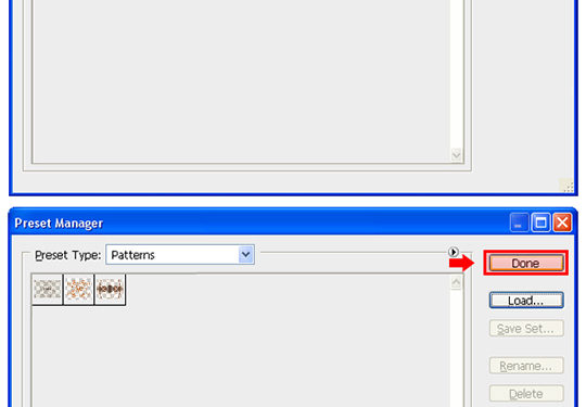
Loading the Patterns: to load the .PAT file into Photoshop, proceed as follows: Open Photoshop and go to Edit > Preset Manager. In the Preset Manager window, select Patterns from the Preset Type dropdown menu. Click on Load, find on your computer the recently downloaded Rusted.pat file and click on Load. Click Done.

Go to File > New. Set the name of the new document to Rusted Text Effect, the Width to 1150, the Height to 1150 and be sure to have a 72dpi resolution and the color mode set to RGB. Click OK.

Click Over the Foreground color in the Tool’s palette and from the new window, set the color to #505252 and click OK.

Press Alt+Delete (Option+Delete) in order to fill the canvas with the recently selected foreground color.

Select the Text tool (T). Set the font to Bebas, size to 180pt, the anti-aliasing method to Sharp, and the text alignement to Center. Pick a white color (#FFFFFF) and click over the canvas and type “LAYERS”.

Press 3 times Control+J (Command+J) to duplicate the layer 3 times.

We will now rename the layers to work more comfortable. There is 2 methods to do this, the first one is to click over each layer’s name and retype the layer’s name, and the second one is to go to Layer > Layer Properties and set the name in the dialog box. Choose your favourite, and rename the layers as showed:

Hide all the layers (except the “Background” and the “shadow” layer) by clicking in the eye icon next to each layer’s name. Select the “shadow” layer and go to Layer > Layer Style > Drop Shadow. Apply the following settings and click OK.

Select the “depth” layer and make it visible by clicking on the eye icon next to the layer’s name. Go to Layer > Layer Style > Drop Shadow and apply these values:

Still in the Layer Style Panel, check the Inner Shadow Option and apply the following values:

Now, check the Bevel and Emboss effect and set the values as shown:

Select the Color Overlay option, set the color to #C6884B and bring down the opacity to 55% as shown:

Finally, check the Pattern Overlay effect. Click over the pattern thumbnail and from the thumbnails list select the “Rust3” pattern.

Apply the following settings and click OK.

Hold the Control (Command) key, and select the “depth” and “shadow” layers. Go to Edit > Transform > Scale, and set the horizontal scale to 97%. Apply this value by clicking the checkmark in the transform panel. We do this in order to give the text a faux 3D effect.

Select the “color” layer and make it visible.

Go to Layer > Layer Style > Drop Shadow and apply the following values:

Still in the Layer Style Panel, check the Inner Shadow Option and apply the following values:

Now, check the Inner Glow effect and set the values as shown:

Select the Bevel and Emboss effect and apply the following settings:

Select the Satin option and set the values as shown:

Finally, check the Gradient Overlay effect. Click over the gradient thumbnail; in the new Gradient Editor window set the following values and click OK:

Apply the following settings and click OK.

Select the “texture” layer and make it visible.

Go to Layer > Layer Style > Pattern Overlay. Click over the pattern thumbnail and from the thumbnails list select the “Rust3” pattern.

Apply the following settings and click OK.

Note: While still in the Pattern Overlay window (and before clicking OK), click and drag over the canvas to freely move the texture. Just for practice, try to place the texture as close as possible as the example image. Don’t worry if you can’t, this step is just to show you what you can do while you are on the Pattern Overlay dialog.
Select all Layers (except the Background) and go to Layer > New > Group from Layers. In the dialog box, set the name to “Style 1” and click OK.

Go to Layer > Duplicate Group. Set the name to “Style 2” and click OK.

Click over the canvas, and drag the content of the “Style 2” group about 200px down. This is just to work more comfortable so the groups don’t overlap.

Expand the “Style 2” group and click over the “depth” layer in order to select it. Go to Layer > Layer Style > Color Overlay. Click over the small color rectangle and in the color picker window set the color to #4C4C4C. Click OK.

Still in the Layer Style window, click over the Drop Shadow tab and uncheck the “Layer Knocks Out Drop Shadow” option. Click OK.

Click over the “color” layer and go to Layer > Layer Style > Gradient Overlay. Click over the gradient thumbnail, and in the gradient editor set the colors as follows. Click OK in the Gradient Editor and click OK again in the Layer Style window. Note that the red numbers refer to the percentage location of each color.

Now, click over the “texture” layer and go to Layer > Layer Style > Pattern Overlay. We will not change the setting here, we will just move the texture to make it look different from the first style. To do so, while you still have the Pattern Overlay tab of the Layer Style window active, click and drag over the canvas to move the texture to another position. Once you have done this, click OK to apply the effect. Try to position the texture as the image shown for practicing purposes.

Collapse the “Style 2” layer’s group by clicking on the arrow next to the group’s name. Go to Layer > Duplicate Group. Set the name to “Style 3” and click OK.

Click over the canvas, and drag the content of the “Style 3” group about 200px down. This is just to work more comfortable so the groups don’t overlap.

Expand the “Style 3” layer group and select the “color” layer. Go to Layer > Layer Style > Gradient Overlay. Click over the gradient thumbnail, and in the gradient editor set the colors as follows. Click OK in the Gradient Editor and click OK again in the Layer Style window. Note that the red numbers refer to the percentage location of each color.

Again, we will modify the texture layer to make it looks different from the other two styles. Click over the “texture” layer inside the “Style 3” layer group and go to Layer > Layer Style > Pattern Overlay. We will just move the texture to make it look different from the others styles, so we will not change the setting here. To do so, while you still have the Pattern Overlay tab of the Layer Style window active, click and drag over the canvas to move the texture to another position. Once you have done this, click OK to apply the effect. Try to position the texture as the image shown for practicing purposes.

We will now make a final variation to get a different style. Collapse the “Style 3” layer’s group by clicking on the arrow next to the group’s name. Go to Layer > Duplicate Group. Set the name to “Style 4” and click OK.

Click over the canvas, and drag the content of the “Style 4” group about 200px down. As we did it before, this is just to work more comfortable so the groups don’t overlap.

Expand the “Style 4” layer group and select the “color” layer. Go to Layer > Layer Style > Gradient Overlay. Click over the gradient thumbnail, and in the gradient editor set the colors as follows. Click OK in the Gradient Editor and click OK again in the Layer Style window. Note that the red numbers refer to the percentage location of each color.

Now, for the last time, we will modify the texture layer of the “Style 4” group to make it looks different from the other styles we have made. Click over the “texture” layer inside the “Style 4” layer group and go to Layer > Layer Style > Pattern Overlay. Besides moving the texture to make it look different from the other styles, we will change a single setting to get other effect. From the Blend Mode dropdown list select Darker Color. Now, with the Pattern Overlay tab of the Layer Style window still active, click and drag over the canvas to move the texture to another position. Once you have done this, click OK to apply the effect. Try to position the texture as the image shown for practicing purposes.

Now that you have completed all the steps, you can try a few different variations by changing the color gradient of any “color” layer, moving, scaling and changing the blend mode of the “texture” layers, and even change the settings of the “shadow” layers to achieve a new and exciting style.
