
When you're creating the next big iOS app, it's important to make sure the interface is designed with usability and function in mind whilst also at the same time look great and fulfill the purpose. This article aims to get you up and running with designing a fundamental part of many iOS apps, the tab and navigation bar in Photoshop.
Getting Set Up
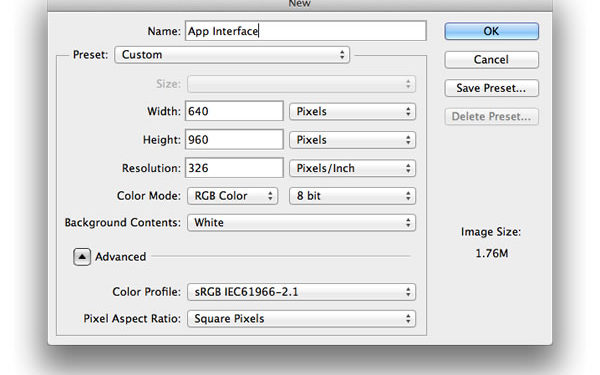
Firstly, we need to get set up with Photoshop, to do this we're going to create our canvas; generally when designing an iOS interface, one would design for the retina display and then resize accordingly. Create a new document, give it a relevant name and make the width 640px and the heigh 960px and change the resolution to 326 pixels per inch and press OK and save.

Setting up our new Photoshop document.
Now we've got our canvas all set up, we're going to add the basic skeleton of our app. This includes the basic navigation, tab and status bar.
First the status bar. Select the Rectangle (U) tool and create a rectangle of any size on your canvas and select the Transformation tool (Command/Control + T) and modify the dimensions of the shape using the values within the option bar at the top. Change the height to 40px and the width to 640px and move the whole rectangle to very top of the interface.
For this tutorial, I have changed the color to #c9c4c4.
Next, create another rectangle in the same fashion but this time make the height 88px and the width 640px and position this just below the status bar.
I've changed the color to #34a2ca.
Finally, we'll add a tab bar. Create another rectangle with the width of 640px and make the height 98px and place this at the very bottom of the interface.

The basic skeleton of our application that we'll be adding effective styling to.
There we have it, you have successfully created the skeleton of a basic tab-based application.
Now we're going to add some style to our navigation and tab bar and make them fit for purpose.
Adding Style
We'll start with the navigation bar.
Double-click the layer that contains the navigation bar rectangle and the Layer Styles dialogue should appear. Select Gradient Overlay from the sidebar and change the opacity to 25%, the scale to 85%, the angle to 90 degrees and make sure the gradient selected is one that fades from black to white.
I encourage you to play around with those values until you've found something you're completely satisfied with.
Check Drop Shadow from the Layer Styles sidebar, make sure the opacity is 100%, the distance and spread are set to 0 and the size is around 8 and also ensure that the color of the shadow is black.
Now, the beauty of designing within Photoshop is that is easy to transfer these styles to our tab bar. Right-click the navigation bar layer and select Copy Layer Style and then right-click the tab bar layer and click Paste Layer Style.
Now, select the Rectangle (U) tool again and create a rectangle that spans the whole canvas and arrange this layer so it's at the very bottom. I have chosen to fill the rectangle with #31657b and added a subtle gradient overlay layer style at 60% scale and 20% opacity.
What use is a tab bar without any tabs? Next we're going to add some tabs.
To do this we're going to divide 640 by the amount of tabs we want. For this example I'll do 4 which equals 160.
Create a rectangle using the Rectangle tool and change the height to 98px and the width to 160px and then within the layer palette, change the fill to 0 and open up Layer Styles and add a rather subtle inner shadow. Mine has an opacity of 45% and a size of 27px; distance and choke are set to 0.
Duplicate this layer four times and align them side-by-side on the tab bar. This will be the background of the selected layer.
You can toggle the visibility of the background of the layer – I have kept the first one visible.

The basic skeleton of our app with some smart Layer Style applied.
Now, we're going to add some icons to the tab bars.
Instead of designing these from the ground up, go to http://app-bits.com/free-icons.html and download these.
We're going to add our own twist to these icons. Once the download has finished, select 4 of the PNG retina icons and drag them onto the canvas and position each one in the centre of each rectangle we created earlier.
Once you've positioned them, double-click the first icon's layer to bring up the Layer Styles dialogue and add a overlay to the icon. I've chosen #040e47 and added a black drop shadow at 55% opacity and a size of 8px.
Now, add the other three icons and place accordingly. I used the same drop shadow but made the color overlay white.

The final tab bar, with a custom design and our own icons.
Finally, we're going to add the title to our navigation bar.
To do this select the Text tool (T) and click somewhere on your canvas and type a title for your tab. I have used Couture font (http://www.dafont.com/couture.font), along with a black drop show at 80% opacity, a size of 8 and the font size is at 48px.
Next, select the Move tool (V) and reposition so it's in the centre of the bar.

The final navigation bar, again, with a custom design and our own custom font.
There we have it – you have successfully created your custom navigation and tab bar, as well as added custom tabs. As you can see, adding subtle gradient overlays to iOS interface elements can have a dramatic yet refreshing effect.
The purpose of this tutorial was to guide you through how to create an iOS navigation and tab bar interface – I encourage you to download the accompanying Photoshop document and play around with the Layer Styles.

The end result: a custom designed tab bar along with a navigation bar – now all it needs is some content!