
The Art of Type: Table Manners
Adobe InDesign offers very precise and explicit control over leading, except in tables, that is, where controlling leading can be a struggle. The root of the problem is that the program doesn’t see a table as a traditional array of rows and columns. Instead, it sees a table’s structure like that of a spreadsheet: a grid of cells.
Each cell is effectively its own text frame. Adjoining cells are stuck to each other (you can’t open up gutters between them, as in traditional typeset tables) but they have no “knowledge” of the typographic specs applied to their neighbors. Each cell is an “island,” and one cell’s leading isn’t related to or dependent on that of cells above or below it. It can become a huge hassle to control—even to know the value of—the leading between text in one cell and the text in cells above or below it. Ditto for rules added between rows. When Adobe decided to model its tables on spreadsheets, it made managing leading a headache.
Take it from the top
To control the leading between the first text line in a cell and the cell’s top border, go to the Table>Cell Options>Text dialog. Here, in the Offset drop-down menu under the heading First Baseline, you can position that first baseline in several ways: according to its Leading, Cap Height, Ascent (ascender height), x Height, or an arbitrary Fixed value. Only the Leading and Fixed options allow you to know what the leading is between the first line and the top of the cell. Stick to one of these two.
The leading between the bottom of the cell and the last text line in it can only be managed via the Bottom field under the Cell Insets heading in the same dialog. If you choose zero, the last text line’s baseline will coincide with the bottom of the cell. Any descending characters—y, for example—will dangle into the cell below. This is weird, but at least you know exactly what the leading is between cell border and text: zero.
When leading isn’t leading
Let’s take a look at the practical consequences of this hybrid approach to vertical spacing: half managed with leading values, half with cell insets.
If you use no rules between column rows (or no color fills to distinguish one row from another), things are pretty logical. With Leading selected as your First Baseline Offset option and no Top or Bottom Cell Insets, the leading between the last text line of one cell and the first text line in the cell below it will be what you’ve chosen for your text. Simple and sensible. Using leading alone (with no cell insets) to space a table, however, yields odd results, with the last line of type in each cell resting on the lower cell border. And descending characters dangle into the row below.
Example using leading alone to space a table
But if you want to add extra leading between those cells, you can’t do it by adjusting the leading itself, which is a text attribute. Instead, you have to do it by altering cell attributes. Whether you choose to do this by adding an inset or by using the Fixed option in the First Baseline Offset drop-down menu in the Cell Options dialog, you’re applying an object attribute, not a text attribute. As with text frames, trying to add “space before” or “space after” as a paragraph attribute has no effect on the top or bottom line of text in a table cell.
So, while leading is a text spec, inset spacing is a cell attribute. Creating styles to speed table formatting requires you to consider spacing in two different places, and this begs mistakes.
The “law of rules”
Things take a bad turn when you want to set rules between table rows or add colors to them, because this makes the cell boundaries visible. Unless you add insets to the bottoms of all the cells in the table, their contents will appear too low, crashing into the rules or dangling out of the colored row highlights.
InDesign should have a control that says, “Position the lower cell border in proportion to the leading used for the first baseline.” This would add enough space between the last text line in the cell and the lower cell boundary, visually centering the cell’s text block between the top and bottom cell borders.
Instead, you have to manage the spacing yourself. Now, typefaces vary in their vertical positioning characteristics, but a rule of thumb is that if the space between the last text baseline in the cell and the cell border equals half the text leading, the text block will appear vertically centered. Do this manually with cell insets, streamlining things by adding that value to a cell style.
InDesign correctly reckons the leading between the first line of type in a cell and any rule applied to the cell border above it. That is, it measures from the baseline of the type to the baseline of the rule, which is its bottom edge. This is in accordance with the way these things have historically been measured.
But now we collide with a cruel reality of the PostScript imaging model that InDesign uses to set rules. Traditional phototypeset rules act like their original metal versions. They’re construed as solid and, regardless of their thickness, their bottom edges are treated as their baselines. Not so in PostScript Land. There, lines are essentially paths, vectors: expressions of direction that have trajectory but no width. Only when stroked do they become visible on a printed page; so a 4-pt stroke yields a 4-pt rule. But these rules are built outward from each side of the path—like the dotted line that runs down the middle of a street, with the pavement “stroked” outward on either side of it.
This looms large at the bottom of a cell that has rules applied to it because, while InDesign will correctly position the top line of text according to the leading in effect, it won’t do the same for the bottom. That’s because bottom cell insets aren’t measured from the baseline of the type to the rule (or to the baseline of the rule) but from the path underlying the rule. You always end up measuring not to the edge of the rule, but to its center.
So let’s say you had set a 6-pt offset between the last line of type and the bottom of the cell before you specified any cell rules. Now if you apply a 4-pt rule to that cell, your bottom inset will be reduced by half the weight of the rule. The offset to the path of the cell border remains the same, but the visible gap between type and rule is made smaller. You have to manually add 2 points to the bottom offset to compensate.
In the example below, text is leaded at 9 points as usual in the Control panel. Then it’s off to the Table>Cell Options>Text dialog, where the first baseline in each cell gets an extra point of lead as a Fixed First Baseline Offset cell attribute. The last line gets a Bottom Cell Inset of 6.5 points: 4.5 points to space it from the cell border plus another 2 points to compensate for the 4-point rule that bounds the cell. The paths of those rules are shown here.
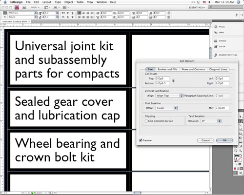
Simple table, complex leading
The net effect
All of these Byzantine workings can be sorted out and ultimately you can have precise numeric control over the leading of everything in a table. These values, in turn, can be built into character, paragraph, and cell styles to make formatting faster and more consistent. But they can make refining the layout of a table a hair-pulling event, because there’s no one place, no one dialog, where you can specify everything. Careful proofreading is a must. And patience is the order of the day.

