The Art of Type: Stroke, Stroke, Stroke

The InDesign Stroke panel can spice up your type in surprising ways. Veteran readers of this column know that I generally take a dim view of electronically manipulated type. When type is electronically oblique or expanded, it doesn’t look as though it came from another typeface, it simply looks fake—ill proportioned and just wrong. But electronically manipulated, intentionally outrageous type, now that’s another story. In this issue, we’ll take a look at how one simple trick—altering a character’s stroke—can create some effects that are very special indeed.
Stroke panel
The appearance of every character you typeset is a product of three things: its outline shape (as described in its font); its fill color (usually black); and the stroke weight of its outline (usually zero). We’ll just focus on tampering with the last of these.
In Illustrator and InDesign, you can alter the stroke of a character by simply selecting it and changing its weight in the Stroke panel and its color in the Color or Swatches panel. Adding a black stroke to a character creates a fake bold—it’s usually not very pretty. If you add a white stroke to a character, you make it thinner, which is even less pretty, especially when carried to extremes.
In InDesign though, you can also apply various types of strokes to characters—dots, dashes, hash marks—and here’s where the fun really starts. The key to making it work is to convert the type to outlines, which turns the text into an independent graphic object—a compound path—no longer associated with any font. Most of the rest of the action takes place in the Stroke panel (Window>Stroke).

The three hard-to-decipher icons in the Stroke panel under the Align Stroke section define where a stroke will set relative to the character outline path: Center, Inside, or Outside.
Various examples
Let’s run through a couple of sequential manipulations for a sampler of what’s possible. The first example shows a simple word in its native condition set in 72-point Verdana. Select the text and choose Type>Create Outlines to convert it to a graphic object. Notice that the text still looks like its old self.

For the second example, open the Stroke panel, choose the Selection tool (V), click on the text to select it, set the Weight to 2 pt, and the stroke Type to Right Slant Hash. This creates type with razor stubble. Under the Align Stroke section, click on the Align Stroke to Center icon so the whiskers overlap the filled portions of the characters.
For the third example, make sure the text is selected and change the stroke Type to Straight Hash. Now open the Swatches panel (Window>Color>Swatches), click the Stroke icon at the top-left to apply the color to the stroke, and choose yellow. Return to the Stroke panel, set Gap Color to red, and Gap Tint to 67%. (Note: The gaps are the spaces between the whiskers.) The net effect is type surrounded with and orange and yellow zipper.
The final example shows a 3 pt stroke Weight, a White Diamond stroke Type, and the Fill color set to None in the Swatches panel, which makes the type itself disappear.
More variations
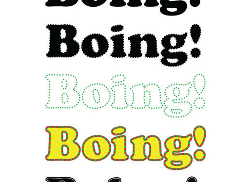
This next set of examples follow another pattern. The first example is good old 72-point Cooper Black. In the second example, set the Weight to 2 pt, the Stroke color to white, and Type to Japanese Dots to give the text a perforated edge. Once again, in the Align Stroke section, click the Align Stroke to Center icon.

The third example has the same Stroke panel properties as the second, but change the Stroke color to green and the Fill color to None. Now follow the dots. In the fourth example, set the Weight to 4 pt, the Gap Color to red, and the Fill color to yellow. This looks like holiday type to me, but I have no idea which one.
Finally, in the fifth example, something completely different: a classic inline effect. Set the stroke Weight to 4 pt, the Type to Thin-Thin, the Stroke color to Paper, the Fill color to black, and the Gap Color to None. Note: The Paper swatch in the Swatches panel translates to “see-through,” so the inline rule will take on whatever color paper the type is printed on.
These examples are just jumping-off points. Using the InDesign tools for creating your own custom stroke types (just choose Stroke Styles>New from the Stroke panel’s flyout menu), you can conjure effects as yet undreamed of.
Kerning controls
One last and important thing: When you convert type to outlines, you lose the ability to use your normal manual kerning controls for adjusting the spaces between characters. To manually kern these outlines, first deselect everything. Then choose the Direct Selection tool (A) and Option-click (PC: Alt-click) inside the character, which selects its entire path. Now use your Left and Right Arrow keys to nudge the selected character one way or the other.
If the nudge increments are too coarse, you can adjust them. Choose InDesign (PC: Edit)>Preferences>Units & Increments. Then, in the Keyboard Increments section, reduce the Cursor Key value from its default value of 0p1 to whatever suits you. You can specify decimal values down to one thousandth of a point (0p0.001).
Note that characters with counters—open spaces, as in an “o” or “p”—consist of two paths: one for the outer outline of the character and another for the counter. A two-story lowercase “g” (as in the Cooper Black font example) has two counters. Yet other characters, such as the exclamation point, come in two pieces. To select multiple paths, select the first using Option-click (PC: Alt-click), and then the successive by using Shift-Option-click (PC: Shift-Alt-click).


