
The Art of Type: Perfecting Tracking
On the Right Track
Typeface Choice, Size, and Output Medium Affect How You Adjust Tracking
There’s plenty of room for argument in typography, but there’s one defining truth that no one can deny: As type size increases, the white space between characters appears to grow faster than the characters themselves. The bigger the type, the looser it appears to be set. The measure of the overall spacing of type is called tracking, and controlling it is a key to perfecting type, both large and small. Large type should have its tracking tightened, while small type often needs to have it loosened.
Adobe programs don’t handle tracking well. PageMaker did, but its tools for automatically adjusting tracking as type size varied didn’t make it into InDesign or any other Creative Suite application. PageMaker even allowed you to set those automatic adjustments on a per-font basis, which is, as we’ll see, a very useful capability. This article, then, can be filed under “workarounds,” or making the best of a bad situation.
How tracking works
Tracking adjustments, like kerning adjustments, are measured in relative units, in this case, thousandths of an em. (An em is equal to the point size of the type you’re using.) Being based on relative measuring units, once a kerning or tracking adjustment has been specified, it remains proportionately consistent as the size of the type changes.
A thousandth of an em is a very small increment. Even a hundredth of an em is quite wee. For tracking adjustments, you’ll probably find the most useful minimum increment to be 5 thousandths of an em. But begin with increments of 10 before trying to split hairs.
In Creative Suite applications, tracking is a character attribute controlled in the Control and Character palettes. You can choose a value from the pop-up menu to the right, or click the up and down arrows to the left (except in Photoshop) to increase or decrease the value. You can also type in any arbitrary value (use a hyphen as a minus sign), which takes effect when you hit Return (PC: Enter). The selected value is applied to any currently selected text.
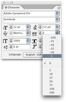
CS2 programs share the same deficient tracking control, found in the Control or Character palette. No automation here—all tracking has to be adjusted manually.
This example shows tracking adjustments in action. If I’ve done my work well, all the samples in each typeface should appear to have the same spacing across a range of sizes. But the numbers alongside them indicate the degree to which tracking has been adjusted to create that impression. You can use these values as starting points for the adjustments you make to your own type. As you can see from the differences between the adjustments for the serif Times Roman and the sans serif Gill Sans Light, there’s no one-size-fits-all when it comes to tracking.
![]()
Here type in a range of sizes in both Times Roman and Gill Sans Light have had their tracking adjusted to give the impression of consistent spacing. Tracking values shown are in thousandths of an em.
Tracking character styles
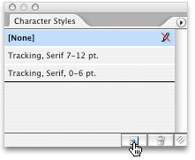
For each font, PageMaker could remember at which point sizes you wanted tracking adjusted and by how much, but in CS2 applications you’re on your own. I recommend creating character styles that control only tracking, and arranging them into sets, for example “Tracking, Serif 0–6 point,” “Tracking, Serif 7–12 point,” “Tracking, Serif 13–20 point,” and so forth, with another set for sans serif faces. These generic settings will work for many faces, but some pesky ones with finicky spacing needs (Bodoni, for example) may require their own styles. Sound like a lot of work? It is. Squawk to Adobe. I’ve been squawking for years, but I feel like a chorus of one.
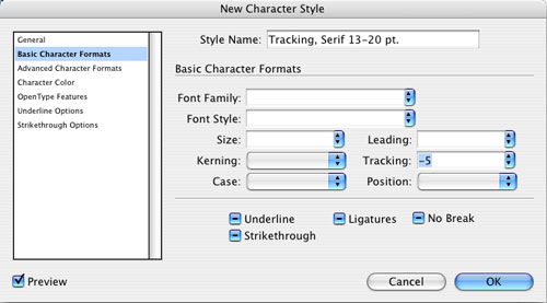
To create a new InDesign or Illustrator character style containing only tracking specs, first deselect everything (Shift-Command-A [PC: Shift-Control-A]). In InDesign, choose Window>Type & Tables>Character Styles (Illustrator: Window>Type>Character Styles) to open the Character Styles palette, then Option-click (PC: Alt-click) the Create New Style icon at the bottom of the palette. In the dialog that appears, choose Basic Character Formats from the list on the left and enter the Tracking value you want. Give your new style a name (as above) and click OK.
Once you have your tracking character styles set up, you can nest them within chosen paragraph styles, such as those for titles, subheads, pull-quotes, footnotes, or whatever. For unstyled text, you can use your tracking styles as shortcuts to typing in values you may have forgotten. [For a tutorial on nested styles, visit www.layersmagazine.com/category/indesign.—Ed.]
Most of the tracking adjustments you make will be for display type, but small type and type meant to be read onscreen need tracking help, too. For example, footnote type should have its tracking opened up because the neutral tracking setting built into most fonts is designed to work best at text size. This setting can cause smaller type to look cramped and make it harder to read. To make a visible difference, you may have to open up tracking quite a bit, as thousandths of an em at 5- or 6-point type starts to approach the micron level. Don’t trust the screen when making this adjustment—zooming in is counterproductive. You have to print proofs, and the higher the resolution the better.
The background view of this InDesign box shows the type as the world sees it. In the foreground is a vision of what you’d see if Adobe’s graphic artists hadn’t adjusted the display type’s tracking.
Likewise, text for CD-based publications or text meant to be read onscreen also benefits from looser tracking, because the finest spacing increment available onscreen is one pixel, which is at best 2/3 of a point wide. Unless you’re using a typeface designed for onscreen use (Matthew Carter’s Georgia or Verdana, for example), you’re likely to see lots of conjoined letter pairs in your text—inadvertent ligatures.
Lastly, adjusting tracking is a great copy-fitting tool, as well as a way to fix widows and orphans, bad rags, and sundry loose and tight lines (or loose and tight whole paragraphs). The key here is balance, so that you don’t vary the tracking so much that you disrupt the consistency of the type color from word to word, line to line, or paragraph to paragraph.

