
Negative Space
What you leave out is just as important as what you leave in
Whether it’s a logo, a magazine page, or a website, sometimes the things you don’t design are more powerful than the things you do. This is often achieved by the use of negative space. In this article, we’ll teach you what negative space is, how it works, and what benefits it can add to your own designs along with some examples to help you along the way.
What is negative space?
When composing a piece of artwork, we generally work with three elements: the frame, the positive space, and the negative space (also called white space). The frame is the bounding size of the artwork, the positive space is the subject, and the negative space is the empty space around the subject. The three images below will give you a basic understanding of this principle.
The frame—the size in which the object is placed
 CREDIT: ©SXC.HU/PAVEL JEDLICKA
The positive space masked in black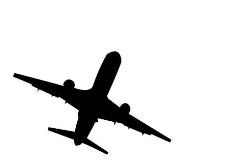
The negative space masked in black—notice how the negative space defines and implies the shape of a plane
Negative space helps define a subject, so subjectively speaking, negative space works when there’s a balance between the positive and negative spaces. Negative space also works when it draws the viewer’s eye into the subject at hand.
To show how negative space works, look at this personal logo design for Peter Ryan. Did you notice how the middle of the letter R is cleverly utilized to become the letter P? This has been achieved by reversing out the positive space of the letter P into negative space.

To put the importance of negative space and the frame into perspective, think about this: Do you ever wonder why when you watch a movie at the cinema, it’s more beautiful than if you watch it at home on a square-format TV? The cinematographer has composed the scene knowing that his frame was going to be viewed in the widescreen format of a cinema screen. However, once the movie gets cropped down to the square format of a non-widescreen TV, much of the beauty, negative space, and composition of the scene is lost, making for a less-appealing image.
The point to remember here is if the subject moves in any direction, inside or outside the frame, the shape and amount of negative space will change, so it’s always important to readjust your frame to the subject at hand.
 Reproduction of Rubin’s Vase shows negative space as an optical illusion—two faces or a vase?
Why use negative space?
If you work with negative spaces rather than on the subject (positive space), you’ll often end up with a more accurate and aesthetically pleasing design and balanced composition. Let’s look at this picture of a toucan, as it’s an excellent example of negative space. The positive space of the photograph is at the forefront of the design, as you can see in the image where the toucan is masked in black. The positive space consists of not only the bird but also the railing that it’s perched on. The negative space is all the other space that’s not at the forefront of the image.
Did you notice the negative space is actually shapes within a frame? Negative space isn’t the absence of space but rather the space that defines the positive space. These shapes are even easier to see when you turn the negative space upside down.
Take one more look at the image where the positive space is masked in black. Notice how the line of the railing leads us into the image of the toucan. The positive space of the railing guides your eyes to the main subject of the image, the toucan, and then continues on to exit the image. This is achieved because of the relationship of the positive spaces of the railing and the toucan to the negative spaces of the environment in which the photograph was taken.
Frame  CREDIT: ©SXC.HU/RONNEY GUIMARAES
Positive space (in black)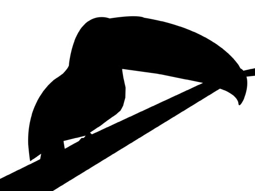
Negative space (in black)
Negative space flipped (in black)
Concentrate on the unfamiliar
More often than not when we’re designing something, we start from what we have in our memories. This focus on the positive space rather than the negative space can leave a design that’s not entirely balanced. The best way to take advantage of negative space is when we have to design something that’s difficult or something that’s not very familiar to us. Pretend that you have the lovely task of drawing your grandmother’s beautiful, wrinkly feet. Rather than focusing on the details, such as the wrinkles, toes, and nails, start looking at the unfamiliar negative spaces, such as the spaces between her toes, the distance from the ground of each toe, and the relationship with the edge of the frame (i.e., the piece of paper you’re drawing on).
If you concentrate on the unfamiliar, you’ll stop working on autopilot and become more focused. The result will be a much more accurate and polished illustration. This doesn’t work just for illustration, but all forms of design, so let’s take a look at how to use negative space in a variety of mediums.
Negative space in photography
In photography you’re dealing with aperture, shutter speed, lighting, and focus at every moment, and whether you know it or not, you’re also dealing with negative and positive space. As we discussed earlier, we define negative space as being the empty space around the subject of the image. It’s this space in photography that’s the most crucial aspect in nearly all compositions—having too much or too little negative space can completely ruin a potentially good photograph.
If you’ve been taking photos with your camera and everything is right technically but you feel something is missing, then it could well be your composition. Pay close attention to the negative space around your main subject, as changing the slightest thing can improve or reduce the quality of your photos. Consider this example: The two compositions use different amounts of negative space. The generous use of negative space in the image on the right makes it a much more pleasing image, as it draws the viewer to the subject and stabilizes the image.
Less negative space 
More negative space
The best method to learn how to master the use of negative space in photography is to practice. Remember that negative space is always related to the edge of the image (i.e., the frame) and it’s not constant, so you must continually readjust, just as you would your aperture, shutter speed, and lighting. You can also observe the images and designs of others. Have a look through this magazine and see how the photos and ads are put together. How have they used negative space in their designs? Does the cropping (i.e., framing) of the photos add impact to the design? If not, how could you improve them?
Observe shapes around the subject
As touched on earlier, when we compose a drawing, we often create objects based upon our existing knowledge and memories. When we outline something that doesn’t look correct, it proves difficult to change because we keep coming back to the same method of observation: We’re trying to make the drawing look as we remember it, not how the object looks in reality.
To solve this problem we have to observe the negative space, which is something that we’re not normally prone to do. If we observe the shapes around the subject, then this will help us fix our false interpretation of the subject. In theory, if we focus on what doesn’t exist (the negative space), we can more accurately define the boundaries of what does exist.
In this example, we can see a chair even though the chair hasn’t actually been drawn? If you focus on the negative spaces first and then fill in the details, your final illustration will be much more realistic. Another tip for creating more lifelike illustrations is to look at your design mirrored—this will make you look at things in an unfamiliar way, helping you to spot flaws in your design.
Negative space drawing of a chair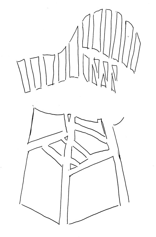
Negative space drawing of a chair reversed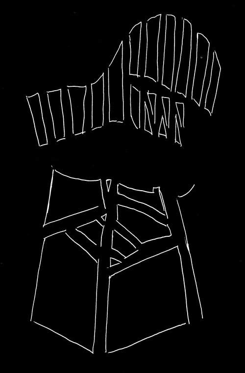
Design your website with negative space
In between columns, images, copy, and just about everything else on a website, there’s negative space. It’s our job as designers to maximize this space to its greatest potential so as not to crowd a website. We must use negative space to intelligently organize text and graphics to give visual relief to the user’s eyes, and we can do this by treating negative space as a crucial design element. Take notice of how much spacing is between your margins, columns, images and lines of text to effectively de-clutter your website.
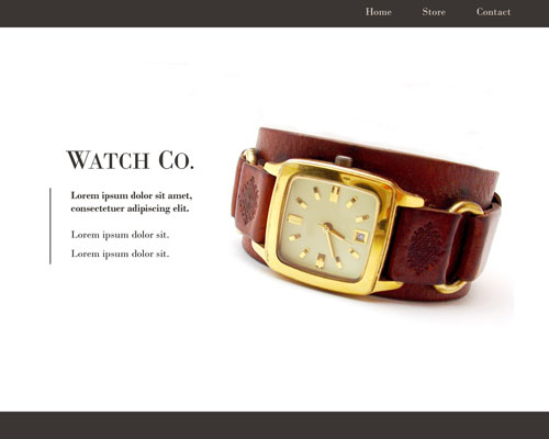
For example, in this mockup website for a watch, generous amounts of negative space convey a sense of good taste and refinement. This amount of negative space may not be appropriate for your design. To guide you in your own designs, take the time to study how other good webpage layouts use negative space.
 CREDIT: ©SXC.HU/MELISSA RAMIREZ
It’s creative and cost-saving in logo design
The use of negative space in logo design is probably one of the most cost-saving and creative techniques available to logo designers. Negative space reduces the amount of colors needed to produce a logo, which in the long run means you’ll pay less, as you’re not using as many colors in your print jobs.
The use of negative space in logo designs can also give logos a subtle third dimension, creating a layered look. The best example of this would have to be the FedEx logo. Visit www.fedex.com and take a close look at their logo. Have you ever seen the hidden arrow found in between the letters E and X? If you haven’t noticed it before, then you’ll never look at this logo the same way again. The hidden arrow portrays the speed and precision of the delivery service in a creative, simple, and clever manner.
How could you use negative space in your next logo design? Try turning the company name or part of the symbol into negative space by dropping the color out of that area. Usually, you’ll need some sort of background shape to do this. For example, in the Peter Ryan logo we showed earlier in this article, the letter P has used the letter R as the background to create the negative space.
Finding a creative solution for a logo that incorporates the use of negative space takes a lot of experimentation and sketching; however, it can really pay off, as the finished result will certainly stand out.
Use “white space” in print design
The use of negative space in print design is often called white space—it’s the space that doesn’t hold any content and it’s usually the key aspect of what makes or breaks a design. It’s also worth mentioning that white space doesn’t have to be white. Your background can be any color you wish; however, be sure to leave empty space. The effect will be the same as if the empty space was actually white.
White space in print design is used purely for semiotic value: a presentation that transcends economic values by insisting that the presented image is more important than the paper it’s printed on. For example, take this DL flyer for a fashion product. Straight away you can tell that the edgiest and most valuable fashion product would be the third design. This is achieved by using an unpredictable, asymmetrical balanced composition with a lot of white space, showing that the image is more valuable than the paper itself.
 CREDIT: ©SXC.HU/SCOTT SNYDER


Although the other two designs are acceptable examples, they don’t communicate as much prestige and class as the third image. This shows just how much power white space can give to a design.
Although there are numerous ways to apply negative space to a design, the best way to come to grips with the concept is to practice. In the same way martial artists have to spend hours and hours practicing simple techniques, graphic designers have to do the same.

