Graffiti-Like Website Layout Using Adobe Illustrator
Let’s create the layout for planning a website portfolio.
By doing so, we’ll learn a few techniques, including applying gradients to simulate a dried paint effect, the Add to Shape command in the Pathfinder palette, clipping masks, and typing on a path.
Step 1
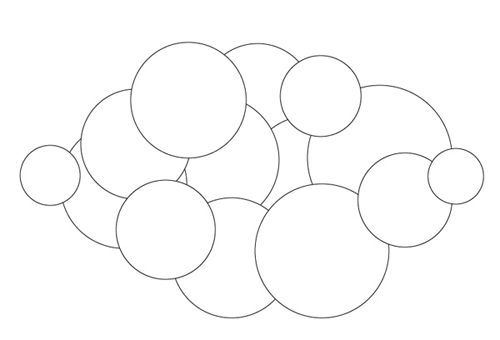
Open a new file in Adobe Illustrator. With the Ellipse tool, click-and-drag out a few overlapping circles. Hold down Shift to draw perfect circles. They should all together form a “cloud” shape.
Step 2
Change the Fill color to an orange swatch from the Swatches palette. Set the Stroke to None.
Step 3
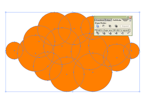
Click-and-drag around all the shapes with a Selection tool to select them all. Open the Pathfinder palette (Window>Pathfinder) and click Add to Shape to combine them all. Press Expand to get rid of the inner edges and make it truly one object.

Advertisement
Step 4
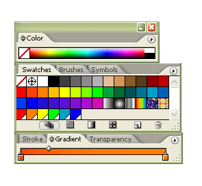
Next, deselect the cloud so we don’t change its color. Draw out a few long, vertical rounded rectangles with the Rounded Rectangle tool. Change its Stroke to None and set the Fill to a gradient. In the Gradient palette, click-and-drag a dark orange and a regular orange to the opposite sides, like shown here.
Step 5
Click-and-drag with the Gradient tool to make the darker orange appear on the bottom side. The effect is accomplished by having a little bit darker orange near the bottom of the paint drips, much like dried paint, which would be a little bit darker.

Step 6
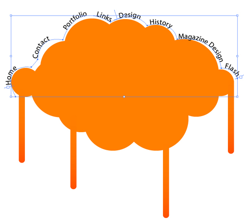
Now let’s add some text for the parts of the website. With the Pen tool, create a curved path that follows the top curves of the cloud. To do this, click first at one point, then let go and then click where the end of a curve is, but don’t let go yet. Drag it to curve the path. After drawing a curve, be sure to click again on the most recently created point to reset the angle so you don’t get awkward curves.

Step 7
With the Text tool, click somewhere on the path and enter in the text.
Step 8
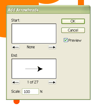
Select the text and go to Edit>Copy and Edit>Paste in Front. Then move the front text for now to select the back text and add some arrowheads to it by going to Effect>Stylize>Add Arrowheads.
Step 9
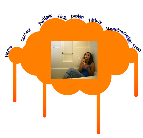
Make the back arrowhead text a different color from the text in front, like blue. Then move the front text back on top of the arrowhead text.
Step 10
Add a photo by placing it (File>Place). If you’d like it to have rounded corners, just draw a Rounded Rectangle over it and when selecting both the photo and the rounded rectangle, go to Object>Clipping Mask>Make. Add a background black rounded rectangle and Arrange it behind the photo for a border. Add some other decorations, such as stars with the Star tool or birds or arrows with the Pen tool.
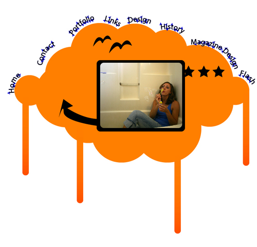
Now we have the basic design down for a portfolio website. Using this, we’d use Adobe Dreamweaver or Adobe GoLive along with Adobe Photoshop to layout out the functional website.

